using CSV, DataFrames, XLSX
using Statistics
using CairoMakie
using DoingEconomics

CairoMakie.activate!(type = "svg")
use_doingecon_theme!()1. Measuring climate change
Charts and summary measures for the extent and causes of climate change
Two questions: how do we know the climate is changing, and how do we know human activity is responsible?
- Part 1.1 — the behaviour of average surface temperature over time
- Part 1.2 — variation in temperature over time
- Part 1.3 — carbon emissions and the environment
New concepts: variance, frequency tables, correlation, spurious correlation. Book pages: project, R walk-throughs, solutions.
The data
| Temperature | NASA GISS GISTEMP v4, Northern-Hemisphere mean anomalies by month, season and year, 1880 onward |
| CO₂ | NOAA Mauna Loa Observatory monthly series, March 1958 onward, via CORE Econ’s frozen 2018 snapshot |
| Vintage | GISTEMP downloaded 2 September 2026; see data/MANIFEST.toml |
NoteOn matching the book’s published numbers
GISTEMP is reissued every month, and each release revises the whole record slightly as station data are corrected. Figures here are computed from a 2026 vintage against solutions published years earlier, so some numbers differ in the last decimal place. Where that happens it is flagged. The CO₂ side uses the book’s own frozen snapshot, so nothing drifts there.
Temperature first. The file has a title line above the real header, and codes missing observations as ***:
temp = CSV.read(rawpath("01", "NH.Ts+dSST.csv"), DataFrame;
                header = 2, missingstring = "***")

first(temp, 4)
4×19 DataFrame
| Row | Year | Jan | Feb | Mar | Apr | May | Jun | Jul | Aug | Sep | Oct | Nov | Dec | J-D | D-N | DJF | MAM | JJA | SON |
|---|---|---|---|---|---|---|---|---|---|---|---|---|---|---|---|---|---|---|---|
| Int64 | Float64 | Float64 | Float64 | Float64 | Float64 | Float64 | Float64 | Float64? | Float64? | Float64? | Float64? | Float64? | Float64? | Float64? | Float64? | Float64 | Float64? | Float64? | |
| 1 | 1880 | -0.37 | -0.52 | -0.24 | -0.3 | -0.07 | -0.17 | -0.2 | -0.27 | -0.24 | -0.32 | -0.43 | -0.41 | -0.3 | missing | missing | -0.2 | -0.21 | -0.33 |
| 2 | 1881 | -0.31 | -0.23 | -0.04 | 0.0 | 0.03 | -0.34 | 0.07 | -0.05 | -0.27 | -0.44 | -0.37 | -0.24 | -0.18 | -0.2 | -0.32 | -0.01 | -0.11 | -0.36 |
| 3 | 1882 | 0.25 | 0.21 | 0.02 | -0.3 | -0.23 | -0.29 | -0.28 | -0.17 | -0.26 | -0.52 | -0.34 | -0.69 | -0.22 | -0.18 | 0.07 | -0.17 | -0.24 | -0.37 |
| 4 | 1883 | -0.58 | -0.65 | -0.15 | -0.29 | -0.24 | -0.11 | -0.06 | -0.23 | -0.34 | -0.15 | -0.44 | -0.15 | -0.28 | -0.33 | -0.64 | -0.23 | -0.13 | -0.31 |
Nineteen columns: the year, the twelve months, two annual averages (J-D calendar-year and D-N December-to-November), and four seasonal averages.
(rows = nrow(temp), years = extrema(temp.Year), columns = names(temp))(rows = 147, years = (1880, 2026), columns = ["Year", "Jan", "Feb", "Mar", "Apr", "May", "Jun", "Jul", "Aug", "Sep", "Oct", "Nov", "Dec", "J-D", "D-N", "DJF", "MAM", "JJA", "SON"])Part 1.1 — The behaviour of average surface temperature over time
Q1. What “anomalies” means
The dataset holds anomalies, not temperatures: how far a month departed from the average for that same month and place over 1951–1980. A June anomaly of +0.5 means half a degree warmer than the average 1951–1980 June.
Anomalies rather than absolute readings because absolute temperature varies by location and season, and the set of reporting stations changes over the decades — averaging raw readings across a hemisphere would largely measure which stations were reporting. A departure from a local baseline is comparable between Norway and Egypt, so departures can be averaged.
Consequence used later: since the baseline is the 1951–1980 mean, anomalies over that window average to zero by construction.
Q2. A line chart for one month
Take June, and plot the whole record.
recent_june = mean(skipmissing(temp.Jun[temp.Year .>= 2015]))

fig = Figure(size = (760, 420))
ax = Axis(fig[1, 1];
          # Derived from the data rather than typed in, so the claim cannot go stale
          # when a later GISTEMP vintage is downloaded.
          title = "June now runs about $(round(recent_june, digits = 1)) °C above " *
                  "the 1951–1980 average",
          xlabel = "Year", ylabel = "Anomaly (°C)")

# The baseline is a reference value, not data, so it stays in chrome grey.
hlines!(ax, 0; color = BASELINE, linewidth = 1)
lines!(ax, temp.Year, temp.Jun; color = series_color(1))

# One direct label at the end of the line rather than a value on every point.
last_year, last_val = temp.Year[end], temp.Jun[end]
scatter!(ax, [last_year], [last_val]; color = series_color(1))
text!(ax, last_year - 3, last_val + 0.12;
      text = "$(last_year): $(last_val) °C", align = (:right, :bottom))

fig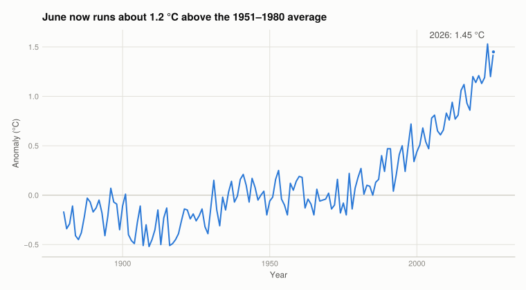
Slightly below baseline until about 1930, up to 1940, flat or falling into the 1970s, then rising without pause for fifty years. Recent values sit outside the entire range of the first century of the record.
Q3. A chart for each season
The DJF, MAM, JJA and SON columns hold winter, spring, summer and autumn averages. Four small multiples on shared axes make them comparable — the point of interest is whether the seasons behave differently, which needs the same scale on each.
seasons = [(:DJF, "Winter (Dec–Feb)"), (:MAM, "Spring (Mar–May)"),
           (:JJA, "Summer (Jun–Aug)"), (:SON, "Autumn (Sep–Nov)")]

fig = Figure(size = (860, 520))
# `tellwidth = false` matters: a Label reports its own width to the layout by
# default, which in a narrow figure squeezes the axes to fit the title instead of
# the other way round.
Label(fig[0, 1:2], "All four seasons warm, and they turn upward together";
      fontsize = 15, font = :bold, color = INK, halign = :left,
      tellwidth = false, padding = (0, 0, 8, 0))

# Shared limits across the four panels; without this the eye compares slopes that
# are drawn at different scales.
allvals = collect(skipmissing(vcat((temp[!, s] for (s, _) in seasons)...)))
ylims = (floor(minimum(allvals) * 2) / 2, ceil(maximum(allvals) * 2) / 2)

for (i, (col, label)) in enumerate(seasons)
    r, c = fldmod1(i, 2)
    ax = Axis(fig[r, c]; title = label, limits = (nothing, ylims),
              xlabel = r == 2 ? "Year" : "", ylabel = c == 1 ? "Anomaly (°C)" : "")
    hlines!(ax, 0; color = BASELINE, linewidth = 1)
    lines!(ax, temp.Year, temp[!, col]; color = series_color(1))
    c == 2 && hideydecorations!(ax; grid = false)
    r == 1 && hidexdecorations!(ax; grid = false)
end

fig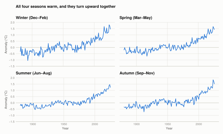
All four rise, and turn upward at the same time. Winter swings widest — Q2.5 puts its 1981–2010 variance at 0.079 °C² against summer’s 0.068 — which matters for Part 1.2.
Q4. The annual series
J-D is the calendar-year average. Averaging twelve months removes most of the month-to-month noise, so the trend that had to be read through the scatter in Figure 1 is simply the shape of the line.
annual = dropmissing(temp[:, [:Year, Symbol("J-D")]])
rename!(annual, Symbol("J-D") => :anomaly)

fig = Figure(size = (760, 420))
ax = Axis(fig[1, 1];
          title = "Annual average anomaly, Northern Hemisphere",
          subtitle = "Twelve-month averaging removes the monthly noise; the trend is the line",
          xlabel = "Year", ylabel = "Anomaly (°C)")
hlines!(ax, 0; color = BASELINE, linewidth = 1)
lines!(ax, annual.Year, annual.anomaly; color = series_color(1))

peak = argmax(annual.anomaly)
scatter!(ax, [annual.Year[peak]], [annual.anomaly[peak]]; color = series_color(1))
text!(ax, annual.Year[peak] - 3, annual.anomaly[peak];
      text = "$(annual.Year[peak]): $(annual.anomaly[peak]) °C", align = (:right, :center))

fig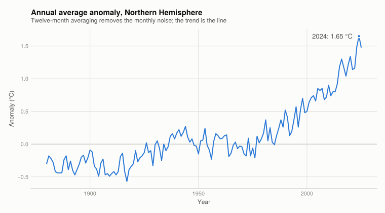
Q5. What each time interval shows
Aggregation trades variance for detail.
Monthly (Figure 1) — most variation, least trend clarity. Consecutive years differ by more than half a degree for reasons unrelated to climate, so any two adjacent years can be picked to show cooling.
Seasonal (Figure 2) — averaging three months cuts the noise by roughly √3 and keeps what the annual series loses: whether warming is uniform across the year. It isn’t; winter is noisier, quantified in Q2.5.
Annual (Figure 3) — clearest trend, no within-year detail. Right chart for “is it warming”, wrong one for “is summer warming faster than winter”.
Q6. Comparison with the book’s Figure 1.4
The book’s Figure 1.4 plots the same GISTEMP annual series, so Figure 3 reproduces its shape: the flat late-19th-century stretch, the rise to 1940, the mid-century pause, and the steady climb from the mid-1970s.
Two differences, both from the passage of time rather than method:
- The record is longer. The book’s figure ends in the 2010s; this one runs to 2025 and the additional years are all near the top of the range, extending the trend rather than changing it.
- The earlier values have moved slightly. GISTEMP is revised with each monthly release. The revisions are small — hundredths of a degree — but they are why exact numbers here differ from the book’s in the last decimal place.
Part 1.2 — Variation in temperature over time
Part 1.1 showed the mean rose. This part asks whether temperature became more variable — a separate claim, and the one that governs how often extremes occur.
June, July and August pooled, for two thirty-year windows.
summer = [:Jun, :Jul, :Aug]

"""Pool the June/July/August anomalies for the years `lo` through `hi`."""
function pool_summer(df, lo, hi)
    window = df[(df.Year .>= lo) .& (df.Year .<= hi), summer]
    return collect(skipmissing(vec(Matrix(window))))
end

base   = pool_summer(temp, 1951, 1980)   # the anomaly baseline period
recent = pool_summer(temp, 1981, 2010)

(base = length(base), recent = length(recent))
(base = 90, recent = 90)Ninety observations each — thirty years times three months.
Q1. Two frequency tables
For the two distributions to be comparable they must use identical bins, so the breaks are derived from both periods together rather than each separately.
step = 0.25
lo = floor(minimum(vcat(base, recent)) / step) * step
hi = ceil(maximum(vcat(base, recent)) / step) * step
breaks = lo:step:hi

freq_base   = freqtable_binned(base;   breaks = breaks)
freq_recent = freqtable_binned(recent; breaks = breaks)

DataFrame(bin = freq_base.bin,
          n_1951_1980 = freq_base.count,
          n_1981_2010 = freq_recent.count)
6×3 DataFrame
| Row | bin | n_1951_1980 | n_1981_2010 |
|---|---|---|---|
| String | Int64 | Int64 | |
| 1 | (-0.50, -0.25] | 2 | 0 |
| 2 | (-0.25, 0] | 40 | 7 |
| 3 | (0, 0.25] | 48 | 23 |
| 4 | (0.25, 0.50] | 0 | 28 |
| 5 | (0.50, 0.75] | 0 | 26 |
| 6 | (0.75, 1] | 0 | 6 |
The two columns barely overlap. In 1951–1980 the mass sits around zero; in 1981–2010 it has moved bodily to the right, and the coldest bins are empty.
Q2. Histograms of the two distributions
fig = Figure(size = (860, 400))
Label(fig[0, 1:2], "The whole distribution moved, it did not just stretch";
      fontsize = 15, font = :bold, color = INK, halign = :left,
      tellwidth = false, padding = (0, 0, 8, 0))

ymax = maximum(vcat(freq_base.count, freq_recent.count)) * 1.15
centres(t) = (t.lower .+ t.upper) ./ 2

for (i, (t, label)) in enumerate(((freq_base, "1951–1980"), (freq_recent, "1981–2010")))
    ax = Axis(fig[1, i]; title = label, xlabel = "Anomaly (°C)",
              ylabel = i == 1 ? "Number of months" : "",
              limits = ((lo - step / 2, hi + step / 2), (0, ymax)))
    # One series, one colour - bar height already encodes the count, so shading
    # the bars by size would spend the colour channel on nothing.
    barplot!(ax, centres(t), t.count;
             width = step * 0.85, color = series_color(1))
    i == 2 && hideydecorations!(ax; grid = false)
end

# Without this the two panels' edge tick labels collide into each other.
colgap!(fig.layout, 28)
fig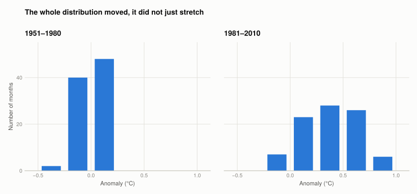
Both distributions have a similar width; the later one sits further right. That is a shift in the mean, not obviously an increase in spread — which is exactly the distinction Q5 tests numerically.
Q3. The 3rd and 7th deciles
The article’s definition: “cold” months are the coldest third of the 1951–1980 baseline, “hot” months the warmest third. So the thresholds are the 3rd and 7th deciles of base.
d3, d7 = quantile(base, [0.3, 0.7])
(third_decile = d3, seventh_decile = d7)
(third_decile = -0.08, seventh_decile = 0.08)
NoteDivergence from the published solution
The book reports −0.1 and 0.11; this vintage gives −0.08 and 0.08.
The cause is GISTEMP revision, amplified by the data’s granularity. Anomalies are published to two decimal places, so with 90 observations there are many ties, and a handful of values shifting by 0.01 moves a decile by a whole step. The mean over the same window is essentially unchanged (Q5 below), which is what you’d expect if the revisions are small and roughly symmetric — deciles are simply more sensitive to them than means are.
Q4. How many recent months count as hot
shares(v) = (cold = 100 * mean(v .< d3), hot = 100 * mean(v .> d7))

DataFrame(period = ["1951–1980", "1981–2010"],
          n = [length(base), length(recent)],
          cold_pct = [shares(base).cold, shares(recent).cold],
          hot_pct  = [shares(base).hot,  shares(recent).hot])
2×4 DataFrame
| Row | period | n | cold_pct | hot_pct |
|---|---|---|---|---|
| String | Int64 | Float64 | Float64 | |
| 1 | 1951–1980 | 90 | 27.7778 | 28.8889 |
| 2 | 1981–2010 | 90 | 1.11111 | 84.4444 |
84.4% of summer months in 1981–2010 were “hot” by the mid-century standard, matching the book exactly. Cold months fell to near zero.
The 1951–1980 row should show 30% in each tail by definition and shows 27.8% and 28.9%. This is a tie effect, not an error: deciles are values, and since anomalies are rounded to 0.01 several observations sit exactly on the threshold, where a strict < or > excludes them. Using ≤ and ≥ overshoots to 33.3% and 31.1%. No single comparison recovers exactly 30% — the book’s “30%” is the definition, not a computed share.
The strict comparison is what reproduces 84.4%, which identifies the convention the book used.
The 1981–2010 cold share is 1.1% against the book’s 2.2% — one month in ninety, from the revised deciles above.
Q5. Mean and variance across three periods
Now the actual question: mean and variance by season, for 1921–1950, 1951–1980 and 1981–2010.
periods = [(1921, 1950), (1951, 1980), (1981, 2010)]

summary = DataFrame(season = Symbol[], period = String[],
                    mean = Float64[], variance = Float64[])

for (col, _) in seasons, (plo, phi) in periods
    v = collect(skipmissing(temp[(temp.Year .>= plo) .& (temp.Year .<= phi), col]))
    # `$(plo)` rather than `$plo`: an en dash is a valid identifier character in
    # Julia, so `"$plo–$phi"` parses as a variable named `plo–`.
    push!(summary, (col, "$(plo)–$(phi)", mean(v), var(v)))
end

summary
12×4 DataFrame
| Row | season | period | mean | variance |
|---|---|---|---|---|
| Symbol | String | Float64 | Float64 | |
| 1 | DJF | 1921–1950 | -0.037 | 0.0557941 |
| 2 | DJF | 1951–1980 | -0.00233333 | 0.050384 |
| 3 | DJF | 1981–2010 | 0.519 | 0.0792438 |
| 4 | MAM | 1921–1950 | -0.05 | 0.0305034 |
| 5 | MAM | 1951–1980 | -2.77556e-18 | 0.0251034 |
| 6 | MAM | 1981–2010 | 0.506667 | 0.0763402 |
| 7 | JJA | 1921–1950 | -0.0616667 | 0.0205937 |
| 8 | JJA | 1951–1980 | 0.000666667 | 0.0145375 |
| 9 | JJA | 1981–2010 | 0.397 | 0.0681803 |
| 10 | SON | 1921–1950 | 0.0733333 | 0.0273816 |
| 11 | SON | 1951–1980 | -0.00133333 | 0.0263844 |
| 12 | SON | 1981–2010 | 0.426 | 0.11139 |
var here is the sample variance, dividing by n − 1 — the same definition R’s var uses, so these are directly comparable with the book’s.
period_labels = ["$(lo)–$(hi)" for (lo, hi) in periods]

fig = Figure(size = (800, 430))
ax = Axis(fig[1, 1];
          title = "Variance rises in the most recent period, in every season",
          ylabel = "Variance (°C²)",
          xticks = (1:length(seasons), [first(l, 6) for (_, l) in seasons]))

# Period carries the colour, season goes on the x-axis: the comparison the question
# asks for is across periods, so that is what the colour channel should encode.
# Three series also keeps every pair of colours on screen safely distinguishable -
# four would put yellow next to orange, which is too close a pair for bars sitting
# side by side.
nper = length(periods)
for (i, plabel) in enumerate(period_labels)
    vals = [only(summary[(summary.season .== col) .& (summary.period .== plabel),
                         :variance]) for (col, _) in seasons]
    # `collect` because barplot! takes vectors, not ranges.
    xs = collect((1:length(seasons)) .+ (i - (nper + 1) / 2) * 0.24)
    barplot!(ax, xs, vals; width = 0.22, color = series_color(i), label = plabel)
end

Legend(fig[1, 2], ax, "Period"; framevisible = false)
fig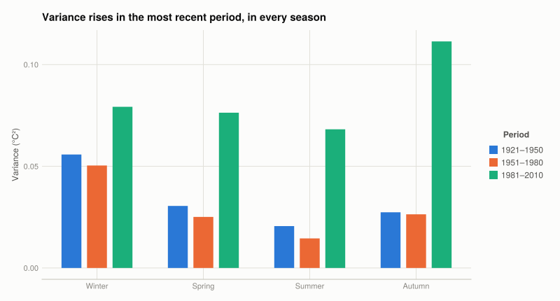
Two separate findings:
- The mean rose. Every season is near zero in both earlier windows and +0.40 to +0.52 °C in 1981–2010. The near-zero for 1951–1980 is guaranteed by the baseline definition; the near-zero for 1921–1950 is not, and puts that decade close to the 1951–1980 norm.
- The variance also rose, in every season. Autumn roughly four-fold (0.026 → 0.111), summer next. The distribution widened as well as sliding right.
Q6. Has temperature become more variable?
Yes, in all four seasons — but the mean shift is the larger effect.
The histograms in Figure 4 show the mean shift plainly and the variance change barely at all; only computing the variance surfaces it. A chart of two distributions shows a change in location and hides a change in spread.
The two effects have different consequences. A pure mean shift makes previously-rare warm months common — the 84.4% result. Higher variance additionally widens both tails relative to the new mean, so record heat becomes more frequent while severe cold events remain possible.
Strength of the claim: three windows give three variance estimates per season, each from 30 observations, so each is itself uncertain. The direction is consistent across all four seasons, but this is description, not a test.
Part 1.3 — Carbon emissions and the environment
co2 = DataFrame(XLSX.readtable(rawpath("01", "1_CO2-data.xlsx"), "Sheet1"))
rename!(co2, "Monthly average" => "average")

for c in ["Year", "Month"]
    co2[!, c] = Int.(co2[!, c])
end
for c in ["average", "Interpolated", "Trend"]
    # NOAA codes an unavailable monthly reading as -99.99. Left as a number it would
    # quietly drag any mean it touched down by a hundred parts per million.
    co2[!, c] = replace(Float64.(co2[!, c]), -99.99 => missing)
end

first(co2, 4)
4×5 DataFrame
| Row | Year | Month | average | Interpolated | Trend |
|---|---|---|---|---|---|
| Int64 | Int64 | Float64? | Float64? | Float64? | |
| 1 | 1958 | 3 | 315.71 | 315.71 | 314.62 |
| 2 | 1958 | 4 | 317.45 | 317.45 | 315.29 |
| 3 | 1958 | 5 | 317.5 | 317.5 | 314.71 |
| 4 | 1958 | 6 | missing | 317.1 | 314.85 |
(rows = nrow(co2), years = extrema(co2.Year),
 missing_average = count(ismissing, co2.average),
 missing_trend = count(ismissing, co2.Trend))
(rows = 713, years = (1958, 2017), missing_average = 7, missing_trend = 0)Seven months have no direct reading — early gaps in the Mauna Loa record.
Q1. Is one observatory a reliable proxy for the globe?
For the long-run trend, yes, for two specific reasons.
CO₂ persists in the atmosphere for centuries, far longer than the one to two years the atmosphere takes to mix, so it is well mixed globally — a molecule emitted anywhere ends up almost everywhere. This does not hold for short-lived pollutants, where one station would describe only its own region.
Mauna Loa sits 3,400 m up a mid-Pacific volcano, thousands of kilometres from major sources, so it samples free-troposphere air; sampling protocols discard air arriving from the volcano’s own vents.
Three real limitations:
- The seasonal cycle is regional. The sawtooth in Figure 6 is Northern-Hemisphere vegetation taking up carbon in spring and summer and releasing it in autumn and winter. A Southern-Hemisphere station shows a smaller cycle in the opposite phase. The trend is global; the cycle is not.
- The level runs slightly high. Emissions concentrate in the Northern Hemisphere, so northern stations read above the global mean.
- No redundancy. Confidence comes from the global network agreeing with the site, not from the site alone.
Q2. interpolated versus trend
Three columns, three different jobs:
average— the actual monthly mean of the measurements, withmissingwhere instruments failed.Interpolated— the same series with those gaps filled in, so it is complete. Still contains the full seasonal cycle.Trend— the interpolated series with the seasonal cycle removed, leaving the underlying long-run movement.
Which one you need depends on the question. Interpolated answers “what was the concentration in June 1985”, a level that includes the summer drawdown. Trend answers “was CO₂ higher in 1985 than 1984”, which the seasonal cycle would otherwise swamp: the sawtooth is about 6 ppm peak-to-trough against an annual increase of 1–2 ppm. Ask the second question of the seasonal series and the answer depends mostly on which months you compared.
Q3. Plotting both series
From January 1960. The full record shows the trend; a decade-long window is needed to see what Trend actually removes, because at full extent the two lines are visually one.
co2s = sort(co2[co2.Year .>= 1960, :], [:Year, :Month])
co2s.time = co2s.Year .+ (co2s.Month .- 0.5) ./ 12

fig = Figure(size = (900, 420))
Label(fig[0, 1:2], "CO₂ rises relentlessly, with an annual cycle riding on top";
      fontsize = 15, font = :bold, color = INK, halign = :left,
      tellwidth = false, padding = (0, 0, 8, 0))

ax1 = Axis(fig[1, 1]; title = "1960–2017", xlabel = "Year",
           ylabel = "CO₂ (ppm)")
lines!(ax1, co2s.time, co2s.Interpolated; color = series_color(1),
       label = "Interpolated")
lines!(ax1, co2s.time, co2s.Trend; color = series_color(2), label = "Trend")

zoom = co2s[co2s.Year .<= 1970, :]
ax2 = Axis(fig[1, 2]; title = "1960–1970 (detail)", xlabel = "Year")
lines!(ax2, zoom.time, zoom.Interpolated; color = series_color(1),
       label = "Interpolated")
lines!(ax2, zoom.time, zoom.Trend; color = series_color(2), label = "Trend")

# Two series, so a legend is present; it is shared rather than repeated per panel.
Legend(fig[2, 1:2], ax1; orientation = :horizontal, framevisible = false)
fig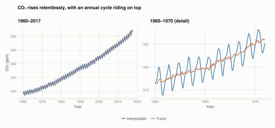
Over the full record the two lines are indistinguishable at this scale — the trend dominates everything. In the detail panel the interpolated series oscillates by roughly 6 ppm each year while the trend passes smoothly through the middle of it.
Q4. CO₂ against temperature
Take June, join CO₂ trend onto the temperature anomalies by year, and look at the relationship.
month_number = Dict(:Jan => 1, :Jun => 6, :Dec => 12)

"""Join the CO2 trend for a given month onto that month's temperature anomaly."""
function month_panel(month::Symbol)
    co2_month = co2[co2.Month .== month_number[month], [:Year, :Trend]]
    joined = innerjoin(temp[:, [:Year, month]], co2_month; on = :Year)
    rename!(joined, month => :anomaly)
    return dropmissing(joined)
end

june = month_panel(:Jun)
(n = nrow(june), years = extrema(june.Year))
(n = 60, years = (1958, 2017))r_june = cor(june.anomaly, june.Trend)0.9140963559587252fig = Figure(size = (700, 460))
ax = Axis(fig[1, 1];
title = "June: r = $(round(r_june, digits = 3))",
subtitle = "Higher CO₂ years are warmer years — but see Q6 on what this does not show",
xlabel = "CO₂ trend (ppm)", ylabel = "June anomaly (°C)")
scatter!(ax, june.Trend, june.anomaly; color = series_color(1))
# Label the two endpoints of the record rather than all sixty points.
for i in (argmin(june.Year), argmax(june.Year))
text!(ax, june.Trend[i], june.anomaly[i];
text = string(june.Year[i]), align = (:left, :top), offset = (6, -4),
fontsize = 11, color = MUTED)
end
fig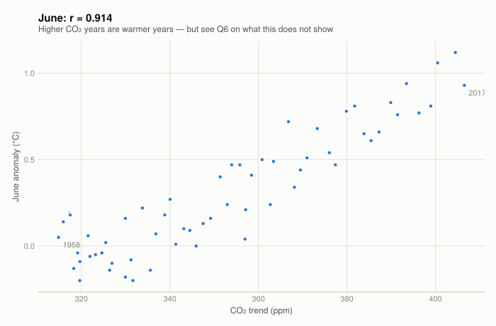
The correlation is 0.914 against the book’s 0.92 — the same answer, differing by the GISTEMP revision. The relationship is strong, positive, and close to linear over this range.
NoteWhy this isn’t the book’s chart
The book’s R walk-through 1.8 puts temperature and CO₂ on one set of axes with two y-scales, using par(new = TRUE) and a second axis on the right.
Where the two scales line up is an arbitrary choice by whoever drew the chart. Slide one scale and the series appear to track each other more or less tightly with no number changing, so the chart implies a strength of relationship it never measured.
Two panels sharing an x-axis carry the same information without that. The correlation coefficient, 0.914, is the actual answer to how closely the two move together.
fig = Figure(size = (760, 520))
Label(fig[0, 1], "Both series rise over the same six decades";
      fontsize = 15, font = :bold, color = INK, halign = :left,
      tellwidth = false, padding = (0, 0, 8, 0))

ax_t = Axis(fig[1, 1]; ylabel = "June anomaly (°C)")
lines!(ax_t, june.Year, june.anomaly; color = series_color(1))
hidexdecorations!(ax_t; grid = false)

ax_c = Axis(fig[2, 1]; xlabel = "Year", ylabel = "CO₂ trend (ppm)")
lines!(ax_c, june.Year, june.Trend; color = series_color(2))

linkxaxes!(ax_t, ax_c)
rowgap!(fig.layout, 8)
fig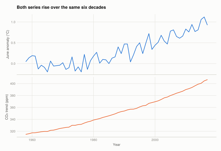
Why not index both series instead?
Indexing both series to 100 at a common base year is the other standard fix for two measures on different scales, and index_to does it. It is the wrong tool here.
Indexing is a ratio to the base value, so the base has to mean something. CO₂ has a true zero and a 1958 value near 315 ppm. A temperature anomaly does not — zero is the 1951–1980 mean, an arbitrary reference — and June 1958’s anomaly happens to be 0.05 °C:
base_anomaly = june.anomaly[1]
final_anomaly = june.anomaly[end]

(base = base_anomaly,
 final = final_anomaly,
 index = 100 * final_anomaly / base_anomaly,
 co2_index = 100 * june.Trend[end] / june.Trend[1])
(base = 0.05, final = 0.93, index = 1860.0, co2_index = 129.1186279180562)Temperature reaches an index of 1860 against CO₂’s 129 — less comparable than what we started with. The figure is also unstable: had 1958’s anomaly been 0.01 °C instead of 0.05, the index would read 9300, with nothing about the climate different.
Those four numbers are inline expressions rather than typed-in values, for the same reason the chart title above is computed: GISTEMP is reissued monthly, so a figure written into the prose is wrong as soon as the data is refreshed.
Index numbers work when both series have a meaningful zero and a base value away from it. Anomalies fail that, so the two-panel chart above is the right presentation.
Q5. A second and third month
fig = Figure(size = (900, 420))
Label(fig[0, 1:2], "The relationship holds in every month";
      fontsize = 15, font = :bold, color = INK, halign = :left,
      tellwidth = false, padding = (0, 0, 8, 0))

correlations = DataFrame(month = String[], n = Int[], r = Float64[])

for (i, m) in enumerate((:Jan, :Dec))
    panel = month_panel(m)
    r = cor(panel.anomaly, panel.Trend)
    push!(correlations, (string(m), nrow(panel), r))

    ax = Axis(fig[1, i]; title = "$m: r = $(round(r, digits = 3))",
              xlabel = "CO₂ trend (ppm)",
              ylabel = i == 1 ? "Anomaly (°C)" : "")
    scatter!(ax, panel.Trend, panel.anomaly; color = series_color(1))
end

fig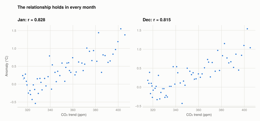
push!(correlations, ("Jun", nrow(june), r_june))
sort!(correlations, :r, rev = true)
correlations
Corollary 1
3×3 DataFrame
| Row | month | n | r |
|---|---|---|---|
| String | Int64 | Float64 | |
| 1 | Jun | 60 | 0.914096 |
| 2 | Jan | 59 | 0.828106 |
| 3 | Dec | 59 | 0.814826 |
June 0.914, January 0.828, December 0.815, against the book’s 0.92, 0.82 and 0.81.
Summer correlates more strongly than winter because winter anomalies are more variable (Q2.5). The extra variance is unrelated to CO₂ and dilutes the shared movement, so the measured correlation falls without the underlying relationship being weaker.
Q6. Correlation, causation, and spurious correlation
Correlation says two variables move together. Causation says changing one changes the other. A spurious correlation is a strong correlation with no causal link either way.
Two mechanisms produce them:
- A common cause. Ice cream sales and drowning deaths correlate; summer causes both.
- A shared trend. Any two series rising over the same period correlate regardless of subject. US cheese consumption and deaths from bedsheet entanglement correlate at about 0.95 — both grew with population.
The second applies here directly: the 0.914 in Figure 7 is on its own weak evidence. Both series trend upward over six decades, which guarantees a high correlation whatever the causal story. Any smoothly rising 1958–2017 series would score similarly.
What distinguishes this from cheese and bedsheets is not the coefficient:
- The mechanism was established first. CO₂’s infrared absorption was measured in the laboratory in the 1850s, decades before either series began. The correlation was predicted before it was observed.
- Direction comes from the mechanism, not the data. A correlation is symmetric and cannot separate CO₂ warming the planet from a warming planet releasing CO₂. Both occur; the second is a feedback. Isotopic evidence on the carbon’s origin settles which dominates.
- Alternatives were checked. Solar output and volcanic activity are measured separately and do not account for the post-1970 rise.
What this project establishes: temperature rose and became more variable (Parts 1.1–1.2); CO₂ rose over the same period and the two correlate strongly (Part 1.3). Attribution to human activity rests on the physics and the wider evidence base, not on the coefficient computed here.
What this project covered
| Concept | Where | In Julia |
|---|---|---|
| Line charts over time | Q1.2, Q1.3, Q1.4 | lines, hlines! |
| Small multiples on shared axes | Q1.3 | fig[r, c], shared limits |
| Frequency tables | Q2.1 | freqtable_binned |
| Histograms | Q2.2 | barplot! on binned counts |
| Deciles and quantiles | Q2.3 | quantile(x, [0.3, 0.7]) |
| Proportions from a condition | Q2.4 | mean(v .> threshold) |
| Mean and variance by group | Q2.5 | groupby + loop, var |
| Joining two datasets | Q3.4 | innerjoin(a, b; on = :Year) |
| Scatterplots and correlation | Q3.4, Q3.5 | scatter, cor |
| Index numbers | Q3.4 | index_to |
The R → Julia page has the full translation table, including the walk-through idioms not needed here.