Doing Economics in Julia
  • Home
  • Setup
  • R → Julia
  1. Empirical projects
  2. 5. Measuring inequality
  • Getting started
    • Overview
    • Setup
  • Empirical projects
    • 1. Measuring climate change
    • 2. Data from experiments
    • 3. Measuring a sugar tax
    • 4. Measuring wellbeing
    • 5. Measuring inequality
    • 6. Management practices
    • 7. Supply and demand
    • 8. Cost of unemployment
    • 9. Credit-excluded households
    • 10. Banking systems
    • 11. Willingness to pay
    • 12. Hong Kong cash handout
    • Extra 2. Carbon taxation
  • Reference
    • R → Julia
    • Technical reference

On this page

  • Part 5.1 — Measuring income inequality
    • Q1. Cumulative income share by decile
    • Q2. Lorenz curves
    • Q3. Reading the curves
    • Q4. Gini coefficients
    • Q5. Inter-decile ratios
    • Q6. Comparing across countries
    • Q7. Measures other than the Gini
  • Part 5.2 — Other kinds of inequality
    • Q1. Inequality in length of life
    • Q2. Ranking countries, 1952 against 2002
    • Q3. A health inequality measure
    • Q4. Gender inequality in education
    • What this project covered
  • View source
  • Report an issue
  1. Empirical projects
  2. 5. Measuring inequality

5. Measuring inequality

Lorenz curves, Gini coefficients, and inequality that isn’t about money

Project 4 ended on GDP per capita’s largest blind spot: a mean says nothing about who receives it. This project measures that directly — first for income, then for two things money does not buy.

  • Part 5.1 — measuring income inequality
  • Part 5.2 — measuring other kinds of inequality

New concepts: the Lorenz curve, the Gini coefficient, and inter-decile ratios. Book pages: project, R walk-throughs, solutions.

ImportantThe book’s dataset no longer exists

Part 5.1 uses decile income data from the Global Consumption and Income Project. The book sends you to the GCIP site to download GCIPrawdata.xlsx. That site is gone — gcip.info has been taken over by an SEO spam operation and globalinc.org redirects to an unrelated domain. Even the Internet Archive’s recent captures are the spam site.

Captures from before the takeover still hold the real files. This project uses an 18 March 2017 capture of the GCIP Global Income Distribution export, committed to this repository so it cannot be lost again. It reproduces the book’s published cumulative shares exactly for China 2014 and the United States in both years, and to within 0.03 percentage points for China 1980.

The export is shaped differently from the book’s: share1–share10 and income1–income10 rather than Decile 1 Income onward, and a CSV inside a zip rather than a spreadsheet.

using ZipFile, CSV, DataFrames
using Statistics
using CairoMakie
using DoingEconomics

CairoMakie.activate!(type = "svg")
use_doingecon_theme!()
"""Read the GCIP CSV straight out of the archive, without unpacking it."""
function read_gcip()
    archive = ZipFile.Reader(rawpath("05", "gcip-gid-excel.zip"))
    try
        idx = findfirst(f -> endswith(f.name, "previewexcel.csv"), archive.files)
        idx === nothing && error("gid-previewexcel.csv not found in the archive")
        return CSV.read(read(archive.files[idx]), DataFrame)
    finally
        close(archive)
    end
end

gcip = read_gcip()
(rows = nrow(gcip), countries = length(unique(gcip.country)),
 years = extrema(gcip.year))
(rows = 8839, countries = 161, years = (1960, 2015))

Part 5.1 — Measuring income inequality

Two countries with very different inequality trajectories: China, which industrialised rapidly over this period, and the United States.

Q1. Cumulative income share by decile

const PAIRS = [("China", 1980), ("China", 2014),
               ("United States", 1980), ("United States", 2014)]

"""Decile income shares for one country-year, poorest decile first."""
function decile_shares_of(df, country, year)
    row = df[(df.country .== country) .& (df.year .== year), :]
    isempty(row) && error("no GCIP row for $country $year")
    return [row[1, Symbol("share$i")] for i in 1:10]
end

cumulative = DataFrame(decile = 1:10)
for (country, year) in PAIRS
    # cumsum turns per-decile shares into the Lorenz curve's vertical axis.
    cumulative[!, "$country $year"] = round.(100 .* cumsum(decile_shares_of(gcip, country, year)),
                                             digits = 2)
end

cumulative
10×5 DataFrame
Row decile China 1980 China 2014 United States 1980 United States 2014
Int64 Float64 Float64 Float64 Float64
1 1 3.15 0.92 2.29 1.88
2 2 7.66 2.84 6.22 5.14
3 3 13.44 5.81 11.52 9.66
4 4 20.48 9.95 18.08 15.41
5 5 28.82 15.44 25.89 22.45
6 6 38.56 22.55 35.04 30.92
7 7 49.92 31.75 45.73 41.09
8 8 63.26 43.95 58.45 53.58
9 9 79.33 61.43 74.39 69.9
10 10 100.0 100.0 100.0 100.0

The ninth-decile row is the one to read: in 1980 the poorest 90% of China received 79.33% of income; by 2014 they received 61.43%. The United States moved from 74.39% to 69.90%.

These reproduce the book’s published solutions exactly for three of the four series. China 1980 differs by 0.01–0.03 percentage points in the first three deciles — a GCIP revision between the book’s vintage and this export, not a method difference, since the same columns match to the digit everywhere else.

Q2. Lorenz curves

fig = Figure(size = (900, 500))
Label(fig[0, 1:2], "China's distribution moved further from equality than the US's";
      fontsize = 15, font = :bold, color = INK, halign = :left,
      tellwidth = false, padding = (0, 0, 8, 0))

axs = [Axis(fig[1, i]; title = country,
            xlabel = "Cumulative share of population",
            ylabel = i == 1 ? "Cumulative share of income" : "",
            limits = ((0, 1), (0, 1)), aspect = 1)
       for (i, country) in enumerate(("China", "United States"))]

for (i, country) in enumerate(("China", "United States"))
    # Perfect equality: everyone holds the same, so share == population share.
    lines!(axs[i], [0, 1], [0, 1]; color = BASELINE, linewidth = 1)
    for (j, year) in enumerate((1980, 2014))
        curve = lorenz(decile_shares_of(gcip, country, year))
        lines!(axs[i], curve.population, curve.share;
               color = series_color(j), label = string(year))
    end
    i == 2 && hideydecorations!(axs[i]; grid = false)
end

Legend(fig[2, 1:2], first(axs); orientation = :horizontal, framevisible = false)
colgap!(fig.layout, 28)
fig
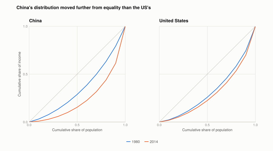
Figure 1: Lorenz curves for China and the United States, 1980 and 2014. The diagonal is perfect equality; the further a curve bows below it, the more unequal the distribution. Faceting by country keeps each panel to two curves, so the colour channel carries year rather than four country-year combinations.

lorenz prepends the origin, so the curve runs from \((0,0)\) to \((1,1)\) and can be plotted straight against the diagonal.

Q3. Reading the curves

Within each country over time. Both curves bow further from the diagonal in 2014 than in 1980, so inequality rose in both. The movement is far larger for China. Its 1980 curve is the closest to equality of the four — a legacy of a centrally planned economy with compressed wage scales — and its 2014 curve is the furthest from it.

Between countries in each year. In 1980 China was substantially more equal than the United States. By 2014 the ordering has reversed and China is the more unequal of the two.

What plausibly drove this. For China, market liberalisation from 1978: returns to skill and capital reappeared, coastal provinces industrialised far faster than inland ones, and the rural–urban gap widened. Growth was fast and very unevenly distributed — average incomes rose enormously while the distribution stretched. For the United States, a slower widening usually attributed to some mix of skill-biased technical change, declining union coverage, and falling top marginal tax rates.

One thing the curves cannot show: China’s poorest decile is far better off in absolute terms in 2014 than in 1980, despite receiving a smaller share. A Lorenz curve is scale-free — it describes shares, not levels — so a country can become more unequal while everyone gets richer.

Q4. Gini coefficients

The Gini is twice the area between the Lorenz curve and the diagonal: 0 at perfect equality, approaching 1 as one unit takes everything.

gini_table = DataFrame(
    country = first.(PAIRS), year = last.(PAIRS),
    gini_from_deciles = [round(gini(decile_shares_of(gcip, c, y)), digits = 4)
                         for (c, y) in PAIRS],
    gini_published = [round(gcip[(gcip.country .== c) .& (gcip.year .== y), :gini][1], digits = 4)
                      for (c, y) in PAIRS])
gini_table.difference = round.(gini_table.gini_from_deciles .- gini_table.gini_published,
                               digits = 4)
gini_table
4×5 DataFrame
Row country year gini_from_deciles gini_published difference
String Int64 Float64 Float64 Float64
1 China 1980 0.2908 0.2944 -0.0036
2 China 2014 0.5107 0.5234 -0.0127
3 United States 1980 0.3448 0.3511 -0.0063
4 United States 2014 0.4 0.4086 -0.0086

The ordering matches the chart exactly, which is the check the question asks for: China 1980 is lowest (0.291), China 2014 highest (0.511), and the US sits between them in both years — the same ranking as how far each curve bows from the diagonal.

NoteWhy these are slightly below GCIP’s own Gini

Every value computed from deciles comes out 0.004 to 0.013 below the Gini GCIP publishes for the same country-year, and the gap is largest for the most unequal case (China 2014).

This is not an error in either number. A Gini computed from ten decile shares treats everyone inside a decile as having identical income, so all within-decile inequality vanishes. The Lorenz curve becomes ten straight segments instead of a smooth curve, and straight segments cut the corner — the area between curve and diagonal is understated, so the Gini is too.

GCIP computes its figure from the underlying distribution, which keeps that inequality. The gap grows with inequality because the top decile is where within-group spread is largest: lumping the top 10% into a single average hides the most.

The practical lesson: a Gini from grouped data is a lower bound, and coarser grouping means a larger bias. Quintiles would understate further than deciles do.

Q5. Inter-decile ratios

# The 90/10 ratio compares income AT the 90th percentile with income AT the 10th -
# not the mean of the top decile against the mean of the bottom one, which is a
# different and larger quantity. The percentile columns exist for benchmark years
# only, and 2014 is not one of them, so 2015 stands in.
const RATIO_YEARS = [1980, 2015]

function ratios_for(df, country, year)
    row = df[(df.country .== country) .& (df.year .== year), :]
    p10, p50, p90 = row.incomeatperc10[1], row.incomeatperc50[1], row.incomeatperc90[1]
    any(ismissing, (p10, p50, p90)) && return (missing, missing, missing)
    return (p90 / p10, p90 / p50, p50 / p10)
end

ratio_table = DataFrame(country = String[], year = Int[],
                        r90_10 = Union{Missing,Float64}[],
                        r90_50 = Union{Missing,Float64}[],
                        r50_10 = Union{Missing,Float64}[])
for country in ("China", "United States"), year in RATIO_YEARS
    r = ratios_for(gcip, country, year)
    push!(ratio_table, (country, year,
                        map(x -> ismissing(x) ? missing : round(x, digits = 2), r)...))
end
ratio_table
4×5 DataFrame
Row country year r90_10 r90_50 r50_10
String Int64 Float64? Float64? Float64?
1 China 1980 4.65 1.98 2.34
2 China 2015 15.59 3.51 4.44
3 United States 1980 5.82 2.19 2.66
4 United States 2015 7.5 2.52 2.98

Why policymakers use these rather than a single Gini. A Gini compresses the whole distribution into one number, so two countries with the same Gini can be unequal in different places. The three ratios separate that:

  • 90/10 is overall spread, top to bottom.
  • 90/50 isolates the top half — how far the well-off are above the median.
  • 50/10 isolates the bottom half — how far the median is above the poor.

The distinction matters because the policies differ. A high 50/10 is about poverty and the bottom of the labour market, addressed by minimum wages, transfers and in-work benefits. A high 90/50 is about top incomes, addressed by progressive taxation. A single Gini cannot tell you which problem you have.

Reading the table: China’s 90/10 more than doubles between 1980 and 2015, and both halves widen. The United States starts more unequal on every ratio and widens more modestly.

Q6. Comparing across countries

The book sends you to the OECD’s interactive portal to browse ratio measures and Gini coefficients for 42 countries. The same comparison is computable here, which has the advantage of being reproducible rather than a screenshot:

benchmark = gcip[(gcip.year .== 2015) .& .!ismissing.(gcip.incomeatperc90) .&
                 .!ismissing.(gcip.incomeatperc10), :]

cross = DataFrame(country = benchmark.country,
                  gini = round.(benchmark.gini, digits = 3),
                  r90_10 = round.(benchmark.incomeatperc90 ./ benchmark.incomeatperc10, digits = 2),
                  r50_10 = round.(benchmark.incomeatperc50 ./ benchmark.incomeatperc10, digits = 2),
                  palma = round.(benchmark.palmaratio, digits = 2))
sort!(cross, :gini, rev = true)

vcat(first(cross, 8), last(cross, 8))
16×5 DataFrame
Row country gini r90_10 r50_10 palma
String31 Float64 Float64 Float64 Float64
1 South Africa 0.662 22.13 4.07 8.96
2 Zambia 0.636 22.73 4.9 8.41
3 Kenya 0.605 18.01 4.64 7.2
4 Jamaica 0.595 25.79 6.17 6.27
5 Malawi 0.594 15.74 4.16 6.59
6 Mozambique 0.592 17.76 4.62 6.51
7 Cameroon 0.588 15.87 4.17 6.35
8 Cote d'Ivoire 0.587 18.49 4.85 6.31
9 Belgium 0.275 3.63 2.03 0.97
10 Sweden 0.273 3.58 2.0 0.96
11 Finland 0.27 3.38 1.83 0.96
12 Iceland 0.269 3.34 1.89 0.96
13 Czech Republic 0.263 3.07 1.82 0.94
14 Slovak Republic 0.26 3.55 2.07 0.88
15 Norway 0.258 3.36 1.91 0.89
16 Slovenia 0.256 3.23 1.87 0.88
fig = Figure(size = (760, 560))
ax = Axis(fig[1, 1];
          title = "Two measures of the same distributions, correlation " *
                  "$(round(cor(cross.gini, cross.r90_10), digits = 3))",
          xlabel = "Gini coefficient", ylabel = "90/10 ratio")
scatter!(ax, cross.gini, cross.r90_10; color = series_color(1))

for name in ("China", "United States", "South Africa", "Sweden")
    idx = findfirst(==(name), cross.country)
    idx === nothing && continue
    text!(ax, cross.gini[idx], cross.r90_10[idx]; text = name, fontsize = 11,
          color = MUTED, align = (:left, :center), offset = (7, 0))
end
fig
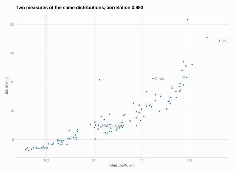
Figure 2: Gini against the 90/10 ratio across countries in 2015. The two measures agree on the broad ordering but not exactly — vertical spread at a given Gini is where the summary measure hides something.

Why more than one measure matters. The two correlate strongly but not perfectly, and the scatter at a given Gini is the point: countries with the same Gini can have quite different 90/10 ratios, because the Gini weights the middle of the distribution heavily while the ratio ignores it entirely. Neither is wrong; they answer different questions. Reporting one alone lets the choice of measure decide the ranking.

Q7. Measures other than the Gini

The book points at the Chartbook of Economic Inequality and asks for two measures excluding the Gini. Two that this dataset already carries, so they can be computed rather than browsed:

alt_measures = DataFrame(country = String[], year = Int[],
                         palma = Float64[], top1_share = Union{Missing,Float64}[],
                         top5_share = Union{Missing,Float64}[])
for (country, year) in PAIRS
    row = gcip[(gcip.country .== country) .& (gcip.year .== year), :]
    push!(alt_measures, (country, year, round(row.palmaratio[1], digits = 3),
                         ismissing(row.sharetop1[1]) ? missing : round(100row.sharetop1[1], digits = 2),
                         ismissing(row.sharetop5[1]) ? missing : round(100row.sharetop5[1], digits = 2)))
end
alt_measures
4×5 DataFrame
Row country year palma top1_share top5_share
String Int64 Float64 Float64? Float64?
1 China 1980 1.01 2.39 11.13
2 China 2014 3.876 missing missing
3 United States 1980 1.416 3.99 15.28
4 United States 2014 1.953 missing missing

The Palma ratio is the income share of the richest 10% divided by that of the poorest 40%. Its rationale is empirical: across countries the middle five deciles receive a strikingly stable share of income, so almost all cross-country variation in inequality is a contest between the top decile and the bottom four. The Palma looks only where the action is, and unlike the Gini it does not dilute that with a large stable middle.

The top 1% share is the share of total income going to the highest-earning 1%. It captures what both the Gini and decile ratios miss by construction: everything inside the top decile. Much of the measured rise in US inequality since 1980 is concentrated in the top 1%, which a decile-based Lorenz curve cannot see at all — the same limitation as the callout in Q4, at the other end of the distribution.

Their weakness is the mirror image of their strength: both discard most of the distribution, so neither would detect a change confined to the middle. This is the running theme — each measure is a deliberate choice about where to look.

Part 5.2 — Other kinds of inequality

Income is one dimension. Two more, where the inequality is in something money cannot be redistributed to fix directly.

Q1. Inequality in length of life

lifespan = CSV.read(rawpath("05", "lifespan-inequality-gini-females.csv"), DataFrame)
rename!(lifespan, names(lifespan)[4] => :lifespan_gini)

(rows = nrow(lifespan), entities = length(unique(lifespan.Entity)),
 years = extrema(lifespan.Year))
(rows = 20804, entities = 264, years = (1751, 2023))

A Gini of lifespan applies the same arithmetic to age at death instead of income. A value of 0 would mean everyone dies at exactly the same age; higher values mean length of life is more unequally distributed. It is a measure of how much mortality risk varies within a population, and most of that variation comes from deaths that happen early.

const COUNTRIES_10 = ["Japan", "Germany", "United States", "Russia", "Brazil",
                      "China", "Mexico", "South Africa", "India", "Nigeria"]

window = lifespan[in(COUNTRIES_10).(lifespan.Entity) .&
                  (lifespan.Year .>= 1952) .& (lifespan.Year .<= 2002), :]

ylims = extrema(window.lifespan_gini) .+ (-0.02, 0.02)

fig = Figure(size = (960, 460))
Label(fig[0, 1:5], "Lifespan inequality fell almost everywhere - and rose in Russia and South Africa";
      fontsize = 15, font = :bold, color = INK, halign = :left,
      tellwidth = false, padding = (0, 0, 8, 0))

for (i, country) in enumerate(COUNTRIES_10)
    r, c = fldmod1(i, 5)
    ax = Axis(fig[r, c]; title = country, limits = (nothing, ylims),
              xlabel = r == 2 ? "Year" : "", ylabel = c == 1 ? "Lifespan Gini" : "",
              xticks = 1960:20:2000)
    s = sort(window[window.Entity .== country, :], :Year)
    lines!(ax, s.Year, s.lifespan_gini; color = series_color(1))
    c != 1 && hideydecorations!(ax; grid = false)
    r != 2 && hidexdecorations!(ax; grid = false)
end
fig
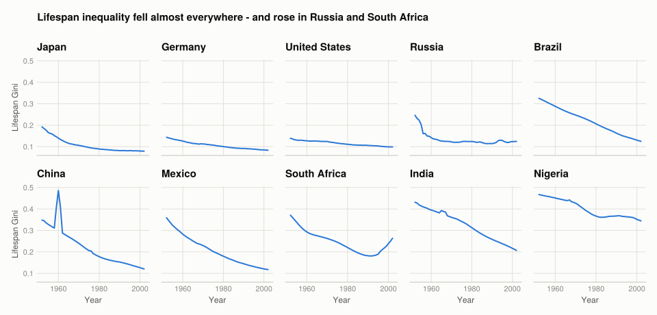
Figure 3: Gini coefficient of female lifespan inequality, 1952–2002, for ten countries on shared axes. Ten series cannot each take a hue, so each country gets its own panel.

Two patterns. The dominant one is convergence downward: every country starts higher in 1952 than it ends in 2002, and the falls are largest where the starting level was highest — India and Nigeria drop furthest. Falling lifespan inequality is mostly falling child mortality, because a death at age 2 pulls the distribution far more than a death at 75.

The exceptions are informative. Russia’s series falls sharply to about 1970, then stalls and rises again through the 1990s — the post-Soviet mortality crisis, concentrated in working-age adults. South Africa turns upward in the 1990s, the timing of the HIV/AIDS epidemic. Both show up as rising inequality in length of life rather than a fall in the average, which is the sort of thing a mean life expectancy reports much later and more weakly.

Q2. Ranking countries, 1952 against 2002

endpoints = DataFrame(country = String[], y1952 = Float64[], y2002 = Float64[])
for country in COUNTRIES_10
    s = lifespan[lifespan.Entity .== country, :]
    a = s[s.Year .== 1952, :lifespan_gini]
    b = s[s.Year .== 2002, :lifespan_gini]
    (isempty(a) || isempty(b)) && continue
    push!(endpoints, (country, a[1], b[1]))
end
endpoints.change = endpoints.y2002 .- endpoints.y1952
sort!(endpoints, :y2002)

fig = Figure(size = (860, 480))
ax = Axis(fig[1, 1]; title = "Lifespan inequality, sorted by 2002",
          ylabel = "Lifespan Gini",
          xticks = (1:nrow(endpoints), endpoints.country),
          xticklabelrotation = pi / 6)

for (j, (col, label)) in enumerate(((:y1952, "1952"), (:y2002, "2002")))
    xs = collect((1:nrow(endpoints)) .+ (j - 1.5) * 0.2)
    barplot!(ax, xs, endpoints[!, col]; width = 0.16,
             color = series_color(j), label = label)
end
Legend(fig[1, 2], ax; framevisible = false)
fig
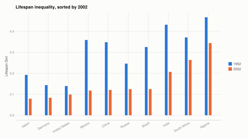
Figure 4: Lifespan inequality in 1952 and 2002, sorted by the 2002 value. Every country improved, but the ordering changed substantially.
ranked = copy(endpoints)
sort!(ranked, :y1952); ranked.rank_1952 = 1:nrow(ranked)
sort!(ranked, :y2002); ranked.rank_2002 = 1:nrow(ranked)
ranked.rank_change = ranked.rank_1952 .- ranked.rank_2002
select(ranked, :country, :y1952, :y2002, :change, :rank_1952, :rank_2002, :rank_change)
10×7 DataFrame
Row country y1952 y2002 change rank_1952 rank_2002 rank_change
String Float64 Float64 Float64 Int64 Int64 Int64
1 Japan 0.192446 0.0790791 -0.113367 3 1 2
2 Germany 0.143804 0.0835613 -0.0602425 2 2 0
3 United States 0.139356 0.0987449 -0.0406106 1 3 -2
4 Mexico 0.358898 0.1178 -0.241098 7 4 3
5 China 0.348151 0.120628 -0.227523 6 5 1
6 Russia 0.246176 0.124521 -0.121655 4 6 -2
7 Brazil 0.325251 0.124747 -0.200503 5 7 -2
8 India 0.431588 0.206883 -0.224705 9 8 1
9 South Africa 0.370898 0.263679 -0.107219 8 9 -1
10 Nigeria 0.467135 0.344205 -0.12293 10 10 0

Every country improved on the level, so the interesting content is in the reordering. Russia is the clearest mover in the wrong direction: comparatively equal in 1952, it ends worse than several countries it started ahead of, because its improvement stopped around 1970 while everyone else’s continued. The countries that started worst improved most, which is convergence — but convergence from very different causes, and it did not reach everyone.

Q3. A health inequality measure

The question asks you to choose a measure. Choice made here: the lifespan Gini above, extended to its full modern coverage rather than a WHO access indicator — because it is a genuine inequality measure rather than a level, and it is available for enough countries to rank.

An access measure like “share of the population with essential medicines” is a level: it tells you how many people are covered, not how unevenly. Two countries at 80% coverage can differ completely in who the missing 20% are. That distinction is the whole subject of this project, so a distributional measure is the better fit.

recent_year = maximum(lifespan.Year)
recent = dropmissing(lifespan[(lifespan.Year .== recent_year) .& .!ismissing.(lifespan.Code), :],
                     :lifespan_gini)

(year = recent_year, countries = nrow(recent),
 lowest = recent.Entity[argmin(recent.lifespan_gini)],
 lowest_value = round(minimum(recent.lifespan_gini), digits = 3),
 highest = recent.Entity[argmax(recent.lifespan_gini)],
 highest_value = round(maximum(recent.lifespan_gini), digits = 3),
 median_value = round(median(recent.lifespan_gini), digits = 3))
(year = 2023, countries = 248, lowest = "Macao", lowest_value = 0.063, highest = "Nigeria", highest_value = 0.281, median_value = 0.103)

How it is built. Take the distribution of age at death implied by a period life table, then compute the Gini of that distribution exactly as for income. The inputs are age-specific mortality rates, so it inherits their quality — which is the main limitation, since countries with weak vital registration have modelled rather than measured rates.

Two further limitations. It is a period measure: it describes the mortality conditions of one year applied to a synthetic cohort, not the experience of any real generation. And it treats all early deaths alike regardless of cause, so it cannot distinguish an epidemic from a war from a rise in infant mortality — the Russia and South Africa series above look similar in shape and have nothing in common in cause.

Q4. Gender inequality in education

education = CSV.read(rawpath("05", "gender-gap-education-levels.csv"), DataFrame)
rename!(education,
        "Girls in primary education" => :girls_primary,
        "Boys in primary education" => :boys_primary,
        "Women in tertiary education" => :women_tertiary,
        "Men in tertiary education" => :men_tertiary)

(rows = nrow(education), entities = length(unique(education.Entity)),
 years = extrema(education.Year))
(rows = 10603, entities = 243, years = (1820, 2025))

Choice made here: the gender parity ratio in primary enrolment — girls enrolled divided by boys enrolled. A ratio of 1 is parity, below 1 means girls are under-enrolled. A ratio is the right form because raw counts confound the gender gap with population size and with overall enrolment growth.

edu = dropmissing(education, [:girls_primary, :boys_primary])
edu = edu[(edu.boys_primary .> 0) .& .!ismissing.(edu.Code), :]
edu.parity = edu.girls_primary ./ edu.boys_primary

window_edu = edu[(edu.Year .>= 1980) .& (edu.Year .<= 2010), :]
coverage = combine(groupby(window_edu, :Entity), nrow => :years)

# Coverage is thin: of 206 countries in the window only 11 report 25 or more of the
# 31 years. A hardcoded country list would mostly miss, so the ten are selected from
# the data instead - among countries with at least 15 observations, the ten furthest
# from parity at their first observation, which are the ones with ground to cover.
eligible = coverage[coverage.years .>= 15, :Entity]

starts = combine(groupby(window_edu[in(eligible).(window_edu.Entity), :], :Entity)) do g
    s = sort(g, :Year)
    (; start_year = s.Year[1], start_parity = s.parity[1])
end
sort!(starts, :start_parity)
EDU_10 = first(starts, 10).Entity

(countries_in_window = nrow(coverage), with_15_plus_years = length(eligible),
 selected = EDU_10)
(countries_in_window = 206, with_15_plus_years = 48, selected = ["Benin", "Guinea", "Gambia", "Oman", "Burkina Faso", "Central African Republic", "Morocco", "Togo", "Burundi", "Bangladesh"])
panel = edu[in(EDU_10).(edu.Entity) .& (edu.Year .>= 1980) .& (edu.Year .<= 2010), :]
context = edu[in(eligible).(edu.Entity) .& (edu.Year .>= 1980) .& (edu.Year .<= 2010), :]

fig = Figure(size = (820, 480))
ax = Axis(fig[1, 1];
          title = "Primary enrolment moved toward parity almost everywhere",
          xlabel = "Year", ylabel = "Girls per boy enrolled")

# Every eligible country as recessive context; parity as the reference line.
for country in eligible
    s = sort(context[context.Entity .== country, :], :Year)
    lines!(ax, s.Year, s.parity; color = (BASELINE, 0.35), linewidth = 0.75)
end
hlines!(ax, 1.0; color = BASELINE, linewidth = 1)

# Three highlighted, which is as many as can carry distinct hues in a scatter of lines.
for (j, country) in enumerate(first(EDU_10, 3))
    s = sort(panel[panel.Entity .== country, :], :Year)
    lines!(ax, s.Year, s.parity; color = series_color(j), linewidth = 3, label = country)
end
text!(ax, 1981, 1.005; text = "parity", align = (:left, :bottom),
      fontsize = 11, color = MUTED)
axislegend(ax; position = :rb, framevisible = false)
fig
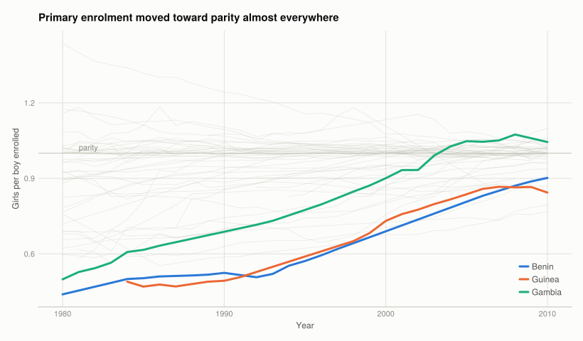
Figure 5: Gender parity in primary enrolment, 1980–2010. All countries with sufficient coverage are shown in grey; the ten selected are drawn in colour only where they can be told apart, with the rest carried by the table below.
# Anchored on each country's first and last available observation rather than on
# 1980 and 2010 exactly, since few countries report both of those years.
change = combine(groupby(panel, :Entity)) do g
    s = sort(g, :Year)
    (; from_year = s.Year[1], from = round(s.parity[1], digits = 3),
       to_year = s.Year[end], to = round(s.parity[end], digits = 3),
       change = round(s.parity[end] - s.parity[1], digits = 3))
end
sort!(change, :change, rev = true)
rename!(change, :Entity => :country)
change
10×6 DataFrame
Row country from_year from to_year to change
String Int64 Float64 Int64 Float64 Float64
1 Gambia 1980 0.499 2010 1.044 0.546
2 Benin 1980 0.439 2010 0.902 0.463
3 Bangladesh 1980 0.688 2010 1.1 0.413
4 Oman 1981 0.581 2009 0.972 0.39
5 Morocco 1980 0.622 2010 1.007 0.385
6 Guinea 1984 0.489 2010 0.844 0.354
7 Burundi 1980 0.679 2010 1.023 0.345
8 Burkina Faso 1980 0.598 2010 0.914 0.317
9 Togo 1980 0.656 2008 0.899 0.243
10 Central African Republic 1981 0.616 2010 0.769 0.153
fig = Figure(size = (800, 440))
ax = Axis(fig[1, 1]; title = "Gain in girls-per-boy enrolment, first to last observation",
          ylabel = "Change in parity ratio",
          xticks = (1:nrow(change), change.country), xticklabelrotation = pi / 6)
hlines!(ax, 0; color = BASELINE, linewidth = 1)
barplot!(ax, 1:nrow(change), change.change; width = 0.5, color = series_color(1))
for (x, v) in zip(1:nrow(change), change.change)
    text!(ax, x, v; text = string(v), fontsize = 10,
          align = (:center, v < 0 ? :top : :bottom), offset = (0, v < 0 ? -4 : 4))
end
fig
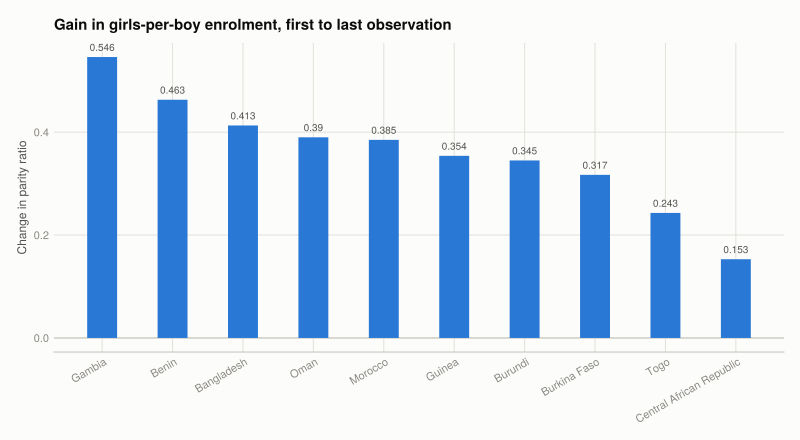
Figure 6: Change in primary enrolment parity between each country’s first and last observation in 1980–2010, sorted. The anchor years differ by country and are given in the table above.

The pattern. These ten were selected as the furthest from parity at the start, so having ground to cover is true by construction. What is not is how much they covered: mean parity goes from 0.587 to 0.947, no country moved backwards, and Gambia gains 0.55 to end above parity. The gap largely closed within a generation.

Two things the selection does not force. Five of the ten reached 0.95 or better, and the laggard is stark — the Central African Republic gains only 0.153 and ends at 0.769, still a quarter short. Convergence was fast but not universal.

Four ended above 1.0 — Bangladesh at 1.10, Gambia 1.04, Burundi 1.02, Morocco 1.01 — meaning more girls than boys enrolled. That is not “parity overshot into female advantage”; it usually means boys are leaving school for paid work, which is its own inequality. It also shows why the ratio needs reading in both directions rather than treated as a target to hit.

Limitations, and they are substantial.

  • Enrolment is not attendance, and neither is learning. A child counted as enrolled may attend rarely. Parity in enrolment is compatible with a large gap in years completed or in what was learned.
  • Parity is not equality, in either direction. A ratio of 1.0 says the same number of girls and boys are enrolled, not that they receive the same quality of schooling, sit the same subjects, or face the same expectations afterwards. And the four countries above 1.0 show the measure is not monotone in “good”: a ratio drifting above parity because boys are leaving for work is a problem the number reports as an improvement.
  • It says nothing about level. Two countries can both be at parity with one enrolling 95% of children and the other 45%. Perfect parity at low enrolment is equality of deprivation — which is exactly the objection Q3 raised against using a coverage level as an inequality measure, running the other way.
  • Primary is the easiest level. Gaps are typically much wider at secondary and tertiary, so primary parity is the most flattering indicator available.

What this project covered

Concept Where In Julia
Reading a CSV inside a zip Setup ZipFile.Reader, then CSV.read(read(f), ...)
Cumulative shares Q5.1 Q1 cumsum
Lorenz curve Q5.1 Q2 lorenz(shares)
Gini coefficient Q5.1 Q4 gini(shares)
Inter-decile ratios Q5.1 Q5 percentile columns, not decile means
Small multiples over 10 series Q5.2 Q1 fldmod1(i, 5) into fig[r, c]
Sorted grouped bars Q5.2 Q2 sort! then dodged barplot!
Rank change Q5.2 Q2 sort twice, difference the positions
Emphasis over many series Q5.2 Q4 grey context lines, colour on three

The R → Julia page has the full translation table.

4. Measuring wellbeing
6. Management practices
Source Code
---
title: "5. Measuring inequality"
subtitle: "Lorenz curves, Gini coefficients, and inequality that isn't about money"
engine: julia
julia:
  exeflags: ["--project=@."]
---

Project 4 ended on GDP per capita's largest blind spot: a mean says nothing about who receives
it. This project measures that directly — first for income, then for two things money does not
buy.

- **[Part 5.1](#part-5.1)** — measuring income inequality
- **[Part 5.2](#part-5.2)** — measuring other kinds of inequality

New concepts: the **Lorenz curve**, the **Gini coefficient**, and inter-decile ratios. Book
pages: [project](https://books.core-econ.org/doing-economics/book/text/05-01.html),
[R walk-throughs](https://books.core-econ.org/doing-economics/book/text/05-03.html),
[solutions](https://books.core-econ.org/doing-economics/book/text/05-04.html).

::: {.callout-important}
## The book's dataset no longer exists

Part 5.1 uses decile income data from the Global Consumption and Income Project. The book sends
you to the GCIP site to download `GCIPrawdata.xlsx`. **That site is gone** — `gcip.info` has
been taken over by an SEO spam operation and `globalinc.org` redirects to an unrelated domain.
Even the Internet Archive's recent captures are the spam site.

Captures from before the takeover still hold the real files. This project uses an 18 March 2017
capture of the GCIP Global Income Distribution export, committed to this repository so it
cannot be lost again. It reproduces the book's published cumulative shares exactly for China
2014 and the United States in both years, and to within 0.03 percentage points for China 1980.

The export is shaped differently from the book's: `share1`–`share10` and `income1`–`income10`
rather than `Decile 1 Income` onward, and a CSV inside a zip rather than a spreadsheet.
:::

```{julia}
#| label: setup
#| output: false
using ZipFile, CSV, DataFrames
using Statistics
using CairoMakie
using DoingEconomics

CairoMakie.activate!(type = "svg")
use_doingecon_theme!()
```

```{julia}
#| label: read-gcip
"""Read the GCIP CSV straight out of the archive, without unpacking it."""
function read_gcip()
    archive = ZipFile.Reader(rawpath("05", "gcip-gid-excel.zip"))
    try
        idx = findfirst(f -> endswith(f.name, "previewexcel.csv"), archive.files)
        idx === nothing && error("gid-previewexcel.csv not found in the archive")
        return CSV.read(read(archive.files[idx]), DataFrame)
    finally
        close(archive)
    end
end

gcip = read_gcip()
(rows = nrow(gcip), countries = length(unique(gcip.country)),
 years = extrema(gcip.year))
```

# Part 5.1 — Measuring income inequality {#part-5.1}

Two countries with very different inequality trajectories: **China**, which industrialised
rapidly over this period, and the **United States**.

## Q1. Cumulative income share by decile {#p1-q1}

```{julia}
#| label: cumulative-shares
const PAIRS = [("China", 1980), ("China", 2014),
               ("United States", 1980), ("United States", 2014)]

"""Decile income shares for one country-year, poorest decile first."""
function decile_shares_of(df, country, year)
    row = df[(df.country .== country) .& (df.year .== year), :]
    isempty(row) && error("no GCIP row for $country $year")
    return [row[1, Symbol("share$i")] for i in 1:10]
end

cumulative = DataFrame(decile = 1:10)
for (country, year) in PAIRS
    # cumsum turns per-decile shares into the Lorenz curve's vertical axis.
    cumulative[!, "$country $year"] = round.(100 .* cumsum(decile_shares_of(gcip, country, year)),
                                             digits = 2)
end

cumulative
```

The ninth-decile row is the one to read: in 1980 the poorest 90% of China received **79.33%** of
income; by 2014 they received **61.43%**. The United States moved from 74.39% to 69.90%.

These reproduce the book's published solutions exactly for three of the four series. China 1980
differs by 0.01–0.03 percentage points in the first three deciles — a GCIP revision between the
book's vintage and this export, not a method difference, since the same columns match to the
digit everywhere else.

## Q2. Lorenz curves {#p1-q2}

```{julia}
#| label: fig-lorenz
#| fig-cap: "Lorenz curves for China and the United States, 1980 and 2014. The diagonal is perfect equality; the further a curve bows below it, the more unequal the distribution. Faceting by country keeps each panel to two curves, so the colour channel carries year rather than four country-year combinations."
fig = Figure(size = (900, 500))
Label(fig[0, 1:2], "China's distribution moved further from equality than the US's";
      fontsize = 15, font = :bold, color = INK, halign = :left,
      tellwidth = false, padding = (0, 0, 8, 0))

axs = [Axis(fig[1, i]; title = country,
            xlabel = "Cumulative share of population",
            ylabel = i == 1 ? "Cumulative share of income" : "",
            limits = ((0, 1), (0, 1)), aspect = 1)
       for (i, country) in enumerate(("China", "United States"))]

for (i, country) in enumerate(("China", "United States"))
    # Perfect equality: everyone holds the same, so share == population share.
    lines!(axs[i], [0, 1], [0, 1]; color = BASELINE, linewidth = 1)
    for (j, year) in enumerate((1980, 2014))
        curve = lorenz(decile_shares_of(gcip, country, year))
        lines!(axs[i], curve.population, curve.share;
               color = series_color(j), label = string(year))
    end
    i == 2 && hideydecorations!(axs[i]; grid = false)
end

Legend(fig[2, 1:2], first(axs); orientation = :horizontal, framevisible = false)
colgap!(fig.layout, 28)
fig
```

`lorenz` prepends the origin, so the curve runs from $(0,0)$ to $(1,1)$ and can be plotted
straight against the diagonal.

## Q3. Reading the curves {#p1-q3}

**Within each country over time.** Both curves bow further from the diagonal in 2014 than in
1980, so inequality rose in both. The movement is far larger for China. Its 1980 curve is the
closest to equality of the four — a legacy of a centrally planned economy with compressed wage
scales — and its 2014 curve is the furthest from it.

**Between countries in each year.** In 1980 China was substantially *more* equal than the United
States. By 2014 the ordering has reversed and China is the more unequal of the two.

**What plausibly drove this.** For China, market liberalisation from 1978: returns to skill and
capital reappeared, coastal provinces industrialised far faster than inland ones, and the
rural–urban gap widened. Growth was fast and very unevenly distributed — average incomes rose
enormously while the distribution stretched. For the United States, a slower widening usually
attributed to some mix of skill-biased technical change, declining union coverage, and falling
top marginal tax rates.

One thing the curves cannot show: China's poorest decile is far better off in absolute terms in
2014 than in 1980, despite receiving a smaller share. A Lorenz curve is scale-free — it
describes shares, not levels — so a country can become more unequal while everyone gets richer.

## Q4. Gini coefficients {#p1-q4}

The Gini is twice the area between the Lorenz curve and the diagonal: 0 at perfect equality,
approaching 1 as one unit takes everything.

```{julia}
#| label: gini-table
gini_table = DataFrame(
    country = first.(PAIRS), year = last.(PAIRS),
    gini_from_deciles = [round(gini(decile_shares_of(gcip, c, y)), digits = 4)
                         for (c, y) in PAIRS],
    gini_published = [round(gcip[(gcip.country .== c) .& (gcip.year .== y), :gini][1], digits = 4)
                      for (c, y) in PAIRS])
gini_table.difference = round.(gini_table.gini_from_deciles .- gini_table.gini_published,
                               digits = 4)
gini_table
```

The ordering matches the chart exactly, which is the check the question asks for: China 1980 is
lowest (0.291), China 2014 highest (0.511), and the US sits between them in both years — the
same ranking as how far each curve bows from the diagonal.

::: {.callout-note}
## Why these are slightly below GCIP's own Gini

Every value computed from deciles comes out **0.004 to 0.013 below** the Gini GCIP publishes for
the same country-year, and the gap is largest for the most unequal case (China 2014).

This is not an error in either number. A Gini computed from ten decile shares treats everyone
inside a decile as having identical income, so all **within-decile** inequality vanishes. The
Lorenz curve becomes ten straight segments instead of a smooth curve, and straight segments cut
the corner — the area between curve and diagonal is understated, so the Gini is too.

GCIP computes its figure from the underlying distribution, which keeps that inequality. The gap
grows with inequality because the top decile is where within-group spread is largest: lumping
the top 10% into a single average hides the most.

The practical lesson: a Gini from grouped data is a lower bound, and coarser grouping means a
larger bias. Quintiles would understate further than deciles do.
:::

## Q5. Inter-decile ratios {#p1-q5}

```{julia}
#| label: ratios
# The 90/10 ratio compares income AT the 90th percentile with income AT the 10th -
# not the mean of the top decile against the mean of the bottom one, which is a
# different and larger quantity. The percentile columns exist for benchmark years
# only, and 2014 is not one of them, so 2015 stands in.
const RATIO_YEARS = [1980, 2015]

function ratios_for(df, country, year)
    row = df[(df.country .== country) .& (df.year .== year), :]
    p10, p50, p90 = row.incomeatperc10[1], row.incomeatperc50[1], row.incomeatperc90[1]
    any(ismissing, (p10, p50, p90)) && return (missing, missing, missing)
    return (p90 / p10, p90 / p50, p50 / p10)
end

ratio_table = DataFrame(country = String[], year = Int[],
                        r90_10 = Union{Missing,Float64}[],
                        r90_50 = Union{Missing,Float64}[],
                        r50_10 = Union{Missing,Float64}[])
for country in ("China", "United States"), year in RATIO_YEARS
    r = ratios_for(gcip, country, year)
    push!(ratio_table, (country, year,
                        map(x -> ismissing(x) ? missing : round(x, digits = 2), r)...))
end
ratio_table
```

**Why policymakers use these rather than a single Gini.** A Gini compresses the whole
distribution into one number, so two countries with the same Gini can be unequal in different
places. The three ratios separate that:

- **90/10** is overall spread, top to bottom.
- **90/50** isolates the top half — how far the well-off are above the median.
- **50/10** isolates the bottom half — how far the median is above the poor.

The distinction matters because the policies differ. A high 50/10 is about poverty and the
bottom of the labour market, addressed by minimum wages, transfers and in-work benefits. A high
90/50 is about top incomes, addressed by progressive taxation. A single Gini cannot tell you
which problem you have.

Reading the table: China's 90/10 more than doubles between 1980 and 2015, and both halves widen.
The United States starts more unequal on every ratio and widens more modestly.

## Q6. Comparing across countries {#p1-q6}

The book sends you to the OECD's interactive portal to browse ratio measures and Gini
coefficients for 42 countries. The same comparison is computable here, which has the advantage
of being reproducible rather than a screenshot:

```{julia}
#| label: cross-country
benchmark = gcip[(gcip.year .== 2015) .& .!ismissing.(gcip.incomeatperc90) .&
                 .!ismissing.(gcip.incomeatperc10), :]

cross = DataFrame(country = benchmark.country,
                  gini = round.(benchmark.gini, digits = 3),
                  r90_10 = round.(benchmark.incomeatperc90 ./ benchmark.incomeatperc10, digits = 2),
                  r50_10 = round.(benchmark.incomeatperc50 ./ benchmark.incomeatperc10, digits = 2),
                  palma = round.(benchmark.palmaratio, digits = 2))
sort!(cross, :gini, rev = true)

vcat(first(cross, 8), last(cross, 8))
```

```{julia}
#| label: fig-gini-vs-ratio
#| fig-cap: "Gini against the 90/10 ratio across countries in 2015. The two measures agree on the broad ordering but not exactly — vertical spread at a given Gini is where the summary measure hides something."
fig = Figure(size = (760, 560))
ax = Axis(fig[1, 1];
          title = "Two measures of the same distributions, correlation " *
                  "$(round(cor(cross.gini, cross.r90_10), digits = 3))",
          xlabel = "Gini coefficient", ylabel = "90/10 ratio")
scatter!(ax, cross.gini, cross.r90_10; color = series_color(1))

for name in ("China", "United States", "South Africa", "Sweden")
    idx = findfirst(==(name), cross.country)
    idx === nothing && continue
    text!(ax, cross.gini[idx], cross.r90_10[idx]; text = name, fontsize = 11,
          color = MUTED, align = (:left, :center), offset = (7, 0))
end
fig
```

**Why more than one measure matters.** The two correlate strongly but not perfectly, and the
scatter at a given Gini is the point: countries with the same Gini can have quite different
90/10 ratios, because the Gini weights the middle of the distribution heavily while the ratio
ignores it entirely. Neither is wrong; they answer different questions. Reporting one alone lets
the choice of measure decide the ranking.

## Q7. Measures other than the Gini {#p1-q7}

The book points at the Chartbook of Economic Inequality and asks for two measures excluding the
Gini. Two that this dataset already carries, so they can be computed rather than browsed:

```{julia}
#| label: other-measures
alt_measures = DataFrame(country = String[], year = Int[],
                         palma = Float64[], top1_share = Union{Missing,Float64}[],
                         top5_share = Union{Missing,Float64}[])
for (country, year) in PAIRS
    row = gcip[(gcip.country .== country) .& (gcip.year .== year), :]
    push!(alt_measures, (country, year, round(row.palmaratio[1], digits = 3),
                         ismissing(row.sharetop1[1]) ? missing : round(100row.sharetop1[1], digits = 2),
                         ismissing(row.sharetop5[1]) ? missing : round(100row.sharetop5[1], digits = 2)))
end
alt_measures
```

**The Palma ratio** is the income share of the richest 10% divided by that of the poorest 40%.
Its rationale is empirical: across countries the middle five deciles receive a strikingly stable
share of income, so almost all cross-country variation in inequality is a contest between the
top decile and the bottom four. The Palma looks only where the action is, and unlike the Gini it
does not dilute that with a large stable middle.

**The top 1% share** is the share of total income going to the highest-earning 1%. It captures
what both the Gini and decile ratios miss by construction: everything inside the top decile.
Much of the measured rise in US inequality since 1980 is concentrated in the top 1%, which a
decile-based Lorenz curve cannot see at all — the same limitation as the callout in Q4, at the
other end of the distribution.

Their weakness is the mirror image of their strength: both discard most of the distribution, so
neither would detect a change confined to the middle. This is the running theme — each measure
is a deliberate choice about where to look.

# Part 5.2 — Other kinds of inequality {#part-5.2}

Income is one dimension. Two more, where the inequality is in something money cannot be
redistributed to fix directly.

## Q1. Inequality in length of life {#p2-q1}

```{julia}
#| label: read-lifespan
lifespan = CSV.read(rawpath("05", "lifespan-inequality-gini-females.csv"), DataFrame)
rename!(lifespan, names(lifespan)[4] => :lifespan_gini)

(rows = nrow(lifespan), entities = length(unique(lifespan.Entity)),
 years = extrema(lifespan.Year))
```

A **Gini of lifespan** applies the same arithmetic to age at death instead of income. A value of
0 would mean everyone dies at exactly the same age; higher values mean length of life is more
unequally distributed. It is a measure of how much *mortality risk* varies within a population,
and most of that variation comes from deaths that happen early.

```{julia}
#| label: fig-lifespan
#| fig-cap: "Gini coefficient of female lifespan inequality, 1952–2002, for ten countries on shared axes. Ten series cannot each take a hue, so each country gets its own panel."
const COUNTRIES_10 = ["Japan", "Germany", "United States", "Russia", "Brazil",
                      "China", "Mexico", "South Africa", "India", "Nigeria"]

window = lifespan[in(COUNTRIES_10).(lifespan.Entity) .&
                  (lifespan.Year .>= 1952) .& (lifespan.Year .<= 2002), :]

ylims = extrema(window.lifespan_gini) .+ (-0.02, 0.02)

fig = Figure(size = (960, 460))
Label(fig[0, 1:5], "Lifespan inequality fell almost everywhere - and rose in Russia and South Africa";
      fontsize = 15, font = :bold, color = INK, halign = :left,
      tellwidth = false, padding = (0, 0, 8, 0))

for (i, country) in enumerate(COUNTRIES_10)
    r, c = fldmod1(i, 5)
    ax = Axis(fig[r, c]; title = country, limits = (nothing, ylims),
              xlabel = r == 2 ? "Year" : "", ylabel = c == 1 ? "Lifespan Gini" : "",
              xticks = 1960:20:2000)
    s = sort(window[window.Entity .== country, :], :Year)
    lines!(ax, s.Year, s.lifespan_gini; color = series_color(1))
    c != 1 && hideydecorations!(ax; grid = false)
    r != 2 && hidexdecorations!(ax; grid = false)
end
fig
```

Two patterns. **The dominant one is convergence downward**: every country starts higher in 1952
than it ends in 2002, and the falls are largest where the starting level was highest — India and
Nigeria drop furthest. Falling lifespan inequality is mostly falling *child* mortality, because
a death at age 2 pulls the distribution far more than a death at 75.

**The exceptions are informative.** Russia's series falls sharply to about 1970, then stalls and
rises again through the 1990s — the post-Soviet mortality crisis, concentrated in
working-age adults. South Africa turns upward in the 1990s, the timing of the HIV/AIDS epidemic.
Both show up as *rising inequality in length of life* rather than a fall in the average, which
is the sort of thing a mean life expectancy reports much later and more weakly.

## Q2. Ranking countries, 1952 against 2002 {#p2-q2}

```{julia}
#| label: fig-lifespan-change
#| fig-cap: "Lifespan inequality in 1952 and 2002, sorted by the 2002 value. Every country improved, but the ordering changed substantially."
endpoints = DataFrame(country = String[], y1952 = Float64[], y2002 = Float64[])
for country in COUNTRIES_10
    s = lifespan[lifespan.Entity .== country, :]
    a = s[s.Year .== 1952, :lifespan_gini]
    b = s[s.Year .== 2002, :lifespan_gini]
    (isempty(a) || isempty(b)) && continue
    push!(endpoints, (country, a[1], b[1]))
end
endpoints.change = endpoints.y2002 .- endpoints.y1952
sort!(endpoints, :y2002)

fig = Figure(size = (860, 480))
ax = Axis(fig[1, 1]; title = "Lifespan inequality, sorted by 2002",
          ylabel = "Lifespan Gini",
          xticks = (1:nrow(endpoints), endpoints.country),
          xticklabelrotation = pi / 6)

for (j, (col, label)) in enumerate(((:y1952, "1952"), (:y2002, "2002")))
    xs = collect((1:nrow(endpoints)) .+ (j - 1.5) * 0.2)
    barplot!(ax, xs, endpoints[!, col]; width = 0.16,
             color = series_color(j), label = label)
end
Legend(fig[1, 2], ax; framevisible = false)
fig
```

```{julia}
#| label: rank-change
ranked = copy(endpoints)
sort!(ranked, :y1952); ranked.rank_1952 = 1:nrow(ranked)
sort!(ranked, :y2002); ranked.rank_2002 = 1:nrow(ranked)
ranked.rank_change = ranked.rank_1952 .- ranked.rank_2002
select(ranked, :country, :y1952, :y2002, :change, :rank_1952, :rank_2002, :rank_change)
```

Every country improved on the level, so the interesting content is in the reordering. **Russia
is the clearest mover in the wrong direction**: comparatively equal in 1952, it ends worse
than several countries it started ahead of, because its improvement stopped around 1970 while
everyone else's continued. The countries that started worst improved most, which is convergence
— but convergence from very different causes, and it did not reach everyone.

## Q3. A health inequality measure {#p2-q3}

The question asks you to choose a measure. **Choice made here: the lifespan Gini above, extended
to its full modern coverage** rather than a WHO access indicator — because it is a genuine
inequality measure rather than a level, and it is available for enough countries to rank.

An access measure like "share of the population with essential medicines" is a *level*: it tells
you how many people are covered, not how unevenly. Two countries at 80% coverage can differ
completely in who the missing 20% are. That distinction is the whole subject of this project, so
a distributional measure is the better fit.

```{julia}
#| label: recent-lifespan
recent_year = maximum(lifespan.Year)
recent = dropmissing(lifespan[(lifespan.Year .== recent_year) .& .!ismissing.(lifespan.Code), :],
                     :lifespan_gini)

(year = recent_year, countries = nrow(recent),
 lowest = recent.Entity[argmin(recent.lifespan_gini)],
 lowest_value = round(minimum(recent.lifespan_gini), digits = 3),
 highest = recent.Entity[argmax(recent.lifespan_gini)],
 highest_value = round(maximum(recent.lifespan_gini), digits = 3),
 median_value = round(median(recent.lifespan_gini), digits = 3))
```

**How it is built.** Take the distribution of age at death implied by a period life table, then
compute the Gini of that distribution exactly as for income. The inputs are age-specific
mortality rates, so it inherits their quality — which is the main limitation, since countries
with weak vital registration have modelled rather than measured rates.

**Two further limitations.** It is a *period* measure: it describes the mortality conditions of
one year applied to a synthetic cohort, not the experience of any real generation. And it treats
all early deaths alike regardless of cause, so it cannot distinguish an epidemic from a war from
a rise in infant mortality — the Russia and South Africa series above look similar in shape and
have nothing in common in cause.

## Q4. Gender inequality in education {#p2-q4}

```{julia}
#| label: read-education
education = CSV.read(rawpath("05", "gender-gap-education-levels.csv"), DataFrame)
rename!(education,
        "Girls in primary education" => :girls_primary,
        "Boys in primary education" => :boys_primary,
        "Women in tertiary education" => :women_tertiary,
        "Men in tertiary education" => :men_tertiary)

(rows = nrow(education), entities = length(unique(education.Entity)),
 years = extrema(education.Year))
```

**Choice made here: the gender parity ratio in primary enrolment** — girls enrolled divided by
boys enrolled. A ratio of 1 is parity, below 1 means girls are under-enrolled. A ratio is the
right form because raw counts confound the gender gap with population size and with overall
enrolment growth.

```{julia}
#| label: parity
edu = dropmissing(education, [:girls_primary, :boys_primary])
edu = edu[(edu.boys_primary .> 0) .& .!ismissing.(edu.Code), :]
edu.parity = edu.girls_primary ./ edu.boys_primary

window_edu = edu[(edu.Year .>= 1980) .& (edu.Year .<= 2010), :]
coverage = combine(groupby(window_edu, :Entity), nrow => :years)

# Coverage is thin: of 206 countries in the window only 11 report 25 or more of the
# 31 years. A hardcoded country list would mostly miss, so the ten are selected from
# the data instead - among countries with at least 15 observations, the ten furthest
# from parity at their first observation, which are the ones with ground to cover.
eligible = coverage[coverage.years .>= 15, :Entity]

starts = combine(groupby(window_edu[in(eligible).(window_edu.Entity), :], :Entity)) do g
    s = sort(g, :Year)
    (; start_year = s.Year[1], start_parity = s.parity[1])
end
sort!(starts, :start_parity)
EDU_10 = first(starts, 10).Entity

(countries_in_window = nrow(coverage), with_15_plus_years = length(eligible),
 selected = EDU_10)
```

```{julia}
#| label: fig-parity
#| fig-cap: "Gender parity in primary enrolment, 1980–2010. All countries with sufficient coverage are shown in grey; the ten selected are drawn in colour only where they can be told apart, with the rest carried by the table below."
panel = edu[in(EDU_10).(edu.Entity) .& (edu.Year .>= 1980) .& (edu.Year .<= 2010), :]
context = edu[in(eligible).(edu.Entity) .& (edu.Year .>= 1980) .& (edu.Year .<= 2010), :]

fig = Figure(size = (820, 480))
ax = Axis(fig[1, 1];
          title = "Primary enrolment moved toward parity almost everywhere",
          xlabel = "Year", ylabel = "Girls per boy enrolled")

# Every eligible country as recessive context; parity as the reference line.
for country in eligible
    s = sort(context[context.Entity .== country, :], :Year)
    lines!(ax, s.Year, s.parity; color = (BASELINE, 0.35), linewidth = 0.75)
end
hlines!(ax, 1.0; color = BASELINE, linewidth = 1)

# Three highlighted, which is as many as can carry distinct hues in a scatter of lines.
for (j, country) in enumerate(first(EDU_10, 3))
    s = sort(panel[panel.Entity .== country, :], :Year)
    lines!(ax, s.Year, s.parity; color = series_color(j), linewidth = 3, label = country)
end
text!(ax, 1981, 1.005; text = "parity", align = (:left, :bottom),
      fontsize = 11, color = MUTED)
axislegend(ax; position = :rb, framevisible = false)
fig
```

```{julia}
#| label: parity-change
# Anchored on each country's first and last available observation rather than on
# 1980 and 2010 exactly, since few countries report both of those years.
change = combine(groupby(panel, :Entity)) do g
    s = sort(g, :Year)
    (; from_year = s.Year[1], from = round(s.parity[1], digits = 3),
       to_year = s.Year[end], to = round(s.parity[end], digits = 3),
       change = round(s.parity[end] - s.parity[1], digits = 3))
end
sort!(change, :change, rev = true)
rename!(change, :Entity => :country)
change
```

```{julia}
#| label: fig-parity-change
#| fig-cap: "Change in primary enrolment parity between each country's first and last observation in 1980–2010, sorted. The anchor years differ by country and are given in the table above."
fig = Figure(size = (800, 440))
ax = Axis(fig[1, 1]; title = "Gain in girls-per-boy enrolment, first to last observation",
          ylabel = "Change in parity ratio",
          xticks = (1:nrow(change), change.country), xticklabelrotation = pi / 6)
hlines!(ax, 0; color = BASELINE, linewidth = 1)
barplot!(ax, 1:nrow(change), change.change; width = 0.5, color = series_color(1))
for (x, v) in zip(1:nrow(change), change.change)
    text!(ax, x, v; text = string(v), fontsize = 10,
          align = (:center, v < 0 ? :top : :bottom), offset = (0, v < 0 ? -4 : 4))
end
fig
```

**The pattern.** These ten were selected as the furthest from parity at the start, so having
ground to cover is true by construction. What is not is how much they covered: mean parity goes
from **0.587 to 0.947**, no country moved backwards, and Gambia gains 0.55 to end above parity.
The gap largely closed within a generation.

Two things the selection does not force. **Five of the ten reached 0.95 or better**, and the
laggard is stark — the Central African Republic gains only 0.153 and ends at 0.769, still a
quarter short. Convergence was fast but not universal.

**Four ended above 1.0** — Bangladesh at 1.10, Gambia 1.04, Burundi 1.02, Morocco 1.01 — meaning
more girls than boys enrolled. That is not "parity overshot into female advantage"; it usually
means boys are leaving school for paid work, which is its own inequality. It also shows why the
ratio needs reading in both directions rather than treated as a target to hit.

**Limitations, and they are substantial.**

- **Enrolment is not attendance, and neither is learning.** A child counted as enrolled may
  attend rarely. Parity in enrolment is compatible with a large gap in years completed or in
  what was learned.
- **Parity is not equality, in either direction.** A ratio of 1.0 says the same *number* of girls
  and boys are enrolled, not that they receive the same quality of schooling, sit the same
  subjects, or face the same expectations afterwards. And the four countries above 1.0 show the
  measure is not monotone in "good": a ratio drifting above parity because boys are leaving for
  work is a problem the number reports as an improvement.
- **It says nothing about level.** Two countries can both be at parity with one enrolling 95% of
  children and the other 45%. Perfect parity at low enrolment is equality of deprivation — which
  is exactly the objection Q3 raised against using a coverage level as an inequality measure,
  running the other way.
- **Primary is the easiest level.** Gaps are typically much wider at secondary and tertiary, so
  primary parity is the most flattering indicator available.

## What this project covered

| Concept | Where | In Julia |
|---|---|---|
| Reading a CSV inside a zip | Setup | `ZipFile.Reader`, then `CSV.read(read(f), ...)` |
| Cumulative shares | Q5.1 Q1 | `cumsum` |
| Lorenz curve | Q5.1 Q2 | `lorenz(shares)` |
| Gini coefficient | Q5.1 Q4 | `gini(shares)` |
| Inter-decile ratios | Q5.1 Q5 | percentile columns, not decile means |
| Small multiples over 10 series | Q5.2 Q1 | `fldmod1(i, 5)` into `fig[r, c]` |
| Sorted grouped bars | Q5.2 Q2 | `sort!` then dodged `barplot!` |
| Rank change | Q5.2 Q2 | sort twice, difference the positions |
| Emphasis over many series | Q5.2 Q4 | grey context lines, colour on three |

The [R → Julia page](../../reference/r-to-julia.qmd) has the full translation table.

Code MIT-licensed. Projects and solutions © CORE Econ.

 
  • View source
  • Report an issue

Built with Quarto and Julia.