using XLSX, CSV, DataFrames, JSON3
using Statistics
using StatsBase: competerank
using CairoMakie
using DoingEconomics

CairoMakie.activate!(type = "svg")
use_doingecon_theme!()4. Measuring wellbeing
GDP, the HDI, and what an index leaves out
GDP per capita is the default measure of how well a country is doing. This project takes it apart — what it is made of, how its composition differs across countries — and then builds a rival, the Human Development Index, from scratch to see how much the ranking depends on what you choose to measure.
- Part 4.1 — GDP and its components as a measure of material wellbeing
- Part 4.2 — the HDI as a measure of wellbeing
New concepts: index, time series against cross-sectional data, and the geometric mean — the choice of average that stops a country compensating for a collapse in one dimension by excelling in another. Book pages: project, R walk-throughs, solutions.
The data
| GDP | UN National Accounts Main Aggregates, GDP and its breakdown at constant prices in US dollars, 220 countries, 1970–2024 |
| HDI | UNDP Human Development Report 2025, composite indices complete time series |
| Alternatives | World Bank WDI via its public API: under-five mortality, primary completion, household consumption per capita |
NoteThree notes on sources
The UN has rebased. The book uses constant 2010 prices; the current file is constant 2020 prices. This matters more than it sounds: shares of real GDP depend on the base year, because components carry different deflators. Shares computed here differ from the book’s by up to 0.06, and are more accurate for recent years than a 2010 base would be. Q4 returns to this.
The HDR arrives two ways. The book reads the statistical annex spreadsheet, whose header spans seven rows with development-group labels interleaved among the data. UNDP also publishes the same numbers as a tidy CSV, which is what this uses.
The World Bank indicators come from the API, not the download tool. The book has you click through an interactive query builder. Requesting the series by indicator code is reproducible, which a manual download is not.
Part 4.1 — GDP and its components
The UN file puts years across the columns and one row per country-indicator. The header sits on row 3, which is the book’s skip = 2:
un = DataFrame(XLSX.readtable(rawpath("04", "un-gdp-constant-usd.xlsx"),
                              "Download-GDPconstant-USD-countr"; first_row = 3))
un.Country = String.(un.Country)
un.IndicatorName = String.(un.IndicatorName)

const YEARS = 1970:2024
const GDP = "Gross Domestic Product (GDP)"
const HOUSEHOLD = "Household consumption expenditure (including Non-profit institutions serving households)"
const GOVERNMENT = "General government final consumption expenditure"
const CAPITAL = "Gross capital formation"
const EXPORTS = "Exports of goods and services"
const IMPORTS = "Imports of goods and services"

(rows = nrow(un), countries = length(unique(un.Country)),
 indicators = length(unique(un.IndicatorName)))
(rows = 3674, countries = 220, indicators = 17)Reshaping to long format makes everything downstream simpler — one row per country, indicator and year, which is what both the charts and the share calculations want:
"""Coerce a spreadsheet cell to `Float64`, or `missing` if it is not a number."""
as_number(x) = x === missing ? missing :
               x isa Number ? Float64(x) : tryparse(Float64, string(x))

gdp_long = stack(un, string.(YEARS);
                 variable_name = :year_str, value_name = :raw)
gdp_long.year = parse.(Int, gdp_long.year_str)
gdp_long.value = as_number.(gdp_long.raw)
select!(gdp_long, :Country => :country, :IndicatorName => :indicator, :year, :value)

first(dropmissing(gdp_long), 4)
4×4 DataFrame
| Row | country | indicator | year | value |
|---|---|---|---|---|
| String | String | Int64 | Float64 | |
| 1 | Afghanistan | Final consumption expenditure | 1970 | 2.98257e9 |
| 2 | Afghanistan | Household consumption expenditure (including Non-profit institutions serving households) | 1970 | 2.68965e9 |
| 3 | Afghanistan | General government final consumption expenditure | 1970 | 3.19431e8 |
| 4 | Afghanistan | Gross capital formation | 1970 | 1.35706e9 |
Q1. Which countries have complete data
gdp_only = gdp_long[gdp_long.indicator .== GDP, :]

completeness = combine(groupby(gdp_only, :country),
                       :value => (v -> sum(!ismissing, v)) => :years_available)
complete = completeness[completeness.years_available .== length(YEARS), :]

(countries = nrow(completeness),
 complete = nrow(complete),
 pct_incomplete = round(100 * (1 - nrow(complete) / nrow(completeness)), digits = 0))
(countries = 220, complete = 179, pct_incomplete = 19.0)179 of 220 countries have GDP for every year, so 19% are missing at least one — matching the book’s figures exactly, even though this file now runs to 2024 rather than 2016. The 41 incomplete cases are mostly states that did not exist for the whole period: the post-Soviet republics, South Sudan, Timor-Leste.
This is the first thing to check in any panel dataset, because it determines what comparisons are available. A chart of “world GDP since 1970” built from whichever countries happened to report would confuse countries entering the data with the world growing.
freqtable_binned(completeness.years_available;
                 breaks = [0, 10, 20, 30, 40, 50, 55], closed = :right)
6×5 DataFrame
| Row | lower | upper | bin | count | proportion |
|---|---|---|---|---|---|
| Float64 | Float64 | String | Int64 | Float64 | |
| 1 | 0.0 | 10.0 | (0, 10] | 0 | 0.0 |
| 2 | 10.0 | 20.0 | (10, 20] | 4 | 0.0181818 |
| 3 | 20.0 | 30.0 | (20, 30] | 6 | 0.0272727 |
| 4 | 30.0 | 40.0 | (30, 40] | 29 | 0.131818 |
| 5 | 40.0 | 50.0 | (40, 50] | 2 | 0.00909091 |
| 6 | 50.0 | 55.0 | (50, 55] | 179 | 0.813636 |
Q2. Net exports
Net exports are exports minus imports, and are not in the file as a row of their own — they have to be constructed:
wide = unstack(gdp_long, [:country, :year], :indicator, :value)
wide.net_exports = wide[!, EXPORTS] .- wide[!, IMPORTS]

focus = ["China", "United States", "India"]
# `Cols` because the indicator names are Strings while :country is a Symbol, and
# DataFrames will not mix the two in one selector vector.
sample = wide[in(focus).(wide.country) .& (wide.year .== 2023),
              Cols(:country, EXPORTS, IMPORTS, :net_exports)]
sample
3×4 DataFrame
| Row | country | Exports of goods and services | Imports of goods and services | net_exports |
|---|---|---|---|---|
| String | Float64? | Float64? | Float64? | |
| 1 | China | 3.36991e12 | 2.78169e12 | 5.88216e11 |
| 2 | India | 7.31411e11 | 7.73165e11 | -4.17534e10 |
| 3 | United States | 2.54807e12 | 3.42776e12 | -8.79698e11 |
China runs a surplus; the United States a deficit. Net exports is the one GDP component that can be negative, which matters for charting: it cannot be stacked with the others.
Q3. Components over time
components = [(HOUSEHOLD, "Household consumption"), (GOVERNMENT, "Government consumption"),
              (CAPITAL, "Gross capital formation"), (:net_exports, "Net exports")]

fig = Figure(size = (900, 560))
Label(fig[0, 1:2], "China's capital formation overtook US levels; consumption did not";
      fontsize = 15, font = :bold, color = INK, halign = :left,
      tellwidth = false, padding = (0, 0, 8, 0))

pair = wide[in(["China", "United States"]).(wide.country), :]

for (i, (col, label)) in enumerate(components)
    r, c = fldmod1(i, 2)
    ax = Axis(fig[r, c]; title = label,
              xlabel = r == 2 ? "Year" : "",
              ylabel = c == 1 ? "Trillions of 2020 US\$" : "")
    hlines!(ax, 0; color = BASELINE, linewidth = 1)
    for (j, country) in enumerate(("China", "United States"))
        s = dropmissing(pair[pair.country .== country, [:year, Symbol(col)]], Symbol(col))
        lines!(ax, s.year, s[!, Symbol(col)] ./ 1e12;
               color = series_color(j), label = country)
    end
    i == 1 && axislegend(ax; position = :lt, framevisible = false)
end

fig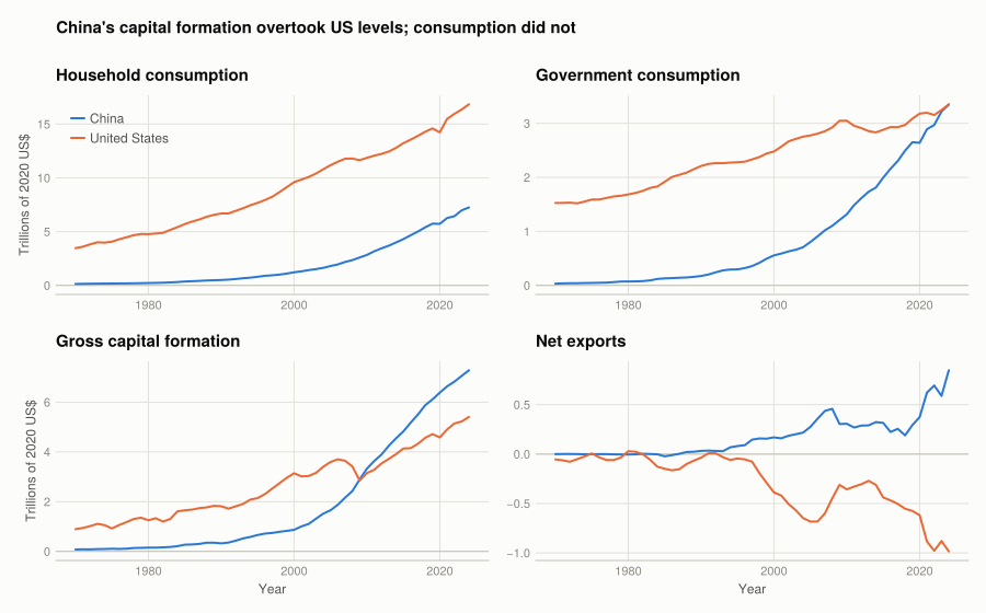
(a) and (b) Household consumption is the largest component for both countries, and the US level is still well above China’s. Government consumption is much the smaller component in both. Capital formation is where they diverge completely: China’s rises from almost nothing to above the US level around 2010.
(c) The US series grow smoothly, interrupted at 2008–09 in consumption and sharply in capital formation — investment is the volatile component in a recession, consumption the stable one. China’s series are flat until the early 1990s and then climb steeply.
(d) Net exports show what the levels hide: the US deficit widens from the 1980s, China’s surplus peaks around 2007 and then narrows.
Q4. Components as proportions
NoteWhy these differ from the book’s
The book reports 2015 household shares of 0.64 (Brazil), 0.37 (China), 0.55 (India), 0.55 (Germany) and 0.62 (US). The figures above are 0.63, 0.38, 0.60, 0.52 and 0.67.
The cause is the rebasing. A share of real GDP is a ratio of two deflated series, and the deflators are rebased along with the level, so the ratio moves when the base year moves. The effect grows with distance from the base year: a 2015 observation is five years from a 2020 base but five years the other side of a 2010 one, and the composition of prices changed a great deal over that decade.
A cross-check: US household consumption is about 68% of GDP at current prices, which the 2020-base figure of 0.67 is close to and the 2010-base 0.62 is not. For share analysis a base year near the years of interest — or current prices outright — is the better choice.
stack_cols = [(:household, "Household"), (:government, "Government"), (:capital, "Capital formation")]

fig = Figure(size = (900, 440))
Label(fig[0, 1:2], "China invests about half its GDP; the US consumes about two-thirds of its";
      fontsize = 15, font = :bold, color = INK, halign = :left,
      tellwidth = false, padding = (0, 0, 8, 0))

axs = [Axis(fig[1, i]; title = c, xlabel = "Year",
            ylabel = i == 1 ? "Share of GDP" : "", limits = (nothing, (0, 1)))
       for (i, c) in enumerate(("China", "United States"))]

for (i, country) in enumerate(("China", "United States"))
    s = dropmissing(shares[shares.country .== country, :],
                    [:household, :government, :capital])
    # Stack by accumulating: each band is drawn between the running total below it
    # and the running total including it.
    lower = zeros(nrow(s))
    for (j, (col, label)) in enumerate(stack_cols)
        upper = lower .+ s[!, col]
        band!(axs[i], s.year, lower, upper;
              color = (series_color(j), 0.85), label = label)
        lower = upper
    end
    i == 2 && hideydecorations!(axs[i]; grid = false)
end

Legend(fig[2, 1:2], first(axs); orientation = :horizontal, framevisible = false)
colgap!(fig.layout, 28)
fig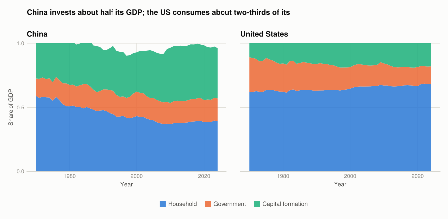
(c) and (d) Proportions answer a question levels cannot. In levels, everything about the US is larger than almost everything about India, so the charts mostly show that the US economy is big. In proportions the countries become comparable, and the structural difference appears: China devotes roughly 43% of GDP to capital formation against the US’s 21%, and consumes 38% against 67%.
That is the advantage of a proportion — it removes scale, which is usually the least interesting thing about a comparison between a large economy and a small one. The cost is that it hides scale entirely: a rising share can mean the numerator grew or the denominator shrank.
Q5. Comparing groups of countries
The book groups countries as developed, transition and developing using the UN’s classification, which is published only as a PDF. Rather than parse it, three countries stand in for each group, named explicitly so the choice is visible rather than buried:
groups = ["Developed" => ["United States", "Germany", "Japan"],
          "Transition" => ["Russian Federation", "Kazakhstan", "Ukraine"],
          "Developing" => ["India", "Brazil", "Nigeria"]]

# A country only earns a bar if all four shares are present for 2023, so a partial
# row cannot silently plot as a short bar.
snapshot_2023 = dropmissing(shares[shares.year .== 2023, :],
                            [:household, :government, :capital, :net_exports])

# Wrapped in `let` so the running position counter is a genuine local. At top level
# a `for` body assigning to an outer name gets its own local under Julia's soft
# scope, which would leave `pos` undefined here.
layout = let
    labels = String[]; positions = Float64[]; group_ticks = Tuple{Float64,String}[]
    rows = NamedTuple[]
    pos = 0.0
    for (gname, members) in groups
        first_pos = pos + 1
        for country in members
            s = snapshot_2023[snapshot_2023.country .== country, :]
            if isempty(s)
                @warn "no complete 2023 shares for $country - omitted from the chart"
                continue
            end
            pos += 1
            push!(labels, country); push!(positions, pos)
            push!(rows, (household = s.household[1], government = s.government[1],
                         capital = s.capital[1], net_exports = s.net_exports[1]))
        end
        push!(group_ticks, ((first_pos + pos) / 2, gname))
        pos += 0.6
    end
    (; labels, positions, group_ticks, rows)
end

labels, positions, group_ticks, rows = layout.labels, layout.positions,
                                       layout.group_ticks, layout.rows

# Leave headroom above the tallest stack for the category labels, so they sit
# outside the bars rather than floating among them.
stack_totals = [r.household + r.government + r.capital for r in rows]
y_top = maximum(stack_totals) * 1.16
y_bottom = min(0.0, minimum(r.net_exports for r in rows)) * 1.15

fig = Figure(size = (900, 500))
ax = Axis(fig[1, 1]; title = "Composition of GDP by development category, 2023",
          ylabel = "Share of GDP", xticks = (positions, labels),
          xticklabelrotation = pi / 6, limits = (nothing, (y_bottom, y_top)))
hlines!(ax, 0; color = BASELINE, linewidth = 1)

# Offsets computed up front rather than accumulated in a loop variable: the running
# total would be a fresh local on each iteration at top level (see the soft-scope
# note on the R -> Julia page).
component_values = [[r[col] for r in rows] for (col, _) in stack_cols]
offsets = [j == 1 ? zeros(length(rows)) : sum(component_values[1:j - 1])
           for j in eachindex(stack_cols)]

for (j, (col, label)) in enumerate(stack_cols)
    barplot!(ax, positions, component_values[j]; offset = offsets[j], width = 0.62,
             color = series_color(j), label = label)
end
barplot!(ax, positions, [r.net_exports for r in rows];
         width = 0.62, color = series_color(4), label = "Net exports")

for (x, g) in group_ticks
    text!(ax, x, y_top * 0.97; text = g, align = (:center, :top),
          fontsize = 12, font = :bold, color = INK)
end
Legend(fig[1, 2], ax; framevisible = false)
fig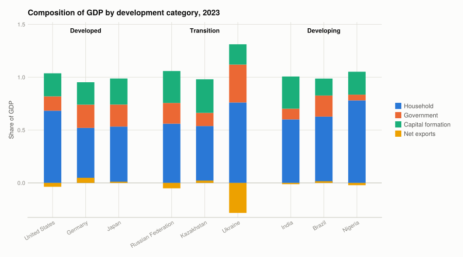
DataFrame(country = labels,
          household = round.([r.household for r in rows], digits = 2),
          government = round.([r.government for r in rows], digits = 2),
          capital = round.([r.capital for r in rows], digits = 2),
          net_exports = round.([r.net_exports for r in rows], digits = 2))
9×5 DataFrame
| Row | country | household | government | capital | net_exports |
|---|---|---|---|---|---|
| String | Float64 | Float64 | Float64 | Float64 | |
| 1 | United States | 0.68 | 0.14 | 0.22 | -0.04 |
| 2 | Germany | 0.52 | 0.22 | 0.21 | 0.05 |
| 3 | Japan | 0.53 | 0.21 | 0.25 | 0.01 |
| 4 | Russian Federation | 0.56 | 0.2 | 0.3 | -0.05 |
| 5 | Kazakhstan | 0.54 | 0.12 | 0.32 | 0.02 |
| 6 | Ukraine | 0.76 | 0.36 | 0.19 | -0.28 |
| 7 | India | 0.6 | 0.1 | 0.3 | -0.01 |
| 8 | Brazil | 0.63 | 0.2 | 0.16 | 0.02 |
| 9 | Nigeria | 0.78 | 0.05 | 0.22 | -0.02 |
Household consumption is the largest component in all nine — nowhere below 0.52. Beyond that, the category pattern is weaker than the framing invites:
- Household share does not sort by development category. Nigeria is highest at 0.78, but the United States (0.68) is above both India (0.60) and Brazil (0.63). Ukraine sits at 0.76 for a reason that has nothing to do with development category — see below.
- Capital formation is highest in Kazakhstan (0.32), then Russia and India at 0.30. Brazil, a developing economy, is lowest of the nine at 0.16.
- Germany has the largest positive net exports (+0.05). The transition group does not lead here at all: Russia is −0.05 and Ukraine −0.28.
Ukraine is worth reading separately. Government consumption is 0.36 and net exports −0.28 — wartime spending and an import surge financed from abroad. Its stack sums above 1.0 precisely because the negative net exports offset it. That is the accounting identity working (C + G + I + NX = GDP, which the table above satisfies to rounding), not an error, and it is why net exports is drawn below the axis rather than stacked.
The general caution the chart makes concrete: three countries cannot represent a category. The within-group spread here is as large as the between-group spread on most components, and picking three different countries would change every claim above.
Q6. GDP per capita as a measure of wellbeing
What it does well. It is measured consistently across almost every country and back several decades, which almost nothing else about wellbeing is. It correlates strongly with things people clearly value — life expectancy, schooling, nutrition. And it aggregates without needing anyone to decide how much a hospital is worth relative to a school; market prices do that.
What it misses, roughly in order of how badly:
- Distribution. A mean says nothing about who receives it. Two countries with identical GDP per capita can have entirely different living standards for a median household. This is what Project 5 measures.
- Unpaid work. Childcare, subsistence farming and housework are all production and none of it is counted, so a country where more of that work is marketised looks richer on identical real activity.
- Depletion and damage. Cutting a forest adds to GDP; the lost forest subtracts nothing. Pollution generates cleanup spending, which also adds.
- Non-material dimensions. Health, security, leisure, political freedom. Income buys some of each, imperfectly.
- Defensive expenditure. Spending forced by a problem — commuting, prisons, flood defence — counts the same as spending that makes someone better off.
The reason GDP survives all this is the reason Part 4.2 matters: the alternatives require choosing what to include and how to weight it, and those choices are contestable in a way that “the market value of output” is not.
Part 4.2 — The HDI
hdr = CSV.read(rawpath("04", "hdr25-composite-time-series.csv"), DataFrame)

hdi = dropmissing(select(hdr,
        :iso3, :country, :hdicode, :region,
        :hdi_rank_2023 => :rank, :hdi_2023 => :hdi,
        :le_2023 => :life_expectancy, :eys_2023 => :expected_schooling,
        :mys_2023 => :mean_schooling, :gnipc_2023 => :gni_per_capita),
    [:hdi, :life_expectancy, :expected_schooling, :mean_schooling, :gni_per_capita])

(countries = nrow(hdi), classifications = sort(unique(skipmissing(hdi.hdicode))))
(countries = 204, classifications = String31["High", "Low", "Medium", "Very High"])Q1. The indicators for each dimension
The HDI covers three dimensions, with four indicators:
| Dimension | Indicator | 2023 range |
|---|---|---|
| Health | Life expectancy at birth | see below |
| Education | Expected years of schooling (for a child entering school) | |
| Education | Mean years of schooling (for adults 25+) | |
| Living standards | GNI per capita, PPP-adjusted |
DataFrame(indicator = ["Life expectancy (years)", "Expected schooling (years)",
                       "Mean schooling (years)", "GNI per capita (PPP \$)"],
          minimum = round.([minimum(hdi.life_expectancy), minimum(hdi.expected_schooling),
                            minimum(hdi.mean_schooling), minimum(hdi.gni_per_capita)], digits = 1),
          maximum = round.([maximum(hdi.life_expectancy), maximum(hdi.expected_schooling),
                            maximum(hdi.mean_schooling), maximum(hdi.gni_per_capita)], digits = 1))
4×3 DataFrame
| Row | indicator | minimum | maximum |
|---|---|---|---|
| String | Float64 | Float64 | |
| 1 | Life expectancy (years) | 54.5 | 85.7 |
| 2 | Expected schooling (years) | 5.6 | 20.8 |
| 3 | Mean schooling (years) | 1.4 | 14.3 |
| 4 | GNI per capita (PPP $) | 688.3 | 1.66812e5 |
Education gets two indicators because the dimension has two distinct parts: how much schooling adults have had, and how much a child starting now can expect. A country that has recently expanded schooling scores high on the second and low on the first, and both facts are real.
GNI per capita rather than GDP per capita, because GNI counts income accruing to residents wherever it is earned. For countries with large foreign-owned production or many workers abroad the two differ substantially — a distinction Luxembourg makes vivid in Q6.
Q2. The normalisation goalposts
Each indicator is rescaled to \([0, 1]\) against fixed goalposts, so the index means the same thing across editions:
\[\text{dimension index} = \frac{\text{actual} - \text{minimum}}{\text{maximum} - \text{minimum}}\]
DataFrame(indicator = ["Life expectancy", "Expected schooling", "Mean schooling",
                       "GNI per capita (log)"],
          goalpost_min = [20, 0, 0, 100],
          goalpost_max = [85, 18, 15, 75_000])
4×3 DataFrame
| Row | indicator | goalpost_min | goalpost_max |
|---|---|---|---|
| String | Int64 | Int64 | |
| 1 | Life expectancy | 20 | 85 |
| 2 | Expected schooling | 0 | 18 |
| 3 | Mean schooling | 0 | 15 |
| 4 | GNI per capita (log) | 100 | 75000 |
These are not the observed minima and maxima, and that is deliberate. Fixed goalposts make the index comparable over time: with observed extremes, every country’s score would shift whenever the best or worst performer changed, and no country’s progress could be read from its own value.
The goalposts have defensible justifications — 20 years is roughly the lowest life expectancy recorded for a society over a sustained period, 18 years of schooling is a master’s degree — but they are choices, and they set how much a given improvement is worth.
Q3. The dimension indices
health_index(le) = (le - 20) / (85 - 20)
# Each schooling measure is capped at its goalpost before averaging, so exceeding
# the goalpost cannot earn extra credit.
education_index(eys, mys) = (min(eys / 18, 1.0) + min(mys / 15, 1.0)) / 2
# Income enters in logs: a given proportional gain matters the same at every level,
# which is a statement about diminishing returns to income.
income_index(gni) = clamp((log(gni) - log(100)) / (log(75_000) - log(100)), 0, 1)

hdi.I_health = health_index.(hdi.life_expectancy)
hdi.I_education = education_index.(hdi.expected_schooling, hdi.mean_schooling)
hdi.I_income = income_index.(hdi.gni_per_capita)

first(select(hdi, :country, :I_health, :I_education, :I_income), 5)
5×4 DataFrame
| Row | country | I_health | I_education | I_income |
|---|---|---|---|---|
| String | Float64 | Float64 | Float64 | |
| 1 | Afghanistan | 0.708231 | 0.383553 | 0.450358 |
| 2 | Albania | 0.916954 | 0.742237 | 0.781266 |
| 3 | Algeria | 0.865554 | 0.677634 | 0.758031 |
| 4 | Andorra | 0.985246 | 0.790966 | 0.977524 |
| 5 | Angola | 0.686415 | 0.536528 | 0.633586 |
The log on income is the substantive assumption in the whole index. It says an extra $1,000 matters far more to a country at $2,000 than to one at $60,000. Without it, rich countries would dominate the index on income alone.
Q4. Recomputing the HDI
The HDI is the geometric mean of the three dimension indices:
\[\text{HDI} = \sqrt[3]{I_\text{health} \times I_\text{education} \times I_\text{income}}\]
hdi.hdi_computed = [geometric_mean([r.I_health, r.I_education, r.I_income])
                    for r in eachrow(hdi)]
hdi.error = hdi.hdi_computed .- hdi.hdi

(countries = nrow(hdi),
 max_abs_error = round(maximum(abs.(hdi.error)), digits = 4),
 mean_abs_error = round(mean(abs.(hdi.error)), digits = 5),
 within_0_001 = round(100 * mean(abs.(hdi.error) .< 0.001), digits = 1),
 within_0_005 = round(100 * mean(abs.(hdi.error) .< 0.005), digits = 1))
(countries = 204, max_abs_error = 0.0036, mean_abs_error = 0.00029, within_0_001 = 99.0, within_0_005 = 100.0)99% of the 204 countries reproduce to within 0.001, and all of them to within 0.005. The largest residual is San Marino at 0.0036, where UNDP substitutes an estimate for a missing component.
first(select(sort(hdi, :hdi_computed, rev = true),
             :country, :rank, :hdi, :hdi_computed), 8)
8×4 DataFrame
| Row | country | rank | hdi | hdi_computed |
|---|---|---|---|---|
| String | Int64? | Float64 | Float64 | |
| 1 | Iceland | 1 | 0.972 | 0.971859 |
| 2 | Switzerland | 2 | 0.97 | 0.970125 |
| 3 | Norway | 2 | 0.97 | 0.970069 |
| 4 | Denmark | 4 | 0.962 | 0.961959 |
| 5 | Sweden | 5 | 0.959 | 0.959294 |
| 6 | Germany | 5 | 0.959 | 0.959178 |
| 7 | Australia | 7 | 0.958 | 0.957845 |
| 8 | Hong Kong, China (SAR) | 8 | 0.955 | 0.957406 |
Why the geometric mean rather than the arithmetic one. It refuses to let one dimension substitute for another. Compare two hypothetical countries:
balanced = [0.6, 0.6, 0.6]
lopsided = [0.95, 0.85, 0.0]

DataFrame(country = ["Balanced (0.6, 0.6, 0.6)", "Lopsided (0.95, 0.85, 0.0)"],
          arithmetic = round.([mean(balanced), mean(lopsided)], digits = 3),
          geometric = round.([geometric_mean(balanced), geometric_mean(lopsided)], digits = 3))
2×3 DataFrame
| Row | country | arithmetic | geometric |
|---|---|---|---|
| String | Float64 | Float64 | |
| 1 | Balanced (0.6, 0.6, 0.6) | 0.6 | 0.6 |
| 2 | Lopsided (0.95, 0.85, 0.0) | 0.6 | 0.0 |
The arithmetic mean rates them the same. The geometric mean sends the lopsided country to zero, because no amount of income compensates for a life expectancy of 20. That is a value judgement built into the arithmetic, and a defensible one: these dimensions are not tradeable.
Q5. An alternative index
Different indicators for the same three dimensions, from the World Bank:
| Dimension | HDI uses | This uses instead |
|---|---|---|
| Health | Life expectancy at birth | Under-five mortality per 1,000 live births |
| Education | Expected + mean years of schooling | Primary completion rate (% of relevant age group) |
| Living standards | GNI per capita | Household final consumption expenditure per capita |
Each is a defensible measure of the same dimension, and each emphasises something different. Under-five mortality weights the very start of life. Primary completion measures whether basic schooling is finished rather than how many years are attended. Household consumption measures what residents actually spend, rather than income that may accrue to firms or foreign owners.
"""
    world_bank(file, name)

Parse a World Bank v2 API JSON payload into a two-column frame. The payload is
`[metadata, rows]`; rows with a null value are dropped.
"""
function world_bank(file, name)
    payload = JSON3.read(read(rawpath("04", file), String))
    out = DataFrame(iso3 = String[], value = Float64[])
    for row in payload[2]
        row.value === nothing && continue
        push!(out, (String(row.countryiso3code), Float64(row.value)))
    end
    rename!(unique(out, :iso3), :value => name)
end

under5 = world_bank("wb-under5-mortality-2023.json", :under5_mortality)
primary = world_bank("wb-primary-completion-2023.json", :primary_completion)
consumption = world_bank("wb-household-consumption-pc-2023.json", :household_consumption)

(under5 = nrow(under5), primary = nrow(primary), consumption = nrow(consumption))
(under5 = 240, primary = 175, consumption = 202)alt = innerjoin(hdi, under5, primary, consumption; on = :iso3)
"""Rescale to [0, 1] against the observed range; `invert` for measures where less is better."""
function rescale(v; invert = false)
lo, hi = extrema(v)
s = (v .- lo) ./ (hi - lo)
return invert ? 1 .- s : s
end
alt.A_health = rescale(alt.under5_mortality; invert = true)
alt.A_education = rescale(alt.primary_completion)
alt.A_income = rescale(log.(alt.household_consumption))
alt.alt_index = [geometric_mean([r.A_health, r.A_education, r.A_income])
for r in eachrow(alt)]
(countries_in_both = nrow(alt),)(countries_in_both = 109,)109 countries have every HDI component and all three alternatives — down from 204, because primary completion and household consumption are reported less widely than life expectancy. That attrition is itself a finding: the official HDI’s indicators were chosen partly because they are available almost everywhere, and an index is worthless for countries it cannot cover.
Note that these dimensions are rescaled against the observed range rather than fixed goalposts, which is what Q2 warned about — these scores are not comparable to a future edition’s. For a one-off ranking comparison that is acceptable; for a series it would not be.
Q6. Comparing the rankings
sort!(alt, :alt_index, rev = true); alt.alt_rank = 1:nrow(alt)
sort!(alt, :hdi, rev = true);       alt.hdi_rank = 1:nrow(alt)
alt.rank_change = alt.hdi_rank .- alt.alt_rank

(rank_correlation = round(cor(alt.hdi_rank, alt.alt_rank), digits = 3),
 level_correlation = round(cor(alt.hdi, alt.alt_index), digits = 3),
 mean_abs_rank_change = round(mean(abs.(alt.rank_change)), digits = 1),
 max_rank_change = maximum(abs.(alt.rank_change)))
(rank_correlation = 0.951, level_correlation = 0.932, mean_abs_rank_change = 6.8, max_rank_change = 58)fig = Figure(size = (760, 620))
ax = Axis(fig[1, 1];
title = "Rank correlation 0.951 — close, but not the same ranking",
xlabel = "Official HDI rank (1 = highest)",
ylabel = "Alternative index rank (1 = highest)")
# The diagonal is agreement; distance from it is disagreement.
lines!(ax, [1, nrow(alt)], [1, nrow(alt)]; color = BASELINE, linewidth = 1)
scatter!(ax, alt.hdi_rank, alt.alt_rank; color = series_color(1))
outliers = first(sort(alt, :rank_change, by = abs, rev = true), 6)
for r in eachrow(outliers)
text!(ax, r.hdi_rank, r.alt_rank; text = r.country, fontsize = 11,
color = MUTED, align = (:left, :bottom), offset = (7, 3))
end
fig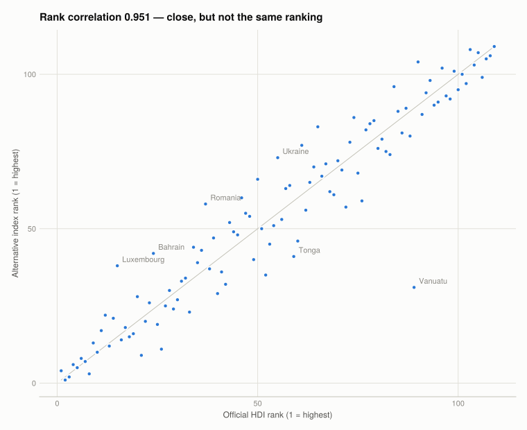
movers = select(sort(alt, :rank_change, rev = true),
                :country, :hdi_rank, :alt_rank, :rank_change)
vcat(first(movers, 5), last(movers, 5))
10×4 DataFrame
| Row | country | hdi_rank | alt_rank | rank_change |
|---|---|---|---|---|
| String | Int64 | Int64 | Int64 | |
| 1 | Vanuatu | 89 | 31 | 58 |
| 2 | Tonga | 59 | 41 | 18 |
| 3 | Mexico | 52 | 35 | 17 |
| 4 | Samoa | 76 | 59 | 17 |
| 5 | Portugal | 26 | 11 | 15 |
| 6 | Bahrain | 24 | 42 | -18 |
| 7 | Ukraine | 55 | 73 | -18 |
| 8 | Lebanon | 65 | 83 | -18 |
| 9 | Romania | 37 | 58 | -21 |
| 10 | Luxembourg | 15 | 38 | -23 |
The two indices agree closely — a rank correlation of 0.951 — which is reassuring about both. Wellbeing is not so arbitrary that any choice of indicator gives any answer.
But the disagreements are systematic, not noise:
- Luxembourg falls 23 places. Its GNI per capita is among the world’s highest, inflated by cross-border commuters and a large financial sector — income recorded in the country that does not accrue to residents’ households. Household consumption per capita, which measures what residents actually spend, ranks it far lower. This is the clearest case that the choice of income measure is doing work rather than the concept.
- Vanuatu rises 58 places, the largest move. Its primary completion rate and child mortality are much better than its schooling years and GNI would suggest.
- Countries with recent conflict or economic collapse (Ukraine, Lebanon) fall, because household consumption responds faster than life expectancy or accumulated schooling years.
The lesson is not that one index is right. It is that a country’s rank is a joint statement about its circumstances and about the measurement choices, and those choices deserve to be visible. Both indices here use the same three dimensions and the same geometric mean — only the indicators differ — and that alone moves some countries by dozens of places.
Q7. GDP per capita against the HDI
fig = Figure(size = (800, 560))
ax = Axis(fig[1, 1];
          title = "Income and human development rise together, with sharply diminishing returns",
          xlabel = "GNI per capita (PPP \$, log scale)", ylabel = "HDI",
          xscale = log10)
scatter!(ax, hdi.gni_per_capita, hdi.hdi; color = series_color(1))

# Label the countries furthest from what income alone predicts, in each direction.
# The line is fitted by least squares rather than guessed, so "furthest" means
# something: residuals from HDI regressed on log income.
log_gni = log10.(hdi.gni_per_capita)
slope = cov(log_gni, hdi.hdi) / var(log_gni)
intercept = mean(hdi.hdi) - slope * mean(log_gni)
residual = hdi.hdi .- (intercept .+ slope .* log_gni)

lines!(ax, extrema(hdi.gni_per_capita) |> collect,
       intercept .+ slope .* log10.(collect(extrema(hdi.gni_per_capita)));
       color = BASELINE, linewidth = 1)

for idx in vcat(partialsortperm(residual, 1:3), partialsortperm(residual, 1:3; rev = true))
    text!(ax, hdi.gni_per_capita[idx], hdi.hdi[idx]; text = hdi.country[idx],
          fontsize = 11, color = MUTED, align = (:left, :center), offset = (7, 0))
end
fig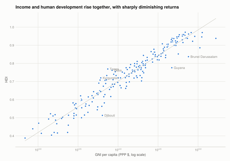
gni_rank = competerank(-hdi.gni_per_capita)
(correlation_log_gni_hdi = round(cor(log.(hdi.gni_per_capita), hdi.hdi), digits = 3),
 rank_correlation = round(cor(gni_rank, hdi.rank), digits = 3))
(correlation_log_gni_hdi = 0.963, rank_correlation = missing)The two measures correlate strongly, which is why GDP per capita survives as a proxy. But the curve flattens: among countries above roughly $40,000 the HDI barely moves with income, while below $5,000 small income differences track large differences in human development.
Two kinds of country sit off the line:
- High income, lower HDI than income predicts — typically oil and gas exporters, where national income is high but schooling and health outcomes have not followed.
- Lower income, higher HDI than income predicts — countries that invested in health and education at modest income levels.
Those two groups are the whole argument for the HDI. If income predicted human development perfectly, the index would be redundant.
Q8. Strengths and limitations of the HDI
Strengths. It made a political point effectively: publishing a ranking that disagreed with GDP forced attention onto health and education. It is transparent — Q4 rebuilt it from four published numbers and matched to three decimal places, which is not true of most composite indices. And the geometric mean encodes a real position, that the dimensions do not substitute.
Limitations:
- The weights are arbitrary and invisible. Equal thirds looks neutral but is a choice, and nothing in the presentation flags it. The goalposts and the log on income are further choices with large effects.
- It ignores distribution. Like GDP per capita, it is built from national averages. UNDP publishes an inequality-adjusted HDI for this reason, and countries fall substantially under it.
- Its dimensions are narrow. No environment, no security, no political freedom, no inequality — mostly because those are harder to measure comparably, which means the index is shaped by data availability as much as by what matters. Q5 showed the same pressure operating.
- The indicators saturate. Most rich countries now sit near the goalposts on health and schooling, so the index has little power to discriminate among them and their ordering is driven mostly by income — the thing it was built to look past.
- Years of schooling is not learning. It counts attendance, not what was learned, and the gap between the two is large and varies by country.
Alternatives that address different parts of this: the inequality-adjusted HDI (adds distribution), the Multidimensional Poverty Index (deprivation counts rather than averages), the OECD Better Life Index (eleven dimensions, and lets the user set the weights — which concedes that no single weighting is correct), and the Planetary pressures-adjusted HDI, which discounts for per-capita emissions and material footprint and reorders the top of the table considerably.
What this project covered
| Concept | Where | In Julia |
|---|---|---|
| Wide to long reshaping | Part 4.1 | stack(df, cols) |
| Long to wide | Q4.2 | unstack(df, keys, :indicator, :value) |
| Completeness by group | Q4.1 | combine(groupby(df, :country), col => count) |
| Derived variables | Q4.2 | df.net_exports = df[!, EXPORTS] .- df[!, IMPORTS] |
| Small multiples | Q4.3 | fldmod1(i, 2) into fig[r, c] |
| Stacked areas | Q4.4 | band!(ax, x, lower, upper) with a running total |
| Stacked bars | Q4.5 | barplot!(...; offset = lower) |
| Parsing an API payload | Q4.2 Q5 | JSON3.read, then a typed frame |
| Geometric mean | Q4.2 Q4 | geometric_mean |
| Rank correlation | Q4.2 Q6 | competerank, cor |
| Log axis | Q4.2 Q7 | Axis(...; xscale = log10) |
The R → Julia page has the full translation table.