Doing Economics in Julia
  • Home
  • Setup
  • R → Julia
  1. Empirical projects
  2. 12. Hong Kong cash handout
  • Getting started
    • Overview
    • Setup
  • Empirical projects
    • 1. Measuring climate change
    • 2. Data from experiments
    • 3. Measuring a sugar tax
    • 4. Measuring wellbeing
    • 5. Measuring inequality
    • 6. Management practices
    • 7. Supply and demand
    • 8. Cost of unemployment
    • 9. Credit-excluded households
    • 10. Banking systems
    • 11. Willingness to pay
    • 12. Hong Kong cash handout
    • Extra 2. Carbon taxation
  • Reference
    • R → Julia
    • Technical reference

On this page

  • Part 12.1 — Inequality
    • Q1. Real incomes by percentile over time
    • Q2. Lorenz curves before and after
    • Q3. Gini coefficients
    • Q4. What the handout did, and for how long
    • Extension: nominal and real values
  • Part 12.2 — Government popularity
    • Q1. Who would support the scheme, and who would object
    • Q2. Is the poll sample representative?
    • Q3. Satisfaction over time
    • Q4. Did the scheme achieve its aims?
    • What this project covered
  • View source
  • Report an issue
  1. Empirical projects
  2. 12. Hong Kong cash handout

12. Government policies and popularity: the Hong Kong cash handout

A one-off HK$6,000 to every adult, and what it did to inequality and to approval

In 2011 the Hong Kong government, sitting on a large budget surplus, gave HK$6,000 to every permanent resident aged 18 or over. Scheme $6,000 was defended as sharing the gains from growth, and suspected of buying popularity.

Both claims are testable. The first against household income data, the second against a public opinion series that runs from 1997.

  • Part 12.1 — inequality
  • Part 12.2 — government popularity

Concepts: Lorenz curves and Gini coefficients applied to a policy, and converting nominal values to real ones. Book pages: project, R walk-through, solutions.

using XLSX, CSV, DataFrames
using Statistics, Dates
using CairoMakie
using DoingEconomics

CairoMakie.activate!(type = "svg")
use_doingecon_theme!()
# One sheet holding three blocks separated by blank rows, so it is read as a cell
# matrix by row index rather than with `readtable`.
cells = XLSX.readxlsx(rawpath("12", "hk-cash-handout.xlsx"))["Sheet1"][:]

const YEARS = [Int(cells[13, j]) for j in 2:9]
const PERCENTILES = [String(cells[i, 1]) for i in 14:18]

nominal = [Float64(cells[i, j]) for i in 4:8, j in 2:9]
real_income = [Float64(cells[i, j]) for i in 14:18, j in 2:9]
inflation = [Float64(cells[10, j]) for j in 2:9]

(years = YEARS, percentile_rows = PERCENTILES, blocks = ("nominal", "CPI change", "real"))
(years = [2009, 2010, 2011, 2012, 2013, 2014, 2015, 2016], percentile_rows = ["85th", "75th", "50th", "25th", "15th"], blocks = ("nominal", "CPI change", "real"))
ImportantThe percentile rows are listed highest-first

PERCENTILES comes back as ["85th", "75th", "50th", "25th", "15th"] — descending. Every construction below assigns household counts to income groups in ascending order, so the rows have to be sorted first.

Getting it wrong does not produce an error or an absurd figure. It produces a Gini of 0.434 instead of 0.469 — entirely plausible, and wrong. That is why Q3 checks the economy-wide total against the published value before trusting the Gini.

Part 12.1 — Inequality

Q1. Real incomes by percentile over time

The figures here are pre-intervention: they exclude handouts and other government transfers, which is what makes them a usable baseline for asking what the handout did.

real_table = DataFrame(percentile = PERCENTILES)
for (j, y) in enumerate(YEARS)
    real_table[!, string(y)] = round.(real_income[:, j], digits = 0)
end
real_table.change_pct = round.(100 .* (real_income[:, end] .- real_income[:, 1]) ./
                               real_income[:, 1], digits = 1)
real_table
5×10 DataFrame
Row percentile 2009 2010 2011 2012 2013 2014 2015 2016 change_pct
String Float64 Float64 Float64 Float64 Float64 Float64 Float64 Float64 Float64
1 85th 43300.0 43945.0 44516.0 44544.0 45270.0 45162.0 47660.0 47086.0 8.7
2 75th 31000.0 31250.0 32274.0 32517.0 34166.0 33299.0 34791.0 34907.0 12.6
3 50th 17400.0 17578.0 17806.0 17818.0 18621.0 18490.0 19064.0 19393.0 11.5
4 25th 8000.0 8203.0 8347.0 8820.0 8542.0 8591.0 8738.0 8533.0 6.7
5 15th 4500.0 4395.0 4637.0 4454.0 4356.0 4091.0 3972.0 3879.0 -13.8
Table 1: Monthly real household income by percentile, 2009 prices.
fig = Figure(size = (960, 460))
order = sortperm(real_income[:, 1])          # ascending, so panels read 15th to 85th
for (k, idx) in enumerate(order)
    ax = Axis(fig[fldmod1(k, 5)...];
              title = PERCENTILES[idx] * " percentile", titlesize = 11,
              xlabel = "Year", ylabel = k == 1 ? "HK\$ per month (2009 prices)" : "",
              xticks = (2010:3:2016, string.(2010:3:2016)))
    hlines!(ax, [real_income[idx, 1]]; color = BASELINE, linewidth = 1)
    lines!(ax, YEARS, real_income[idx, :]; color = series_color(1), linewidth = 2.5)
    scatter!(ax, YEARS, real_income[idx, :]; color = series_color(1), markersize = 6)
end
fig
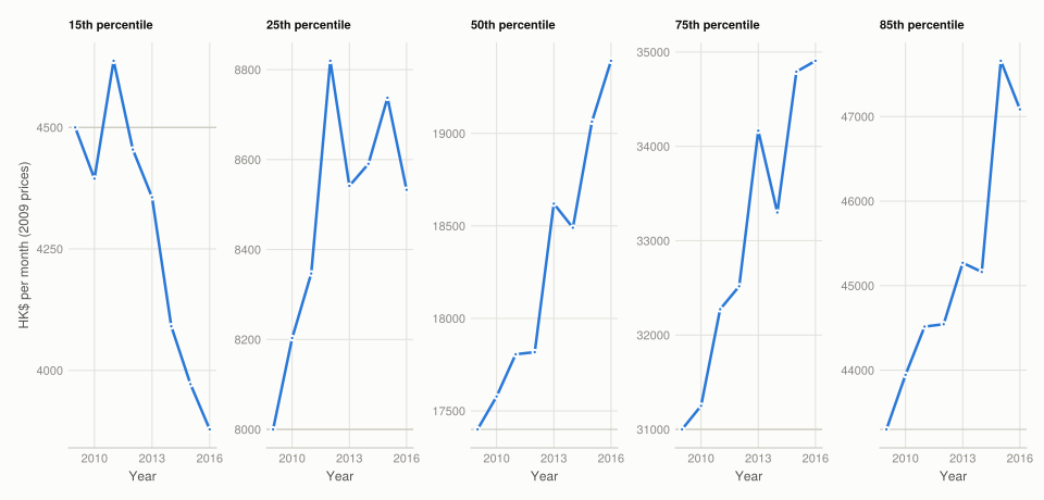
Figure 1: Monthly real household income by percentile, 2009 prices, each on its own panel so that series two orders of magnitude apart stay readable. The grey line in each panel is that percentile’s 2009 level, so the shape shows change against the starting point rather than against zero.

Real income rose at every percentile except the bottom one. The 85th, 75th, 50th and 25th percentiles all end 2016 above their 2009 level, while the 15th percentile falls — from about HK$4,500 to HK$3,879 a month, a decline of roughly 14%.

That divergence is the substantive finding of the Part, and it is not a story about the handout. Over eight years the bottom of the Hong Kong distribution lost real income while everyone above it gained, which is inequality widening through the level of incomes rather than through anything a one-off transfer touches.

Note the shape at the top: the 85th percentile rises to 2015 and then dips, while the 50th keeps climbing. Growth was not uniform even among the gainers.

Q2. Lorenz curves before and after

(a) Cumulative income shares. The data gives income at five percentiles. Turning that into a Lorenz curve means building an economy of 100 households: each income group is repeated for as many households as the group covers, with the bottom 15 households assigned zero income.

const GROUP_SIZES = [15, 10, 25, 25, 10, 15]   # sums to 100 households

"""The 100-household economy for `year`, in annual real HK\$.

A zero-income group is prepended, monthly figures are annualised, and in 2012 the
one-off HK\$6,000 handout is added to every household.
"""
function economy(year)
    col = findfirst(==(year), YEARS)
    incomes = sort(vcat(0.0, real_income[:, col]))     # ascending: 0, 15th … 85th
    annual = incomes .* 12
    year == 2012 && (annual = annual .+ 6000)
    return reduce(vcat, [fill(annual[g], GROUP_SIZES[g]) for g in eachindex(GROUP_SIZES)])
end

"""Thousands-separated string, e.g. `20,288,016`.

DataFrames renders large floats in scientific notation (`2.0288e7`), which hides exactly
the digits these tables exist to let you check against the published figures.
"""
function commas(x; digits = 0)
    text = digits > 0 ? rstrip(rstrip(string(round(x; digits)), '0'), '.') : string(round(Int, x))
    sign, text = startswith(text, '-') ? ("-", text[2:end]) : ("", text)
    whole, dot, frac = partition_decimal(text)
    groups = String[]
    while length(whole) > 3
        pushfirst!(groups, whole[end-2:end])
        whole = whole[1:end-3]
    end
    pushfirst!(groups, whole)
    return sign * join(groups, ",") * dot * frac
end

"""Split `"543242.51"` into `("543242", ".", "51")`, or `"6000"` into `("6000", "", "")`."""
function partition_decimal(text)
    i = findfirst('.', text)
    return i === nothing ? (text, "", "") : (text[1:i-1], ".", text[i+1:end])
end

DataFrame(year = [2011, 2012, 2013],
          households = [length(economy(y)) for y in [2011, 2012, 2013]],
          economy_total = [commas(sum(economy(y))) for y in [2011, 2012, 2013]])
3×3 DataFrame
Row year households economy_total
Int64 Int64 String
1 2011 100 20,288,016
2 2012 100 21,045,778
3 2013 100 20,919,962

The 2011 total of HK$20,288,016 and the 2012 total of HK$21,045,778 both match the published figures, which is the check that the group sizes line up with the right incomes.

cumulative = DataFrame(population_pct = [0, 15, 25, 50, 75, 85, 100],
                       perfect_equality = [0, 15, 25, 50, 75, 85, 100])
for y in [2011, 2012]
    v = sort(economy(y))
    total = sum(v)
    cumulative[!, "share_$y"] = [round(p == 0 ? 0.0 : 100 * sum(v[1:p]) / total, digits = 2)
                                 for p in cumulative.population_pct]
end
cumulative
7×4 DataFrame
Row population_pct perfect_equality share_2011 share_2012
Int64 Int64 Float64 Float64
1 0 0 0.0 0.0
2 15 15 0.0 0.43
3 25 25 2.74 3.25
4 50 50 15.09 16.54
5 75 75 41.42 42.65
6 85 85 60.5 61.47
7 100 100 100.0 100.0
Table 2: Cumulative share of income held by the bottom x% of households. Reproduces the book’s Solution figure 12.6.

All ten values match the published table.

(b) The Lorenz curves.

fig = Figure(size = (620, 600))
ax = Axis(fig[1, 1];
          title = "The handout lifted the whole curve, most at the bottom",
          xlabel = "Cumulative share of population (%)",
          ylabel = "Cumulative share of income (%)",
          limits = ((0, 100), (0, 100)), aspect = 1)
lines!(ax, [0, 100], [0, 100]; color = BASELINE, linewidth = 1, linestyle = :dash)
text!(ax, 52, 55; text = "perfect equality", rotation = pi / 4, fontsize = 10,
      align = (:center, :bottom), color = MUTED)

for (j, y) in enumerate([2011, 2012])
    lines!(ax, cumulative.population_pct, cumulative[!, "share_$y"];
           color = series_color(j), linewidth = 2.5, label = string(y))
    scatter!(ax, cumulative.population_pct, cumulative[!, "share_$y"];
             color = series_color(j))
end
axislegend(ax; position = :lt, framevisible = false)
fig
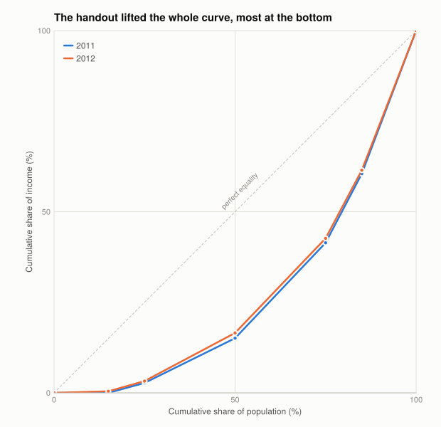
Figure 2: Lorenz curves for 2011 and 2012, with the perfect-equality diagonal. Two series, so the year carries the colour; the diagonal is a reference, not data, so it stays in chrome grey and dashed. The 2012 curve is the handout year and sits everywhere at or above 2011.

The 2012 curve sits above the 2011 curve everywhere, which is what an equal lump sum to everyone must do: adding the same amount to every household raises the share held by the poor and lowers the share held by the rich.

The largest gap is at the bottom, and it comes off a floor of literally zero. In 2011 the bottom 15% of households hold 0.00% of income; in 2012 they hold 0.43%. That is the handout in its entirety — HK$6,000 against nothing — and it is why the curve lifts off the horizontal axis at all.

Higher up, the gap narrows: 15.09% to 16.54% at the median, and 60.50% to 61.47% at the 85th percentile. The proportional effect of a fixed sum shrinks as income rises, which is the mechanical reason a flat handout is progressive.

Q3. Gini coefficients

(a) Incomes for all 100 households.

incomes_by_year = DataFrame(percentile = 1:100)
for y in [2011, 2012, 2013]
    incomes_by_year[!, string(y)] = [commas(v; digits = 2) for v in sort(economy(y))]
end
vcat(first(incomes_by_year, 3), last(incomes_by_year, 3))
6×4 DataFrame
Row percentile 2011 2012 2013
Int64 String String String
1 1 0 6,000 0
2 2 0 6,000 0
3 3 0 6,000 0
4 98 534,188.03 540,530.13 543,242.51
5 99 534,188.03 540,530.13 543,242.51
6 100 534,188.03 540,530.13 543,242.51
Table 3: Annual real income for each of the 100 households, showing the ends of the distribution. Reproduces the book’s Solution figure 12.8.

Both ends match the published values: zero for the bottom households in 2011 and 2013 against HK$6,000 in 2012, and 534,188 / 540,530 / 543,242.51 at the top.

(b) The Gini coefficient for each year.

gini_table = DataFrame(year = [2011, 2012, 2013],
                       gini = [round(gini(economy(y)), digits = 4) for y in [2011, 2012, 2013]],
                       handout = ["no", "yes", "no"])
gini_table.change = [missing; round.(diff(gini_table.gini), digits = 4)]
gini_table
3×4 DataFrame
Row year gini handout change
Int64 Float64 String Float64?
1 2011 0.4688 no missing
2 2012 0.4519 yes -0.0169
3 2013 0.4698 no 0.0179
Table 4: Gini coefficient of annual real household income, computed with gini from the shared helpers.
fig = Figure(size = (620, 440))
ax = Axis(fig[1, 1];
          title = "Inequality fell in the handout year and returned the year after",
          ylabel = "Gini coefficient",
          xticks = (1:3, ["2011\nno handout", "2012\nhandout", "2013\nno handout"]),
          limits = (nothing, (0.44, 0.48)))
barplot!(ax, 1:3, gini_table.gini; width = 0.5, color = series_color(1))
for (x, v) in zip(1:3, gini_table.gini)
    text!(ax, x, v; text = string(v), fontsize = 11,
          align = (:center, :bottom), offset = (0, 4), color = INK)
end
fig
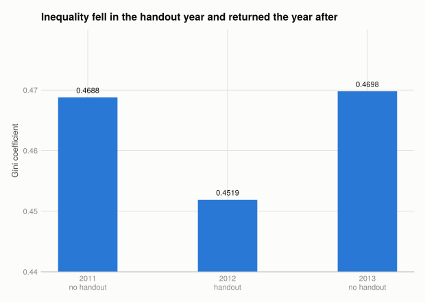
Figure 3: Gini coefficient by year. One series, so one colour. The axis starts at 0.44 rather than 0 — the differences here are hundredths and a zero baseline would hide them — which is legitimate only because every bar is labelled with its value.

0.4688 in 2011, 0.4519 in 2012, 0.4698 in 2013 — all three matching the published values.

Q4. What the handout did, and for how long

In the short run it worked, by about 0.017 Gini points. The fall from 0.4688 to 0.4519 is real and it is exactly what the arithmetic requires: give everyone the same amount and the distribution compresses.

In the long run it did nothing. 2013 comes in at 0.4698 — marginally above 2011. The effect lasted precisely as long as the payment.

Four reasons that is the expected outcome rather than a disappointment:

  1. A one-off transfer cannot change a distribution’s structure. The Gini is a property of how income is generated — education, occupation, capital ownership, mobility. A payment that arrives once and is not repeated leaves every one of those untouched. By 2013 the only trace is whatever the money bought.
  2. The amount was too small to be an investment. HK$6,000 is roughly a month and a half of income at the 15th percentile. It cannot fund a qualification or start a business, and low-income households are typically credit-constrained, so it was most likely spent on consumption. Useful, and not transformative.
  3. The 2013 figure is slightly worse than 2011, which the handout cannot explain. Something else was widening the distribution over these years — and Q1 already showed what: the 15th percentile’s real income was falling throughout.
  4. The 2012 change is not all handout. Other things moved incomes that year, including bonuses and rebates that fall disproportionately to higher earners. If those widened the distribution, the handout’s own effect was larger than 0.017 and was partly offset.

Two thought experiments the questions raise, both of which the Lorenz curve makes easy to reason about:

  • Transfers targeted only at zero-income households would raise the very bottom of the curve further, moving it toward the diagonal and lowering the Gini more per dollar spent than a universal payment. Scheme $6,000 spent most of its money on households that were not poor.
  • Income tax on the richest households would cut the top of the curve, also moving it toward the diagonal and also lowering the Gini. The two instruments work from opposite ends and the Lorenz curve shows why both reduce measured inequality.
NoteWhat this measure can and cannot see

Every Gini here comes from six income values expanded into 100 households, so within each group inequality is assumed away. Project 5 showed that computing a Gini from grouped data understates it, and this is a far coarser grouping than deciles — the Lorenz curve is six straight segments.

The direction and rough size of the 2012 change are trustworthy, because the handout is a known constant added to every household. The level of 0.4688 is not a good estimate of Hong Kong’s actual Gini.

Extension: nominal and real values

The workbook supplies real income already deflated, but the conversion is worth doing since it explains why the two blocks differ.

index_table = DataFrame(year = YEARS, inflation_pct = inflation)
index_table.price_index = let running = 1.0
    [k == 1 ? 1.0 : (running *= 1 + inflation[k] / 100) for k in eachindex(YEARS)]
end
index_table.price_index = round.(index_table.price_index, digits = 3)
index_table
8×3 DataFrame
Row year inflation_pct price_index
Int64 Float64 Float64
1 2009 0.5 1.0
2 2010 2.4 1.024
3 2011 5.3 1.078
4 2012 4.1 1.122
5 2013 4.3 1.171
6 2014 4.4 1.222
7 2015 3.0 1.259
8 2016 2.4 1.289
Table 5: Building a price index from year-on-year inflation rates. Reproduces the book’s Solution figure 12.9.

All eight index values match the published table. Prices rose 28.9% between 2009 and 2016, so a nominal income that grew by less than that lost purchasing power.

check = DataFrame(percentile = PERCENTILES,
                  nominal_2009 = nominal[:, 1], nominal_2016 = nominal[:, end],
                  nominal_growth_pct = round.(100 .* (nominal[:, end] .- nominal[:, 1]) ./
                                              nominal[:, 1], digits = 1),
                  real_growth_pct = round.(100 .* (real_income[:, end] .- real_income[:, 1]) ./
                                           real_income[:, 1], digits = 1))
check
5×5 DataFrame
Row percentile nominal_2009 nominal_2016 nominal_growth_pct real_growth_pct
String Float64 Float64 Float64 Float64
1 85th 43300.0 60700.0 40.2 8.7
2 75th 31000.0 45000.0 45.2 12.6
3 50th 17400.0 25000.0 43.7 11.5
4 25th 8000.0 11000.0 37.5 6.7
5 15th 4500.0 5000.0 11.1 -13.8

This is why the distinction matters. In nominal terms the 15th percentile’s income was flat between 2009 and 2016 — HK$4,500 to HK$5,000, up 11.1%. In real terms it fell 13.8%, because prices rose 28.9% over the same period.

A nominal series would have shown the bottom of the distribution standing still. The real series shows it going backwards. Same data, opposite conclusion, and the only difference is the deflator.

Note also the ordering: real growth rises monotonically with the percentile — the higher the income, the better it did. That is the inequality story the Gini cannot see, because the Gini here is dominated by a handout the income data excludes.

Part 12.2 — Government popularity

Q1. Who would support the scheme, and who would object

Support is easiest to explain for two groups with quite different reasons:

  • Lower-income recipients, for whom HK$6,000 is a meaningful share of annual income — around a tenth at the 15th percentile, on the annualised figures in Q3.
  • The government and politicians, for whom the scheme is visible, immediate and attributable. A universal payment is noticed by everyone; a targeted programme of the same cost is noticed by few. If popularity is the objective, universality is a feature.

Objection comes from three directions, and the interesting ones are not the obvious ones:

  • Wealthier residents and business interests may object to an equal split on the grounds that contributions to growth were unequal.
  • Some lower-income residents may object because it is universal — a payment unrelated to need spends most of its money on people who do not need it, which is precisely what Q4 found.
  • Policymakers who would prefer the surplus spent on pensions, housing or training, on the grounds that a one-off payment buys a one-off effect. The Gini series is evidence for their position.

Q2. Is the poll sample representative?

The survey is a telephone poll of Cantonese-speaking Hong Kong residents aged 18 and over. Some of the design is sound:

  • Numbers are randomly generated rather than drawn from a directory, which avoids excluding unlisted households.
  • The sample is weighted to the population’s age and sex distribution, so those margins match by construction.

Three limitations matter for reading the series:

  1. Telephone coverage is not neutral. Whether landlines or mobiles are called changes who is reachable, and that correlates with age and income. Weighting to age and sex does not fix a bias in who answers within those cells.
  2. Willingness to spend time on a survey is not random, and it plausibly correlates with political engagement — the thing being measured.
  3. Cantonese-only excludes part of the population, notably non-Cantonese-speaking migrants, whose views on a residents-only handout might differ systematically.

None of this undermines the comparison over time, which is what Part 12.2 needs. A stable bias shifts the whole series and leaves changes intact. It would matter if the bias changed around 2011, and there is no reason to think it did.

Q3. Satisfaction over time

"""Read one HKPORI half-yearly table.

Columns are bilingual with no separator, e.g. "淨值Netvalue". Percentages carry a
"%" and counts carry thousands separators, so both need stripping before parsing.
"""
function read_poll(file)
    raw = CSV.read(rawpath("12", file), DataFrame)
    col(fragment) = names(raw)[findfirst(c -> occursin(fragment, c), names(raw))]
    clean(x) = tryparse(Float64, replace(string(x), "%" => "", "," => ""))
    out = DataFrame(start_date = Date.(string.(raw[!, col("Survey Start Date")])),
                    end_date = Date.(string.(raw[!, col("Survey End Date")])),
                    netvalue = clean.(raw[!, col("Netvalue")]),
                    mean_value = clean.(raw[!, col("Mean value")]))
    sort!(out, :start_date)
    return dropmissing(out, :netvalue)
end

overall = read_poll("datatables.csv")
livelihood = read_poll("satisfaction_datatables.csv")

DataFrame(series = ["Overall satisfaction", "Improving people's livelihood"],
          polls = [nrow(overall), nrow(livelihood)],
          first = [minimum(overall.start_date), minimum(livelihood.start_date)],
          last = [maximum(overall.start_date), maximum(livelihood.start_date)],
          net_min = [minimum(overall.netvalue), minimum(livelihood.netvalue)],
          net_max = [maximum(overall.netvalue), maximum(livelihood.netvalue)])
2×6 DataFrame
Row series polls first last net_min net_max
String Int64 Date Date Float64 Float64
1 Overall satisfaction 51 1997-07-29 2022-07-04 -62.4 40.7
2 Improving people's livelihood 50 1997-07-29 2022-10-10 -57.0 14.0
ImportantThe source the book names no longer serves this data

The book says to open the HKU POP overall performance page and click “Download Excel”. HKU POP became the Hong Kong Public Opinion Research Institute in 2019; the page is now on pori.hk, where the table is rendered client-side behind bot protection. The page HTML contains no table at all, so there is nothing to fetch.

The Internet Archive does hold the old HKU POP series as plain text, and it loads cleanly — but it publishes only the positive percentages for six performance questions. The book’s question needs the net value, positive minus negative, and the dissatisfaction companion series is not archived as data.

The copy used here comes from CORE Econ’s own Python implementation of the book, whose data directory carries the file under the same name the walk-through uses, with the full response breakdown including the net value. Provenance for all three of this project’s files is in data/MANIFEST.toml.

(a) Net satisfaction with the government since 2006.

from_2006(df) = df[df.start_date .>= Date(2006, 1, 1), :]
o, l = from_2006(overall), from_2006(livelihood)

# Dates are converted to fractional years rather than handed to Makie as `Date`.
# Mixing a Date axis with `vspan!` and `text!` needs Makie's dimension-conversion
# machinery to be primed by the first plot call, which is fragile; a numeric axis with
# explicit year ticks behaves the same and always works.
as_year(d) = year(d) + (dayofyear(d) - 1) / 365.25

fig = Figure(size = (960, 520))
ax = Axis(fig[1, 1];
          title = "Approval was already falling when the handout arrived, and kept falling",
          xlabel = "Survey start date", ylabel = "Net satisfaction (% points)",
          xticks = (2006:2:2022, string.(2006:2:2022)))
vspan!(ax, as_year(Date(2011, 3, 1)), as_year(Date(2012, 8, 31)); color = (GRIDLINE, 0.9))
hlines!(ax, [0]; color = BASELINE, linewidth = 1)
text!(ax, as_year(Date(2011, 4, 1)), 34; text = "Scheme \$6,000\nannounced and paid",
      fontsize = 10, align = (:left, :top), color = MUTED)

for (j, (df, lab)) in enumerate([(o, "Government overall"),
                                 (l, "Improving people's livelihood")])
    x = as_year.(df.start_date)
    lines!(ax, x, df.netvalue; color = series_color(j), linewidth = 2.5)
    scatter!(ax, x, df.netvalue; color = series_color(j), markersize = 6)
    text!(ax, x[end], df.netvalue[end]; text = lab, fontsize = 10,
          align = (:right, :top), offset = (-4, -8), color = INK_SECONDARY)
end
fig
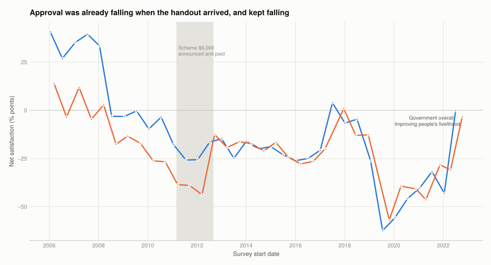
Figure 4: Net satisfaction — the percentage satisfied minus the percentage dissatisfied — with the government overall and with its performance on improving livelihoods. Two series, so the question carries the colour, and both are direct-labelled. The rule at zero is where satisfied and dissatisfied balance; the shaded band marks the 2011–12 handout.
window = overall[(overall.start_date .>= Date(2009, 1, 1)) .&
                 (overall.start_date .<= Date(2014, 12, 31)), :]
select(window, :start_date, :end_date, :netvalue, :mean_value)
12×4 DataFrame
Row start_date end_date netvalue mean_value
Date Date Float64 Float64
1 2009-01-19 2009-06-21 -3.2 2.9
2 2009-07-20 2009-12-17 -0.3 2.9
3 2010-01-18 2010-06-22 -9.7 2.8
4 2010-07-19 2010-12-22 -3.5 2.9
5 2011-01-18 2011-06-29 -17.8 2.7
6 2011-07-21 2011-12-28 -25.8 2.6
7 2012-01-12 2012-06-25 -25.6 2.6
8 2012-07-09 2012-12-28 -16.4 2.7
9 2013-01-02 2013-06-19 -14.8 2.7
10 2013-07-02 2013-12-19 -24.9 2.6
11 2014-01-02 2014-06-19 -16.1 2.7
12 2014-07-07 2014-12-22 -20.0 2.6
Table 6: Net satisfaction in the polls either side of the handout.

Overall satisfaction was high through 2006 and the first half of 2008, then fell. It dropped in the second half of 2008 — the financial crisis — stayed low through 2009, and then declined further from 2010 through 2012. It crossed into negative territory and stayed there for years.

The handout is not visible in the series. Approval was falling before it, during it, and after it. If the scheme was intended to buy popularity, the series gives no sign that it worked.

(b) and (c) The livelihood indicator. Satisfaction with the government’s performance on improving people’s livelihood tracks the overall series closely — the two rise and fall together across the whole period, and neither shows a break at the handout.

The livelihood series sits below the overall series for most of the period, which is the more interesting detail: people rated the government worse on improving livelihoods than they rated it in general. A cash handout is about as direct an attempt at improving livelihoods as a government can make, and it did not move the indicator most specific to it.

Q4. Did the scheme achieve its aims?

On inequality: briefly and mechanically, yes. The Gini fell 0.017 points in 2012 and returned to its prior level in 2013.

On popularity: no evidence at all. Net satisfaction was in decline before the payment and continued declining after it, on both the overall measure and the one closest to the policy.

Why this cannot be read as “the handout was unpopular”. The design here is a single series with a single intervention and no comparison group, so anything else happening in Hong Kong over 2010–2012 is inside the estimate. That is the weakness Project 3 identified in before-and-after comparisons, and it applies with full force:

  • The trend was already downward. The decline runs from 2008. Extrapolating it, 2012’s value is roughly where the trend was heading — so the handout may have arrived, done nothing, or slowed a steeper fall, and this data cannot distinguish those.
  • Other things dominated the period. Political controversies, housing costs and the 2012 Chief Executive transition all bear on government approval, and any of them could swamp a one-off payment.
  • A one-off payment plausibly buys a one-off response. Even a real effect on approval would be expected to decay, and the polls are half-yearly, so a short-lived bump could fall between observations entirely.

What would be needed to answer the question properly is the difference-in-differences design this project does not have: a comparable population that did not receive the payment, so that the common trend could be removed. Scheme $6,000 went to every adult resident simultaneously, which is excellent policy delivery and leaves no control group. The universality that made it politically attractive is exactly what makes its effect unmeasurable.

What this project covered

Concept Where In Julia
Reading blocks from one sheet Setup readxlsx(path)[sheet][:], index by row
Rows in an unexpected order Setup sort before assigning group sizes
Expanding grouped data to units Q12.1 Q2 reduce(vcat, [fill(v, n) for ...])
Cumulative income shares Q12.1 Q2 sum(sorted[1:p]) / sum(sorted)
Lorenz curve with an equality line Q12.1 Q2 lines! plus a dashed reference diagonal
Gini from unit records Q12.1 Q3 gini(v) from the shared helpers
A chain index from growth rates Q12.1 ext running product inside a let
Bilingual column names Q12.2 Q3 match on a fragment with occursin
Percentages stored as text Q12.2 Q3 strip % and , before tryparse
Dates from ISO strings Q12.2 Q3 Date.(string.(col))
Shading a period on a time axis Q12.2 Q3 vspan!(ax, from, to)

The R → Julia page has the full translation table.

11. Willingness to pay
Extra 2. Carbon taxation
Source Code
---
title: "12. Government policies and popularity: the Hong Kong cash handout"
subtitle: "A one-off HK$6,000 to every adult, and what it did to inequality and to approval"
engine: julia
julia:
  exeflags: ["--project=@."]
---

In 2011 the Hong Kong government, sitting on a large budget surplus, gave **HK$6,000 to every
permanent resident aged 18 or over**. Scheme $6,000 was defended as sharing the gains from
growth, and suspected of buying popularity.

Both claims are testable. The first against household income data, the second against a public
opinion series that runs from 1997.

- **[Part 12.1](#part-12.1)** — inequality
- **[Part 12.2](#part-12.2)** — government popularity

Concepts: **Lorenz curves** and **Gini coefficients** applied to a policy, and converting
nominal values to real ones. Book pages:
[project](https://books.core-econ.org/doing-economics/book/text/12-01.html),
[R walk-through](https://books.core-econ.org/doing-economics/book/text/12-03.html),
[solutions](https://books.core-econ.org/doing-economics/book/text/12-04.html).

```{julia}
#| label: setup
#| output: false
using XLSX, CSV, DataFrames
using Statistics, Dates
using CairoMakie
using DoingEconomics

CairoMakie.activate!(type = "svg")
use_doingecon_theme!()
```

```{julia}
#| label: read-income
# One sheet holding three blocks separated by blank rows, so it is read as a cell
# matrix by row index rather than with `readtable`.
cells = XLSX.readxlsx(rawpath("12", "hk-cash-handout.xlsx"))["Sheet1"][:]

const YEARS = [Int(cells[13, j]) for j in 2:9]
const PERCENTILES = [String(cells[i, 1]) for i in 14:18]

nominal = [Float64(cells[i, j]) for i in 4:8, j in 2:9]
real_income = [Float64(cells[i, j]) for i in 14:18, j in 2:9]
inflation = [Float64(cells[10, j]) for j in 2:9]

(years = YEARS, percentile_rows = PERCENTILES, blocks = ("nominal", "CPI change", "real"))
```

::: {.callout-important}
## The percentile rows are listed highest-first

`PERCENTILES` comes back as `["85th", "75th", "50th", "25th", "15th"]` — **descending**. Every
construction below assigns household counts to income groups in ascending order, so the rows
have to be sorted first.

Getting it wrong does not produce an error or an absurd figure. It produces a Gini of 0.434
instead of 0.469 — entirely plausible, and wrong. That is why [Q3](#p1-q3) checks the
economy-wide total against the published value before trusting the Gini.
:::

# Part 12.1 — Inequality {#part-12.1}

## Q1. Real incomes by percentile over time {#p1-q1}

The figures here are **pre-intervention**: they exclude handouts and other government
transfers, which is what makes them a usable baseline for asking what the handout did.

```{julia}
#| label: tbl-real-income
#| tbl-cap: "Monthly real household income by percentile, 2009 prices."
real_table = DataFrame(percentile = PERCENTILES)
for (j, y) in enumerate(YEARS)
    real_table[!, string(y)] = round.(real_income[:, j], digits = 0)
end
real_table.change_pct = round.(100 .* (real_income[:, end] .- real_income[:, 1]) ./
                               real_income[:, 1], digits = 1)
real_table
```

```{julia}
#| label: fig-percentiles
#| fig-cap: "Monthly real household income by percentile, 2009 prices, each on its own panel so that series two orders of magnitude apart stay readable. The grey line in each panel is that percentile's 2009 level, so the shape shows change against the starting point rather than against zero."
fig = Figure(size = (960, 460))
order = sortperm(real_income[:, 1])          # ascending, so panels read 15th to 85th
for (k, idx) in enumerate(order)
    ax = Axis(fig[fldmod1(k, 5)...];
              title = PERCENTILES[idx] * " percentile", titlesize = 11,
              xlabel = "Year", ylabel = k == 1 ? "HK\$ per month (2009 prices)" : "",
              xticks = (2010:3:2016, string.(2010:3:2016)))
    hlines!(ax, [real_income[idx, 1]]; color = BASELINE, linewidth = 1)
    lines!(ax, YEARS, real_income[idx, :]; color = series_color(1), linewidth = 2.5)
    scatter!(ax, YEARS, real_income[idx, :]; color = series_color(1), markersize = 6)
end
fig
```

**Real income rose at every percentile except the bottom one.** The 85th, 75th, 50th and 25th
percentiles all end 2016 above their 2009 level, while the **15th percentile falls** — from about
HK$4,500 to HK$3,879 a month, a decline of roughly 14%.

That divergence is the substantive finding of the Part, and it is not a story about the handout.
Over eight years the bottom of the Hong Kong distribution lost real income while everyone above
it gained, which is inequality widening through the *level* of incomes rather than through
anything a one-off transfer touches.

Note the shape at the top: the 85th percentile rises to 2015 and then dips, while the 50th keeps
climbing. Growth was not uniform even among the gainers.

## Q2. Lorenz curves before and after {#p1-q2}

**(a) Cumulative income shares.** The data gives income *at* five percentiles. Turning that into
a Lorenz curve means building an economy of 100 households: each income group is repeated for as
many households as the group covers, with the bottom 15 households assigned zero income.

```{julia}
#| label: economy
const GROUP_SIZES = [15, 10, 25, 25, 10, 15]   # sums to 100 households

"""The 100-household economy for `year`, in annual real HK\$.

A zero-income group is prepended, monthly figures are annualised, and in 2012 the
one-off HK\$6,000 handout is added to every household.
"""
function economy(year)
    col = findfirst(==(year), YEARS)
    incomes = sort(vcat(0.0, real_income[:, col]))     # ascending: 0, 15th … 85th
    annual = incomes .* 12
    year == 2012 && (annual = annual .+ 6000)
    return reduce(vcat, [fill(annual[g], GROUP_SIZES[g]) for g in eachindex(GROUP_SIZES)])
end

"""Thousands-separated string, e.g. `20,288,016`.

DataFrames renders large floats in scientific notation (`2.0288e7`), which hides exactly
the digits these tables exist to let you check against the published figures.
"""
function commas(x; digits = 0)
    text = digits > 0 ? rstrip(rstrip(string(round(x; digits)), '0'), '.') : string(round(Int, x))
    sign, text = startswith(text, '-') ? ("-", text[2:end]) : ("", text)
    whole, dot, frac = partition_decimal(text)
    groups = String[]
    while length(whole) > 3
        pushfirst!(groups, whole[end-2:end])
        whole = whole[1:end-3]
    end
    pushfirst!(groups, whole)
    return sign * join(groups, ",") * dot * frac
end

"""Split `"543242.51"` into `("543242", ".", "51")`, or `"6000"` into `("6000", "", "")`."""
function partition_decimal(text)
    i = findfirst('.', text)
    return i === nothing ? (text, "", "") : (text[1:i-1], ".", text[i+1:end])
end

DataFrame(year = [2011, 2012, 2013],
          households = [length(economy(y)) for y in [2011, 2012, 2013]],
          economy_total = [commas(sum(economy(y))) for y in [2011, 2012, 2013]])
```

The 2011 total of **HK$20,288,016** and the 2012 total of **HK$21,045,778** both match the
published figures, which is the check that the group sizes line up with the right incomes.

```{julia}
#| label: tbl-cumulative
#| tbl-cap: "Cumulative share of income held by the bottom x% of households. Reproduces the book's Solution figure 12.6."
cumulative = DataFrame(population_pct = [0, 15, 25, 50, 75, 85, 100],
                       perfect_equality = [0, 15, 25, 50, 75, 85, 100])
for y in [2011, 2012]
    v = sort(economy(y))
    total = sum(v)
    cumulative[!, "share_$y"] = [round(p == 0 ? 0.0 : 100 * sum(v[1:p]) / total, digits = 2)
                                 for p in cumulative.population_pct]
end
cumulative
```

All ten values match the published table.

**(b) The Lorenz curves.**

```{julia}
#| label: fig-lorenz
#| fig-cap: "Lorenz curves for 2011 and 2012, with the perfect-equality diagonal. Two series, so the year carries the colour; the diagonal is a reference, not data, so it stays in chrome grey and dashed. The 2012 curve is the handout year and sits everywhere at or above 2011."
fig = Figure(size = (620, 600))
ax = Axis(fig[1, 1];
          title = "The handout lifted the whole curve, most at the bottom",
          xlabel = "Cumulative share of population (%)",
          ylabel = "Cumulative share of income (%)",
          limits = ((0, 100), (0, 100)), aspect = 1)
lines!(ax, [0, 100], [0, 100]; color = BASELINE, linewidth = 1, linestyle = :dash)
text!(ax, 52, 55; text = "perfect equality", rotation = pi / 4, fontsize = 10,
      align = (:center, :bottom), color = MUTED)

for (j, y) in enumerate([2011, 2012])
    lines!(ax, cumulative.population_pct, cumulative[!, "share_$y"];
           color = series_color(j), linewidth = 2.5, label = string(y))
    scatter!(ax, cumulative.population_pct, cumulative[!, "share_$y"];
             color = series_color(j))
end
axislegend(ax; position = :lt, framevisible = false)
fig
```

**The 2012 curve sits above the 2011 curve everywhere**, which is what an equal lump sum to
everyone must do: adding the same amount to every household raises the share held by the poor
and lowers the share held by the rich.

**The largest gap is at the bottom, and it comes off a floor of literally zero.** In 2011 the
bottom 15% of households hold **0.00%** of income; in 2012 they hold **0.43%**. That is the
handout in its entirety — HK$6,000 against nothing — and it is why the curve lifts off the
horizontal axis at all.

Higher up, the gap narrows: 15.09% to 16.54% at the median, and 60.50% to 61.47% at the 85th
percentile. The proportional effect of a fixed sum shrinks as income rises, which is the
mechanical reason a flat handout is progressive.

## Q3. Gini coefficients {#p1-q3}

**(a) Incomes for all 100 households.**

```{julia}
#| label: tbl-percentile-incomes
#| tbl-cap: "Annual real income for each of the 100 households, showing the ends of the distribution. Reproduces the book's Solution figure 12.8."
incomes_by_year = DataFrame(percentile = 1:100)
for y in [2011, 2012, 2013]
    incomes_by_year[!, string(y)] = [commas(v; digits = 2) for v in sort(economy(y))]
end
vcat(first(incomes_by_year, 3), last(incomes_by_year, 3))
```

Both ends match the published values: zero for the bottom households in 2011 and 2013 against
HK$6,000 in 2012, and 534,188 / 540,530 / 543,242.51 at the top.

**(b) The Gini coefficient for each year.**

```{julia}
#| label: tbl-gini
#| tbl-cap: "Gini coefficient of annual real household income, computed with `gini` from the shared helpers."
gini_table = DataFrame(year = [2011, 2012, 2013],
                       gini = [round(gini(economy(y)), digits = 4) for y in [2011, 2012, 2013]],
                       handout = ["no", "yes", "no"])
gini_table.change = [missing; round.(diff(gini_table.gini), digits = 4)]
gini_table
```

```{julia}
#| label: fig-gini
#| fig-cap: "Gini coefficient by year. One series, so one colour. The axis starts at 0.44 rather than 0 — the differences here are hundredths and a zero baseline would hide them — which is legitimate only because every bar is labelled with its value."
fig = Figure(size = (620, 440))
ax = Axis(fig[1, 1];
          title = "Inequality fell in the handout year and returned the year after",
          ylabel = "Gini coefficient",
          xticks = (1:3, ["2011\nno handout", "2012\nhandout", "2013\nno handout"]),
          limits = (nothing, (0.44, 0.48)))
barplot!(ax, 1:3, gini_table.gini; width = 0.5, color = series_color(1))
for (x, v) in zip(1:3, gini_table.gini)
    text!(ax, x, v; text = string(v), fontsize = 11,
          align = (:center, :bottom), offset = (0, 4), color = INK)
end
fig
```

**0.4688 in 2011, 0.4519 in 2012, 0.4698 in 2013** — all three matching the published values.

## Q4. What the handout did, and for how long {#p1-q4}

**In the short run it worked, by about 0.017 Gini points.** The fall from 0.4688 to 0.4519 is
real and it is exactly what the arithmetic requires: give everyone the same amount and the
distribution compresses.

**In the long run it did nothing.** 2013 comes in at 0.4698 — marginally *above* 2011. The effect
lasted precisely as long as the payment.

Four reasons that is the expected outcome rather than a disappointment:

1. **A one-off transfer cannot change a distribution's structure.** The Gini is a property of how
   income is generated — education, occupation, capital ownership, mobility. A payment that
   arrives once and is not repeated leaves every one of those untouched. By 2013 the only trace
   is whatever the money bought.
2. **The amount was too small to be an investment.** HK$6,000 is roughly a month and a half of
   income at the 15th percentile. It cannot fund a qualification or start a business, and
   low-income households are typically credit-constrained, so it was most likely spent on
   consumption. Useful, and not transformative.
3. **The 2013 figure is slightly worse than 2011**, which the handout cannot explain. Something
   else was widening the distribution over these years — and [Q1](#p1-q1) already showed what:
   the 15th percentile's real income was falling throughout.
4. **The 2012 change is not all handout.** Other things moved incomes that year, including
   bonuses and rebates that fall disproportionately to higher earners. If those widened the
   distribution, the handout's own effect was larger than 0.017 and was partly offset.

**Two thought experiments the questions raise**, both of which the Lorenz curve makes easy to
reason about:

- **Transfers targeted only at zero-income households** would raise the very bottom of the curve
  further, moving it toward the diagonal and lowering the Gini more per dollar spent than a
  universal payment. Scheme $6,000 spent most of its money on households that were not poor.
- **Income tax on the richest households** would cut the top of the curve, also moving it toward
  the diagonal and also lowering the Gini. The two instruments work from opposite ends and the
  Lorenz curve shows why both reduce measured inequality.

::: {.callout-note}
## What this measure can and cannot see

Every Gini here comes from **six income values** expanded into 100 households, so within each
group inequality is assumed away. [Project 5](../05-measuring-inequality/index.qmd) showed that
computing a Gini from grouped data understates it, and this is a far coarser grouping than
deciles — the Lorenz curve is six straight segments.

The direction and rough size of the 2012 change are trustworthy, because the handout is a known
constant added to every household. The *level* of 0.4688 is not a good estimate of Hong Kong's
actual Gini.
:::

## Extension: nominal and real values {#p1-extension}

The workbook supplies real income already deflated, but the conversion is worth doing since it
explains why the two blocks differ.

```{julia}
#| label: tbl-inflation
#| tbl-cap: "Building a price index from year-on-year inflation rates. Reproduces the book's Solution figure 12.9."
index_table = DataFrame(year = YEARS, inflation_pct = inflation)
index_table.price_index = let running = 1.0
    [k == 1 ? 1.0 : (running *= 1 + inflation[k] / 100) for k in eachindex(YEARS)]
end
index_table.price_index = round.(index_table.price_index, digits = 3)
index_table
```

All eight index values match the published table. **Prices rose 28.9% between 2009 and 2016**, so
a nominal income that grew by less than that lost purchasing power.

```{julia}
#| label: nominal-vs-real
check = DataFrame(percentile = PERCENTILES,
                  nominal_2009 = nominal[:, 1], nominal_2016 = nominal[:, end],
                  nominal_growth_pct = round.(100 .* (nominal[:, end] .- nominal[:, 1]) ./
                                              nominal[:, 1], digits = 1),
                  real_growth_pct = round.(100 .* (real_income[:, end] .- real_income[:, 1]) ./
                                           real_income[:, 1], digits = 1))
check
```

**This is why the distinction matters.** In nominal terms the 15th percentile's income was
**flat** between 2009 and 2016 — HK$4,500 to HK$5,000, up 11.1%. In real terms it **fell 13.8%**,
because prices rose 28.9% over the same period.

A nominal series would have shown the bottom of the distribution standing still. The real series
shows it going backwards. Same data, opposite conclusion, and the only difference is the
deflator.

Note also the ordering: real growth rises monotonically with the percentile — the higher the
income, the better it did. That is the inequality story the Gini cannot see, because the Gini
here is dominated by a handout the income data excludes.

# Part 12.2 — Government popularity {#part-12.2}

## Q1. Who would support the scheme, and who would object {#p2-q1}

**Support** is easiest to explain for two groups with quite different reasons:

- **Lower-income recipients**, for whom HK$6,000 is a meaningful share of annual income — around
  a tenth at the 15th percentile, on the annualised figures in [Q3](#p1-q3).
- **The government and politicians**, for whom the scheme is visible, immediate and
  attributable. A universal payment is noticed by everyone; a targeted programme of the same cost
  is noticed by few. If popularity is the objective, universality is a feature.

**Objection** comes from three directions, and the interesting ones are not the obvious ones:

- **Wealthier residents and business interests** may object to an equal split on the grounds that
  contributions to growth were unequal.
- **Some lower-income residents** may object *because* it is universal — a payment unrelated to
  need spends most of its money on people who do not need it, which is precisely what
  [Q4](#p1-q4) found.
- **Policymakers** who would prefer the surplus spent on pensions, housing or training, on the
  grounds that a one-off payment buys a one-off effect. The Gini series is evidence for their
  position.

## Q2. Is the poll sample representative? {#p2-q2}

The survey is a telephone poll of Cantonese-speaking Hong Kong residents aged 18 and over. Some
of the design is sound:

- **Numbers are randomly generated** rather than drawn from a directory, which avoids excluding
  unlisted households.
- **The sample is weighted to the population's age and sex distribution**, so those margins match
  by construction.

Three limitations matter for reading the series:

1. **Telephone coverage is not neutral.** Whether landlines or mobiles are called changes who is
   reachable, and that correlates with age and income. Weighting to age and sex does not fix a
   bias in who answers within those cells.
2. **Willingness to spend time on a survey is not random**, and it plausibly correlates with
   political engagement — the thing being measured.
3. **Cantonese-only excludes part of the population**, notably non-Cantonese-speaking migrants,
   whose views on a residents-only handout might differ systematically.

None of this undermines the *comparison over time*, which is what Part 12.2 needs. A stable bias
shifts the whole series and leaves changes intact. It would matter if the bias changed around
2011, and there is no reason to think it did.

## Q3. Satisfaction over time {#p2-q3}

```{julia}
#| label: read-polls
"""Read one HKPORI half-yearly table.

Columns are bilingual with no separator, e.g. "淨值Netvalue". Percentages carry a
"%" and counts carry thousands separators, so both need stripping before parsing.
"""
function read_poll(file)
    raw = CSV.read(rawpath("12", file), DataFrame)
    col(fragment) = names(raw)[findfirst(c -> occursin(fragment, c), names(raw))]
    clean(x) = tryparse(Float64, replace(string(x), "%" => "", "," => ""))
    out = DataFrame(start_date = Date.(string.(raw[!, col("Survey Start Date")])),
                    end_date = Date.(string.(raw[!, col("Survey End Date")])),
                    netvalue = clean.(raw[!, col("Netvalue")]),
                    mean_value = clean.(raw[!, col("Mean value")]))
    sort!(out, :start_date)
    return dropmissing(out, :netvalue)
end

overall = read_poll("datatables.csv")
livelihood = read_poll("satisfaction_datatables.csv")

DataFrame(series = ["Overall satisfaction", "Improving people's livelihood"],
          polls = [nrow(overall), nrow(livelihood)],
          first = [minimum(overall.start_date), minimum(livelihood.start_date)],
          last = [maximum(overall.start_date), maximum(livelihood.start_date)],
          net_min = [minimum(overall.netvalue), minimum(livelihood.netvalue)],
          net_max = [maximum(overall.netvalue), maximum(livelihood.netvalue)])
```

::: {.callout-important}
## The source the book names no longer serves this data

The book says to open the HKU POP overall performance page and click "Download Excel". HKU POP
became the Hong Kong Public Opinion Research Institute in 2019; the page is now on `pori.hk`,
where the table is rendered client-side behind bot protection. The page HTML contains **no table
at all**, so there is nothing to fetch.

The Internet Archive does hold the old HKU POP series as plain text, and it loads cleanly — but
it publishes only the **positive** percentages for six performance questions. The book's
question needs the **net** value, positive minus negative, and the dissatisfaction companion
series is not archived as data.

The copy used here comes from **CORE Econ's own Python implementation** of the book, whose data
directory carries the file under the same name the walk-through uses, with the full response
breakdown including the net value. Provenance for all three of this project's files is in
`data/MANIFEST.toml`.
:::

**(a) Net satisfaction with the government since 2006.**

```{julia}
#| label: fig-satisfaction
#| fig-cap: "Net satisfaction — the percentage satisfied minus the percentage dissatisfied — with the government overall and with its performance on improving livelihoods. Two series, so the question carries the colour, and both are direct-labelled. The rule at zero is where satisfied and dissatisfied balance; the shaded band marks the 2011–12 handout."
from_2006(df) = df[df.start_date .>= Date(2006, 1, 1), :]
o, l = from_2006(overall), from_2006(livelihood)

# Dates are converted to fractional years rather than handed to Makie as `Date`.
# Mixing a Date axis with `vspan!` and `text!` needs Makie's dimension-conversion
# machinery to be primed by the first plot call, which is fragile; a numeric axis with
# explicit year ticks behaves the same and always works.
as_year(d) = year(d) + (dayofyear(d) - 1) / 365.25

fig = Figure(size = (960, 520))
ax = Axis(fig[1, 1];
          title = "Approval was already falling when the handout arrived, and kept falling",
          xlabel = "Survey start date", ylabel = "Net satisfaction (% points)",
          xticks = (2006:2:2022, string.(2006:2:2022)))
vspan!(ax, as_year(Date(2011, 3, 1)), as_year(Date(2012, 8, 31)); color = (GRIDLINE, 0.9))
hlines!(ax, [0]; color = BASELINE, linewidth = 1)
text!(ax, as_year(Date(2011, 4, 1)), 34; text = "Scheme \$6,000\nannounced and paid",
      fontsize = 10, align = (:left, :top), color = MUTED)

for (j, (df, lab)) in enumerate([(o, "Government overall"),
                                 (l, "Improving people's livelihood")])
    x = as_year.(df.start_date)
    lines!(ax, x, df.netvalue; color = series_color(j), linewidth = 2.5)
    scatter!(ax, x, df.netvalue; color = series_color(j), markersize = 6)
    text!(ax, x[end], df.netvalue[end]; text = lab, fontsize = 10,
          align = (:right, :top), offset = (-4, -8), color = INK_SECONDARY)
end
fig
```

```{julia}
#| label: tbl-around-handout
#| tbl-cap: "Net satisfaction in the polls either side of the handout."
window = overall[(overall.start_date .>= Date(2009, 1, 1)) .&
                 (overall.start_date .<= Date(2014, 12, 31)), :]
select(window, :start_date, :end_date, :netvalue, :mean_value)
```

**Overall satisfaction was high through 2006 and the first half of 2008, then fell.** It dropped
in the second half of 2008 — the financial crisis — stayed low through 2009, and then declined
further from 2010 through 2012. It crossed into **negative** territory and stayed there for
years.

**The handout is not visible in the series.** Approval was falling before it, during it, and
after it. If the scheme was intended to buy popularity, the series gives no sign that it worked.

**(b) and (c) The livelihood indicator.** Satisfaction with the government's performance on
improving people's livelihood tracks the overall series closely — the two rise and fall together
across the whole period, and neither shows a break at the handout.

The livelihood series sits **below** the overall series for most of the period, which is the
more interesting detail: people rated the government worse on improving livelihoods than they
rated it in general. A cash handout is about as direct an attempt at improving livelihoods as a
government can make, and it did not move the indicator most specific to it.

## Q4. Did the scheme achieve its aims? {#p2-q4}

**On inequality: briefly and mechanically, yes.** The Gini fell 0.017 points in 2012 and returned
to its prior level in 2013.

**On popularity: no evidence at all.** Net satisfaction was in decline before the payment and
continued declining after it, on both the overall measure and the one closest to the policy.

**Why this cannot be read as "the handout was unpopular".** The design here is a single series
with a single intervention and no comparison group, so anything else happening in Hong Kong over
2010–2012 is inside the estimate. That is the weakness [Project 3](../03-sugar-tax/index.qmd)
identified in before-and-after comparisons, and it applies with full force:

- **The trend was already downward.** The decline runs from 2008. Extrapolating it, 2012's value
  is roughly where the trend was heading — so the handout may have arrived, done nothing, or
  slowed a steeper fall, and this data cannot distinguish those.
- **Other things dominated the period.** Political controversies, housing costs and the
  2012 Chief Executive transition all bear on government approval, and any of them could swamp a
  one-off payment.
- **A one-off payment plausibly buys a one-off response.** Even a real effect on approval would
  be expected to decay, and the polls are half-yearly, so a short-lived bump could fall between
  observations entirely.

**What would be needed to answer the question properly** is the difference-in-differences design
this project does not have: a comparable population that did not receive the payment, so that the
common trend could be removed. Scheme $6,000 went to every adult resident simultaneously, which
is excellent policy delivery and leaves no control group. The universality that made it
politically attractive is exactly what makes its effect unmeasurable.

## What this project covered

| Concept | Where | In Julia |
|---|---|---|
| Reading blocks from one sheet | Setup | `readxlsx(path)[sheet][:]`, index by row |
| Rows in an unexpected order | Setup | `sort` before assigning group sizes |
| Expanding grouped data to units | Q12.1 Q2 | `reduce(vcat, [fill(v, n) for ...])` |
| Cumulative income shares | Q12.1 Q2 | `sum(sorted[1:p]) / sum(sorted)` |
| Lorenz curve with an equality line | Q12.1 Q2 | `lines!` plus a dashed reference diagonal |
| Gini from unit records | Q12.1 Q3 | `gini(v)` from the shared helpers |
| A chain index from growth rates | Q12.1 ext | running product inside a `let` |
| Bilingual column names | Q12.2 Q3 | match on a fragment with `occursin` |
| Percentages stored as text | Q12.2 Q3 | strip `%` and `,` before `tryparse` |
| Dates from ISO strings | Q12.2 Q3 | `Date.(string.(col))` |
| Shading a period on a time axis | Q12.2 Q3 | `vspan!(ax, from, to)` |

The [R → Julia page](../../reference/r-to-julia.qmd) has the full translation table.

Code MIT-licensed. Projects and solutions © CORE Econ.

 
  • View source
  • Report an issue

Built with Quarto and Julia.