using XLSX, DataFrames, Statistics, Random
using HypothesisTests
using CairoMakie
using DoingEconomics

CairoMakie.activate!(type = "svg")
use_doingecon_theme!()2. Collecting and analysing data from experiments
A public goods game, and whether punishment changed behaviour
A public goods game run in 16 cities, twice: once with no way to punish free-riders, once with one. The question is whether the rule change caused the difference in behaviour, or whether a difference that size could have come up by chance.
- Part 2.1 — collecting data by playing the game
- Part 2.2 — describing the data
- Part 2.3 — how the rule change affected behaviour
New concepts: standard deviation, range, p-value, and what an experiment has to look like before a difference can be called causal. Book pages: project, R walk-throughs, solutions.
The experiment
Groups of four, ten rounds. Each round every player gets $20 and chooses how much to put into a common pot. Every dollar contributed pays $0.40 to each of the four players — so a dollar contributed returns $1.60 to the group but only $0.40 to the contributor. Contributing is collectively optimal and individually costly, which is what makes it a public goods problem.
The second experiment is identical except that after seeing what everyone contributed, players can pay $1 to fine another player $3.
The data
| Source | Herrmann, Thöni & Gächter (2008), Antisocial Punishment Across Societies, Science 319(5868) — via CORE Econ |
| Shape | Two 10 × 16 blocks: periods 1–10 down, 16 cities across |
| Cities | Copenhagen, Dnipropetrovs’k, Minsk, St. Gallen, Muscat, Samara, Zurich, Boston, Bonn, Chengdu, Seoul, Riyadh, Nottingham, Athens, Istanbul, Melbourne |
The file is a frozen snapshot, so every figure below reproduces the book’s published solutions exactly.
Both blocks live on one sheet with headers on rows 2 and 16. The book’s R code reads them as two ranges, A2:Q12 and A16:Q26; the same two slices in Julia:
const SHEET = "Public goods contributions"
path = rawpath("02", "public-goods-experiment.xlsx")

raw = XLSX.readdata(path, SHEET, "A1:Q26")
cities = String.(raw[2, 2:17])

# Rows 3-12 and 17-26 are periods 1-10 of each condition.
no_pun   = Float64.(raw[3:12,  2:17])
with_pun = Float64.(raw[17:26, 2:17])

(cities = length(cities), no_punishment = size(no_pun), with_punishment = size(with_pun))
(cities = 16, no_punishment = (10, 16), with_punishment = (10, 16))A tidy long-format table is easier to work with than two matrices, and is what the charts use:
contributions = DataFrame(
    period = repeat(1:10, outer = 2 * length(cities)),
    city = repeat(cities, inner = 10, outer = 2),
    condition = repeat(["Without punishment", "With punishment"], inner = 10 * length(cities)),
    contribution = vcat(vec(no_pun), vec(with_pun)),
)

first(contributions, 4)
4×4 DataFrame
| Row | period | city | condition | contribution |
|---|---|---|---|---|
| Int64 | String | String | Float64 | |
| 1 | 1 | Copenhagen | Without punishment | 14.1029 |
| 2 | 2 | Copenhagen | Without punishment | 14.1324 |
| 3 | 3 | Copenhagen | Without punishment | 13.7206 |
| 4 | 4 | Copenhagen | Without punishment | 12.8971 |
Part 2.1 — Collecting data by playing the game
Q1. Chart your group’s average contribution by period
This part asks you to play the game in class and plot your own results, so there is no dataset to substitute — the answer depends on what your group actually did.
What can be provided is the code, written to take any table of period and contribution and produce the chart the question asks for. Below it runs on one city from the Herrmann data (Copenhagen, no punishment) so the output is visible; swap in your own numbers and it works unchanged.
# Replace this with your own group's numbers.
own_data = DataFrame(period = 1:10, contribution = no_pun[:, 1])

fig = Figure(size = (700, 400))
ax = Axis(fig[1, 1];
          title = "Average contribution by period",
          subtitle = "Demonstration data: Copenhagen, without punishment",
          xlabel = "Period", ylabel = "Average contribution (\$)",
          xticks = 1:10)
lines!(ax, own_data.period, own_data.contribution; color = series_color(1))
scatter!(ax, own_data.period, own_data.contribution; color = series_color(1))
fig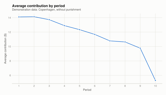
own_data with your own class results to answer the question.
The pattern to look for, and the one Herrmann et al. found nearly everywhere: contributions start moderately high and decay as the rounds proceed. Players begin willing to cooperate, observe others contributing less, and reduce their own contributions in response.
Q2. Comparison with Figure 3 of the paper
Figure 3 of Herrmann et al. is the no-punishment panel — the same 16 series plotted below in Figure 2. The comparison to make is on three specific things:
- Starting level. Across the 16 cities, period 1 averages 10.58, with individual cities ranging from 7.96 to 14.10.
- Ending level. Period 10 averages 4.38, ranging from 1.30 to 8.68.
- Shape. Monotone decay in nearly every city.
A single classroom group will be noisier than any of these city averages, because each city figure already averages over many groups.
Q3. Why classroom results differ from the published study
Four reasons, in rough order of how much they matter:
- Sample size. Each published city average pools many groups of four; a classroom produces one or a few. Small samples swing widely for no substantive reason.
- Stakes. The published experiment paid real money. Hypothetical payoffs weaken the incentive that the game is built on.
- Who is playing. Subjects were recruited to be strangers. Classmates know each other, expect to meet again, and can be seen — so reputation and social pressure enter a game designed to exclude them.
- Common knowledge. Students who already know the theoretical prediction play differently from subjects who don’t.
Part 2.2 — Describing the data
Q1. Mean contribution per period
means = DataFrame(
    period = 1:10,
    without_punishment = [mean(no_pun[p, :]) for p in 1:10],
    with_punishment = [mean(with_pun[p, :]) for p in 1:10],
)
means.difference = means.with_punishment .- means.without_punishment

means
10×4 DataFrame
| Row | period | without_punishment | with_punishment | difference |
|---|---|---|---|---|
| Int64 | Float64 | Float64 | Float64 | |
| 1 | 1 | 10.5783 | 10.6388 | 0.0604458 |
| 2 | 2 | 10.6284 | 11.9548 | 1.3264 |
| 3 | 3 | 10.4071 | 12.6643 | 2.25726 |
| 4 | 4 | 9.81303 | 12.9667 | 3.15363 |
| 5 | 5 | 9.30543 | 13.3316 | 4.0262 |
| 6 | 6 | 8.45484 | 13.5022 | 5.04739 |
| 7 | 7 | 7.83757 | 13.5747 | 5.73711 |
| 8 | 8 | 7.37639 | 13.6355 | 6.25915 |
| 9 | 9 | 6.39299 | 13.5695 | 7.17656 |
| 10 | 10 | 4.38377 | 12.8699 | 8.48611 |
Every one of these twenty means matches the book’s published solutions to two decimal places.
fig = Figure(size = (820, 460))
ax = Axis(fig[1, 1];
          title = "Punishment reverses the decay in contributions",
          xlabel = "Period", ylabel = "Average contribution (\$)",
          xticks = 1:10)

# All 32 city series as context. Sixteen cities cannot each get their own hue -
# past eight, colours stop being distinguishable - so the cities carry no colour
# and the two condition means carry all of it. Kept at low opacity: at full
# strength 32 lines out-ink the two that matter.
for j in eachindex(cities)
    lines!(ax, 1:10, no_pun[:, j];   color = (BASELINE, 0.4), linewidth = 0.75)
    lines!(ax, 1:10, with_pun[:, j]; color = (BASELINE, 0.4), linewidth = 0.75)
end

lines!(ax, 1:10, means.without_punishment;
       color = series_color(1), linewidth = 3, label = "Without punishment")
lines!(ax, 1:10, means.with_punishment;
       color = series_color(2), linewidth = 3, label = "With punishment")

# Legend only. Direct end-labels would land inside the grey band and simply
# restate the legend sitting beside them.
axislegend(ax; position = :lb, framevisible = false)
fig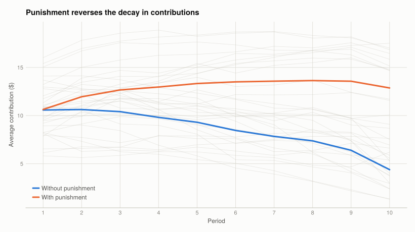
The two conditions start in the same place — 10.58 against 10.64, a gap of 0.06 — and then separate completely. Without punishment, contributions fall by about 6 dollars to 4.38. With punishment, they rise through period 8 and finish at 12.87.
That the two lines start together is the single most important feature of the chart, and Q4 returns to why.
Q2. Periods 1 and 10 side by side
endpoints = means[[1, 10], :]

fig = Figure(size = (620, 420))
ax = Axis(fig[1, 1];
          title = "Identical at the start, $(round(endpoints.difference[2], digits = 1)) dollars apart at the end",
          ylabel = "Mean contribution (\$)",
          xticks = ([1, 2], ["Period 1", "Period 10"]),
          limits = ((0.6, 2.4), nothing))

for (i, (col, label)) in enumerate(((:without_punishment, "Without punishment"),
                                    (:with_punishment, "With punishment")))
    xs = [1, 2] .+ (i - 1.5) * 0.18
    # Thin bars with air either side: four wide blocks read as decoration rather
    # than data, and the height is what carries the value.
    barplot!(ax, xs, endpoints[!, col]; width = 0.14,
             color = series_color(i), label = label)
    # Two bars per group, so a value on each cap is four labels, not forty.
    for (x, v) in zip(xs, endpoints[!, col])
        text!(ax, x, v; text = string(round(v, digits = 2)),
              align = (:center, :bottom), offset = (0, 4), fontsize = 11)
    end
end

Legend(fig[1, 2], ax; framevisible = false)
fig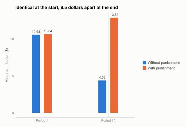
Q3. Standard deviation
summary_stats = DataFrame(period = Int[], condition = String[], mean = Float64[],
                          variance = Float64[], sd = Float64[], min = Float64[],
                          max = Float64[], range = Float64[])

for p in (1, 10), (m, cond) in ((no_pun, "Without punishment"), (with_pun, "With punishment"))
    v = m[p, :]
    push!(summary_stats, (p, cond, mean(v), var(v), std(v),
                          minimum(v), maximum(v), maximum(v) - minimum(v)))
end

select(summary_stats, :period, :condition, :mean, :sd)
4×4 DataFrame
| Row | period | condition | mean | sd |
|---|---|---|---|---|
| Int64 | String | Float64 | Float64 | |
| 1 | 1 | Without punishment | 10.5783 | 2.02072 |
| 2 | 1 | With punishment | 10.6388 | 3.20726 |
| 3 | 10 | Without punishment | 4.38377 | 2.18713 |
| 4 | 10 | With punishment | 12.8699 | 3.89802 |
Period 1: 2.02 without punishment against 3.21 with. Period 10: 2.19 against 3.90.
This answers the question the book poses directly — the two experiments both average about 10.6 in period 1, so are the datasets the same? No. Equal means with different standard deviations means the same centre and a different spread: with punishment, cities are more spread out around that shared average. A mean alone cannot distinguish the two datasets, which is the reason to report spread alongside it.
The rule of thumb is that roughly 95% of observations fall within two standard deviations of the mean:
rule = transform(summary_stats,
    [:mean, :sd] => ByRow((m, s) -> round(m - 2s, digits = 1)) => :lower,
    [:mean, :sd] => ByRow((m, s) -> round(m + 2s, digits = 1)) => :upper)

within = [100 * mean(abs.(m[p, :] .- mean(m[p, :])) .<= 2 * std(m[p, :]))
          for p in (1, 10) for m in (no_pun, with_pun)]

select(transform(rule, [] => (() -> within) => :pct_within),
       :period, :condition, :lower, :upper, :pct_within)
4×5 DataFrame
| Row | period | condition | lower | upper | pct_within |
|---|---|---|---|---|---|
| Int64 | String | Float64 | Float64 | Float64 | |
| 1 | 1 | Without punishment | 6.5 | 14.6 | 100.0 |
| 2 | 1 | With punishment | 4.2 | 17.1 | 100.0 |
| 3 | 10 | Without punishment | 0.0 | 8.8 | 100.0 |
| 4 | 10 | With punishment | 5.1 | 20.7 | 100.0 |
The intervals match the book’s ([8.6, 12.6], [7.5, 13.7], [2.3, 6.5], [9.1, 16.7]). All four contain 93.75% of observations — 15 of 16 cities — against the 95% the rule predicts. With only 16 observations the achievable percentages are multiples of 6.25, so 93.75% is as close to 95% as this sample can get. The rule of thumb assumes an approximately normal distribution and is an approximation even then; it holds well here.
Q4. Minimum, maximum and range
select(summary_stats, :period, :condition, :min, :max, :range)4×5 DataFrame
| Row | period | condition | min | max | range |
|---|---|---|---|---|---|
| Int64 | String | Float64 | Float64 | Float64 | |
| 1 | 1 | Without punishment | 7.95833 | 14.1029 | 6.14461 |
| 2 | 1 | With punishment | 5.81818 | 16.0179 | 10.1997 |
| 3 | 10 | Without punishment | 1.3 | 8.68182 | 7.38182 |
| 4 | 10 | With punishment | 6.20455 | 17.5119 | 11.3074 |
Q5. The full summary table
summary_stats4×8 DataFrame
| Row | period | condition | mean | variance | sd | min | max | range |
|---|---|---|---|---|---|---|---|---|
| Int64 | String | Float64 | Float64 | Float64 | Float64 | Float64 | Float64 | |
| 1 | 1 | Without punishment | 10.5783 | 4.08332 | 2.02072 | 7.95833 | 14.1029 | 6.14461 |
| 2 | 1 | With punishment | 10.6388 | 10.2865 | 3.20726 | 5.81818 | 16.0179 | 10.1997 |
| 3 | 10 | Without punishment | 4.38377 | 4.78352 | 2.18713 | 1.3 | 8.68182 | 7.38182 |
| 4 | 10 | With punishment | 12.8699 | 15.1946 | 3.89802 | 6.20455 | 17.5119 | 11.3074 |
Reading across the four rows:
- Period 1 means are effectively equal (10.58, 10.64) while everything describing spread differs — SD 2.02 against 3.21, range 6.14 against 10.20.
- By period 10 the means diverge (4.38 against 12.87) and the spreads widen in both conditions.
- The with-punishment condition is more variable throughout. Punishment did not move every city the same way; it moved the average up while spreading cities further apart. Athens finishes at 6.20 while Seoul reaches 17.51.
That last point is easy to miss from the means alone, and it is what the Herrmann paper is actually about — the paper’s title concerns antisocial punishment, cases where players fined high contributors rather than free-riders, which happened much more in some cities than others.
Part 2.3 — How did changing the rules affect behaviour?
Q1. The coin-flip exercise
The exercise is to flip a coin six times with one hand, record the result, then repeat with the other hand, and note that the two runs differ even though nothing about the process changed.
Simulating it makes the same point with enough replications to see the distribution rather than two draws from it. The seed is fixed so the page renders identically each time:
rng = MersenneTwister(20260902)

left  = rand(rng, Bool, 6)
right = rand(rng, Bool, 6)

(left_sequence = Int.(left), left_heads = sum(left),
 right_sequence = Int.(right), right_heads = sum(right))
(left_sequence = [0, 0, 0, 0, 1, 0], left_heads = 1, right_sequence = [0, 0, 0, 0, 1, 1], right_heads = 2)Two runs of an identical process, different results — different counts and different sequences. Any difference between the hands is chance, because there is no mechanism by which the hand could matter.
runs = [sum(rand(rng, Bool, 6)) for _ in 1:10_000]
counts = [count(==(k), runs) for k in 0:6]

fig = Figure(size = (700, 400))
ax = Axis(fig[1, 1];
          title = "A fair coin produces a spread of outcomes, not always three heads",
          xlabel = "Heads in six flips", ylabel = "Runs out of 10,000",
          xticks = 0:6)
barplot!(ax, 0:6, counts; width = 0.7, color = series_color(1))
for (k, c) in zip(0:6, counts)
    text!(ax, k, c; text = string(c), align = (:center, :bottom),
          offset = (0, 4), fontsize = 11)
end
fig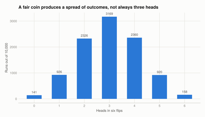
This is the logic a p-value formalises: to judge whether an observed difference is meaningful, you need to know what range of differences the no-real-effect case produces.
Q2. The p-value for period 1
The same 16 cities appear in both conditions, so the two samples are paired — comparing Copenhagen with Copenhagen, not the two groups as unrelated samples. The book makes this correction explicitly, and it matters: pairing removes between-city differences from the comparison.
In R that is t.test(x, y, paired = TRUE). Julia has no separate paired test; a paired t-test is a one-sample test on the differences, which is what OneSampleTTest on x .- y does:
p1_test = OneSampleTTest(no_pun[1, :] .- with_pun[1, :])One sample t-test
-----------------
Population details:
parameter of interest: Mean
value under h_0: 0
point estimate: -0.0604458
95% confidence interval: (-0.9196, 0.7987)
Test summary:
outcome with 95% confidence: fail to reject h_0
two-sided p-value: 0.8828
Details:
number of observations: 16
t-statistic: -0.14995904535850296
degrees of freedom: 15
empirical standard error: 0.40308176858461536(mean_difference = mean(no_pun[1, :] .- with_pun[1, :]),
p_value = pvalue(p1_test))(mean_difference = -0.060445757218365925, p_value = 0.8827947293072503)The mean difference is −0.06 with a p-value of 0.88. There is no detectable difference between the two conditions in period 1.
The p-value is the probability of seeing a difference at least this large if the two conditions really had the same mean. At 0.88 the observed gap is entirely ordinary under that assumption — the same reading as getting 4 heads instead of 3 in Figure 4.
Q3. The p-value for period 10
p10_test = OneSampleTTest(no_pun[10, :] .- with_pun[10, :])One sample t-test
-----------------
Population details:
parameter of interest: Mean
value under h_0: 0
point estimate: -8.48611
95% confidence interval: (-11.28, -5.695)
Test summary:
outcome with 95% confidence: reject h_0
two-sided p-value: <1e-04
Details:
number of observations: 16
t-statistic: -6.480599529730059
degrees of freedom: 15
empirical standard error: 1.3094637858753957(mean_difference = mean(no_pun[10, :] .- with_pun[10, :]),
p_value = pvalue(p10_test))(mean_difference = -8.486110394942632, p_value = 1.0374516722799413e-5)A mean difference of −8.49 with a p-value of 0.00001. A gap this large would arise by chance about once in a hundred thousand times if punishment made no difference.
For comparison, the unpaired form the book starts with — R’s default t.test(x, y), which is Welch’s test:
unpaired = UnequalVarianceTTest(no_pun[10, :], with_pun[10, :])
(paired_p = pvalue(p10_test), unpaired_p = pvalue(unpaired))
(paired_p = 1.0374516722799413e-5, unpaired_p = 8.758435771909662e-8)Both reject decisively here, but the paired test is the correct one and gives the smaller p-value, because removing between-city variation leaves a cleaner comparison.
Why the size of the difference is not enough on its own. 8.49 dollars sounds large, but “large” has no meaning without knowing how much the quantity varies. A difference of 8.49 in a setting where cities routinely differ by 20 would be noise. The p-value is what supplies that context: it measures the difference in units of its own sampling variability. That is why period 1’s difference of 0.06 and period 10’s of 8.49 get such different verdicts — not because one number is bigger, but because only one is big relative to the spread.
Q4. What makes punishment the cause
The p-value establishes that the period 10 difference is not chance. It does not, by itself, establish that punishment produced it — something else differing between the two groups could be responsible.
What rules that out is the period 1 result. Both conditions used the same 16 cities, and at period 1 — before anyone had an opportunity to punish — the two groups were statistically indistinguishable (p = 0.88). So the groups were comparable before the treatment took effect and differed sharply after it, with the punishment option being the thing that changed between them.
That structure is what makes an experiment able to support a causal claim:
- The treatment is assigned, not chosen. Subjects did not select into the punishment condition, so the groups do not differ in ways that also affect contributions.
- The groups are verifiably similar beforehand. This is testable, and the period 1 comparison is the test.
- Only one thing differs. Same payoffs, same rounds, same protocol — only the punishment option changes.
The period 1 comparison is doing real work. Without it, an argument that the punishment cities were simply more cooperative to begin with would be unanswerable.
Q5. Limitations
Five, with what would address each:
- Subject pools are not their societies. The subjects were mostly university students in 16 cities, so “Athens” means the students who turned up in Athens. Recruiting broader samples would help; it is expensive, which is why it is rarely done.
- Laboratory behaviour need not transfer. A $20 endowment in a ten-round game is not a tax bill or a team project. Field experiments in real settings are the check.
- Subjects know they are observed. Being watched encourages generosity, likely inflating contributions in both conditions. This biases levels more than the between-condition difference, which is what the analysis rests on.
- Ten rounds with a known end. Contributions drop sharply in the final period in nearly every city, an artefact of the game ending rather than of preferences. Randomising the endpoint removes it.
- The mechanism is not identified. The experiment shows punishment raised contributions, not why — deterrence, reciprocity, and anger are all consistent with it. Varying the fine’s size and cost separately would begin to separate them.
The design handles the threat that matters most for the causal claim — pre-treatment comparability — and these limitations bear on how far the result generalises rather than on whether it holds in this setting.
What this project covered
| Concept | Where | In Julia |
|---|---|---|
| Reading a fixed cell range | Setup | XLSX.readdata(path, sheet, "A1:Q26") |
| Long-format reshaping | Setup | DataFrame with repeat(...; inner, outer) |
| Mean by group | Q2.1 | mean(m[p, :]) |
| Emphasis over 16 series | Q2.1 | grey context lines, colour on the two means |
| Grouped column chart | Q2.2 | dodged barplot! |
| Standard deviation, variance | Q2.3 | std, var |
| Min, max, range | Q2.4 | minimum, maximum |
| Simulation with a fixed seed | Q3.1 | MersenneTwister(seed), rand(rng, Bool, n) |
| Paired t-test | Q3.2, Q3.3 | OneSampleTTest(x .- y) |
| Unpaired (Welch) t-test | Q3.3 | UnequalVarianceTTest(x, y) |
The R → Julia page has the full translation table.