using XLSX, DataFrames
using Statistics
using HypothesisTests
using CairoMakie
using DoingEconomics

CairoMakie.activate!(type = "svg")
use_doingecon_theme!()10. Characteristics of banking systems around the world
Depth, access and stability across 200 countries, and what a weighted average changes
The World Bank’s Global Financial Development Database: 11,330 country-years from 1960 to 2014, 110 indicators. This project takes eight of them, covering how deep a banking system is, how much access people have to it, and how stable it is — then asks whether stability improved after 2008.
New concepts: box and whisker plots, weighted averages, and Winsorization as a way to keep extreme observations without letting them dominate. Book pages: project, R walk-through, solutions.
ImportantThe file the book specifies is no longer downloadable
The book sends you to the World Bank’s Global Financial Development Database page and says to click “June 2017 Version”. That link is still on the page and still points at GlobalFinancialDevelopmentDatabaseJune2017.xlsx — but the file has been removed. The request returns the World Bank’s 404 page as a 100 KB HTML body, so a naive download produces an HTML file with an .xlsx extension and the failure only surfaces when something tries to read it. The November 2013 link is dead the same way; November 2021 and September 2022 still work.
The copy here is the 1 April 2022 Internet Archive capture, requested in id_ form so the bytes are the original file rather than a rewritten page. An April 2023 revisit carries the same WARC digest, so the capture is stable.
Using a current version was the alternative, and the book warns results differ between versions. Since every figure below is checked against the published solutions, the specified vintage is what makes those checks mean anything. This is the second dataset in this repository whose official source has gone — Project 5’s was the first.
path = rawpath("10", "gfdd-june-2017.xlsx")

# The "June 2017" release contains tabs named "Data - May 2017" and "Data - June 2016".
# The book uses the June 2016 tab, which is the one covering 1960-2014.
gfdd = DataFrame(XLSX.readtable(path, "Data - June 2016"; infer_eltypes = true))
rename!(gfdd, "Income Group" => :income)

const INDICATORS = [
    ("GFDD.DI.01", "Depth", "Private credit by deposit money banks to GDP (%)"),
    ("GFDD.DI.02", "Depth", "Deposit money banks' assets to GDP (%)"),
    ("GFDD.AI.01", "Access", "Bank accounts per 1,000 adults"),
    ("GFDD.AI.02", "Access", "Bank branches per 100,000 adults"),
    ("GFDD.AI.03", "Access", "Firms with a bank loan or line of credit (%)"),
    ("GFDD.AI.04", "Access", "Small firms with a bank loan or line of credit (%)"),
    ("GFDD.SI.01", "Stability", "Bank Z-score"),
    ("GFDD.SI.05", "Stability", "Bank regulatory capital to risk-weighted assets (%)"),
]
const CODES = first.(INDICATORS)

# Numeric columns arrive as `Any` because blanks are interleaved with numbers.
num(x) = x === missing ? missing : x isa Number ? Float64(x) : tryparse(Float64, string(x))
for col in vcat(CODES, "SP.POP.TOTL", "Year")
    gfdd[!, col] = num.(gfdd[!, col])
end

(rows = nrow(gfdd), columns = ncol(gfdd),
 years = extrema(skipmissing(gfdd.Year)),
 countries = length(unique(gfdd.Country)))
(rows = 11330, columns = 122, years = (1960.0, 2014.0), countries = 206)DataFrame(code = CODES,
category = [c for (_, c, _) in INDICATORS],
indicator = [d for (_, _, d) in INDICATORS],
observations = [count(!ismissing, gfdd[!, c]) for c in CODES],
coverage_pct = [round(100 * count(!ismissing, gfdd[!, c]) / nrow(gfdd), digits = 1)
for c in CODES])8×5 DataFrame
| Row | code | category | indicator | observations | coverage_pct |
|---|---|---|---|---|---|
| String | String | String | Int64 | Float64 | |
| 1 | GFDD.DI.01 | Depth | Private credit by deposit money banks to GDP (%) | 7575 | 66.9 |
| 2 | GFDD.DI.02 | Depth | Deposit money banks' assets to GDP (%) | 7600 | 67.1 |
| 3 | GFDD.AI.01 | Access | Bank accounts per 1,000 adults | 918 | 8.1 |
| 4 | GFDD.AI.02 | Access | Bank branches per 100,000 adults | 1955 | 17.3 |
| 5 | GFDD.AI.03 | Access | Firms with a bank loan or line of credit (%) | 220 | 1.9 |
| 6 | GFDD.AI.04 | Access | Small firms with a bank loan or line of credit (%) | 220 | 1.9 |
| 7 | GFDD.SI.01 | Stability | Bank Z-score | 3244 | 28.6 |
| 8 | GFDD.SI.05 | Stability | Bank regulatory capital to risk-weighted assets (%) | 1728 | 15.3 |
Coverage is the first thing to notice and it constrains everything after. The two depth indicators are recorded for a large share of country-years; the two firm-level access indicators are recorded for very few, because they come from enterprise surveys run occasionally rather than from banking returns collected annually. Any comparison using GFDD.AI.03 or GFDD.AI.04 is working with a fraction of the sample, and not a random fraction.
Part 10.1 — Summarizing the data
Q1. What each indicator measures, and where it misleads
The workbook’s own definitions:
definitions = DataFrame(XLSX.readtable(path, "Definitions and Sources"))
wanted = definitions[in(CODES).(coalesce.(definitions[!, 1], "")), :]
select(wanted, 1 => :code, 3 => :short_description)
0×2 DataFrame
| Row | code | short_description |
|---|---|---|
| String | String |
Depth.
- Private credit by deposit money banks to GDP is the standard measure of financial depth: outstanding credit from resident deposit-taking banks to the non-financial private sector, scaled by GDP. It is a good measure because it captures the function that matters — moving savings to private borrowers — rather than the mere existence of institutions. Its weakness is institutional coverage: where the state provides credit directly or owns the enterprises doing the borrowing, real intermediation is happening that this indicator does not count, so it understates depth in state-dominated economies.
- Deposit money banks’ assets to GDP is broader, and the breadth cuts both ways. It includes lending to state-owned enterprises, which fixes part of the problem above. But it also counts assets that are not lending to the economy at all — most importantly government bonds. A banking system that funds the state by holding its debt looks as deep on this measure as one funding firms, which are very different economic functions.
Access.
- Bank accounts per 1,000 adults is the most direct measure of whether people are inside the financial system. Two problems: one person can hold several accounts, so the numerator is accounts rather than people, and the denominator effect varies with how many accounts a typical customer holds — which itself differs by country. Cross-country differences may reflect banking conventions rather than access.
- Bank branches per 100,000 adults measures physical reach. Its weakness is distribution: the same branch count is very different if the branches are spread across a country or clustered in the capital, and the indicator cannot tell them apart. It is also increasingly obsolete as a measure — a country with widespread mobile and online banking needs fewer branches, so falling branch density can mean improving access.
- Firms with a bank loan or line of credit narrows to a group with a clear demand for credit, which removes some of the taste variation that troubles household measures. It remains a mix of supply and demand: a low value is consistent with firms being refused or not needing to borrow.
- Small firms with a bank loan or line of credit is the policy-relevant version of the same, because small and new firms are where credit rationing bites hardest — they have the least collateral and no track record. It is the closest indicator here to what Project 9 measured at the household level.
Stability.
- Bank Z-score combines capitalisation, return and the volatility of returns into an estimated distance from default, asset-weighted across banks. Higher is more stable. It is a genuine risk measure rather than a balance-sheet ratio, which is its strength. Its blind spot is interconnectedness: it scores each bank in isolation, so a system of individually sound but mutually exposed banks scores well, and that is precisely the configuration that failed in
- Bank regulatory capital to risk-weighted assets is the regulatory solvency ratio, the inverse of leverage. More capital against risk-weighted assets means more capacity to absorb losses. Its weakness is that the risk weights are chosen, and both the weights and the accounting behind them differ across countries and over time, so the ratio is not comparable across borders in the way its units suggest. It is also gameable: the same portfolio can be made to look better capitalised by reclassifying assets.
Q2. Distributions and outliers
quartile_table = DataFrame(indicator = String[], n = Int[], min = Float64[], q1 = Float64[],
                           median = Float64[], q3 = Float64[], max = Float64[],
                           outliers = Int[], outlier_pct = Float64[])
for (code, _, desc) in INDICATORS
    v = Float64.(collect(skipmissing(gfdd[!, code])))
    q1, q3 = quantile(v, [0.25, 0.75])
    fence = 1.5 * (q3 - q1)
    n_out = count(x -> x < q1 - fence || x > q3 + fence, v)
    push!(quartile_table, (desc, length(v), round(minimum(v), digits = 2),
                           round(q1, digits = 2), round(median(v), digits = 2),
                           round(q3, digits = 2), round(maximum(v), digits = 2),
                           n_out, round(100 * n_out / length(v), digits = 1)))
end
quartile_table
8×9 DataFrame
| Row | indicator | n | min | q1 | median | q3 | max | outliers | outlier_pct |
|---|---|---|---|---|---|---|---|---|---|
| String | Int64 | Float64 | Float64 | Float64 | Float64 | Float64 | Int64 | Float64 | |
| 1 | Private credit by deposit money banks to GDP (%) | 7575 | 0.0 | 12.32 | 23.62 | 46.02 | 262.46 | 435 | 5.7 |
| 2 | Deposit money banks' assets to GDP (%) | 7600 | 0.0 | 16.28 | 30.7 | 56.93 | 263.13 | 383 | 5.0 |
| 3 | Bank accounts per 1,000 adults | 918 | 0.0 | 92.16 | 328.41 | 730.19 | 3368.39 | 38 | 4.1 |
| 4 | Bank branches per 100,000 adults | 1955 | 0.13 | 4.62 | 12.78 | 24.76 | 285.0 | 108 | 5.5 |
| 5 | Firms with a bank loan or line of credit (%) | 220 | 2.8 | 19.05 | 34.6 | 48.92 | 79.6 | 0 | 0.0 |
| 6 | Small firms with a bank loan or line of credit (%) | 220 | 1.9 | 14.92 | 26.8 | 41.28 | 72.5 | 0 | 0.0 |
| 7 | Bank Z-score | 3244 | -21.22 | 5.82 | 9.68 | 15.3 | 89.93 | 110 | 3.4 |
| 8 | Bank regulatory capital to risk-weighted assets (%) | 1728 | 1.8 | 12.6 | 15.15 | 18.1 | 48.6 | 94 | 5.4 |
fig = Figure(size = (960, 620))
for (k, (code, category, desc)) in enumerate(INDICATORS)
    row, col = fldmod1(k, 4)
    v = Float64.(collect(skipmissing(gfdd[!, code])))
    ax = Axis(fig[row, col];
              title = "$code\n$category", titlesize = 11,
              xticksvisible = false, xticklabelsvisible = false,
              xgridvisible = false)
    boxplot!(ax, fill(1, length(v)), v;
             width = 0.5, color = series_color(1), whiskerwidth = 0.4,
             mediancolor = SURFACE, markersize = 4,
             outliercolor = (series_color(1), 0.35), strokecolor = SURFACE, strokewidth = 0)
    hidexdecorations!(ax; grid = true)
end
Label(fig[0, 1:4], "Every indicator is right-skewed with a long upper tail";
      fontsize = 14, color = INK, halign = :left, padding = (8, 0, 0, 0))
fig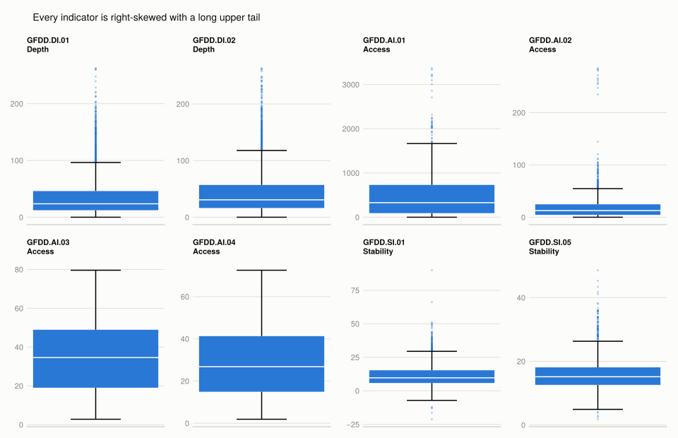
Every one of the eight is right-skewed, and for six of them the box is narrow relative to the whiskers — most country-years cluster and a minority sit far above. The outlier counts in the table put numbers on it.
The two exceptions are the firm-level access indicators, which have far fewer flagged outliers. That is not because firm credit is more evenly distributed but because those indicators are bounded percentages — a share of firms cannot exceed 100 — whereas bank accounts per 1,000 adults and assets-to-GDP have no ceiling. A bounded measure cannot produce a long tail.
Why so many outliers. Three distinct causes, worth separating because they call for different responses:
- Genuine structural differences. Financial centres — Luxembourg, Hong Kong, Switzerland — host banking systems sized for the world rather than for their own economies, so credit-to-GDP ratios of several hundred per cent are real, not errors. Scaling by domestic GDP is the problem, not the data.
- Different banking technology. A country where most transactions are mobile or online needs few branches; a cash economy needs many. Both extremes appear as outliers on branch density while describing normal arrangements.
- Measurement and definition. The capital ratio depends on national accounting and on chosen risk weights, so some spread is the measurement apparatus rather than the thing measured.
Only the third is an argument for excluding observations. The first two are the variation the project is about, which is why Q5 uses Winsorization — pulling the tails in while keeping every country — rather than dropping anything.
Q3. One depth and one access indicator over time
Following the book’s examples: deposit money banks’ assets to GDP for depth and bank accounts per 1,000 adults for access, 2000–2014.
(a) By income group and by region.
const INCOME_ORDER = ["Low income", "Lower middle income", "Upper middle income",
                      "High income: nonOECD", "High income: OECD"]

function group_means(indicator, groupcol, groups, years)
    out = DataFrame(year = collect(years))
    for g in groups
        means, counts = Float64[], Int[]
        for y in years
            v = Float64[x for x in gfdd[coalesce.(gfdd[!, groupcol] .== g, false) .&
                                        coalesce.(gfdd.Year .== y, false), indicator]
                        if x !== missing]
            push!(means, isempty(v) ? NaN : round(mean(v), digits = 2))
            push!(counts, length(v))
        end
        out[!, g] = means
        out[!, "n ($g)"] = counts
    end
    return out
end

depth_income = group_means("GFDD.DI.02", :income, INCOME_ORDER, 2000:2014)
show_all(select(depth_income, :year, INCOME_ORDER...))
15×6 DataFrame
| Row | year | Low income | Lower middle income | Upper middle income | High income: nonOECD | High income: OECD |
|---|---|---|---|---|---|---|
| Int64 | Float64 | Float64 | Float64 | Float64 | Float64 | |
| 1 | 2000 | 15.26 | 28.1 | 45.6 | 63.8 | 89.67 |
| 2 | 2001 | 14.96 | 27.85 | 46.79 | 67.17 | 90.06 |
| 3 | 2002 | 14.98 | 27.61 | 45.17 | 68.69 | 91.16 |
| 4 | 2003 | 15.71 | 27.76 | 44.8 | 67.29 | 92.75 |
| 5 | 2004 | 15.2 | 28.61 | 44.92 | 63.35 | 94.17 |
| 6 | 2005 | 15.25 | 30.36 | 46.68 | 62.19 | 98.79 |
| 7 | 2006 | 15.86 | 30.35 | 48.37 | 62.77 | 105.78 |
| 8 | 2007 | 16.57 | 32.02 | 50.24 | 65.25 | 110.92 |
| 9 | 2008 | 18.28 | 34.73 | 54.25 | 68.73 | 117.73 |
| 10 | 2009 | 19.11 | 37.65 | 58.59 | 79.37 | 123.16 |
| 11 | 2010 | 20.3 | 37.23 | 58.52 | 78.77 | 120.75 |
| 12 | 2011 | 21.58 | 37.88 | 58.91 | 78.0 | 118.81 |
| 13 | 2012 | 21.19 | 38.63 | 59.95 | 78.85 | 117.64 |
| 14 | 2013 | 22.87 | 40.28 | 61.48 | 80.12 | 115.07 |
| 15 | 2014 | 23.56 | 42.46 | 64.68 | 83.81 | 112.49 |
show_all(select(depth_income, :year, ["n ($g)" for g in INCOME_ORDER]...))15×6 DataFrame
| Row | year | n (Low income) | n (Lower middle income) | n (Upper middle income) | n (High income: nonOECD) | n (High income: OECD) |
|---|---|---|---|---|---|---|
| Int64 | Int64 | Int64 | Int64 | Int64 | Int64 | |
| 1 | 2000 | 26 | 45 | 44 | 25 | 32 |
| 2 | 2001 | 26 | 47 | 45 | 25 | 32 |
| 3 | 2002 | 27 | 48 | 46 | 26 | 32 |
| 4 | 2003 | 27 | 48 | 46 | 26 | 32 |
| 5 | 2004 | 27 | 48 | 46 | 27 | 32 |
| 6 | 2005 | 27 | 48 | 45 | 27 | 32 |
| 7 | 2006 | 26 | 48 | 46 | 27 | 32 |
| 8 | 2007 | 26 | 48 | 47 | 27 | 31 |
| 9 | 2008 | 26 | 48 | 47 | 27 | 31 |
| 10 | 2009 | 25 | 47 | 47 | 25 | 30 |
| 11 | 2010 | 25 | 48 | 47 | 26 | 30 |
| 12 | 2011 | 25 | 46 | 47 | 26 | 29 |
| 13 | 2012 | 23 | 47 | 47 | 26 | 29 |
| 14 | 2013 | 23 | 46 | 47 | 26 | 29 |
| 15 | 2014 | 22 | 44 | 45 | 25 | 29 |
Fifteen years by five groups, and the published table reproduces throughout except one cell.
NoteOne cell differs from the published table
The book’s Solution figure 10.10 gives 63.89 for High income: nonOECD in 2000. This gives 63.80, from the same 25 countries.
h = gfdd[coalesce.(gfdd.income .== "High income: nonOECD", false) .&
         coalesce.(gfdd.Year .== 2000, false) .& .!ismissing.(gfdd[!, "GFDD.DI.02"]), :]
values = Float64.(h[!, "GFDD.DI.02"])

(countries = length(values),
 sum = round(sum(values), digits = 3),
 mean = round(mean(values), digits = 4),
 sum_needed_for_63_89 = round(63.89 * length(values), digits = 3))
(countries = 25, sum = 1595.04, mean = 63.8016, sum_needed_for_63_89 = 1597.25)Same count of countries, and 2001 through 2014 all reproduce exactly, as do every other group’s 2000 value. An isolated 0.09 in one cell of a 75-cell table, with the neighbouring years correct, is most consistent with a transcription slip in the published figure — but the cause cannot be established from here, so it is reported rather than explained.
const REGIONS = sort(unique(skipmissing(gfdd.Region)))
access_region = group_means("GFDD.AI.01", :Region, REGIONS, 2000:2014)
show_all(select(access_region, :year, REGIONS...))
15×8 DataFrame
| Row | year | East Asia & Pacific | Europe & Central Asia | Latin America & Caribbean | Middle East & North Africa | North America | South Asia | Sub-Saharan Africa |
|---|---|---|---|---|---|---|---|---|
| Int64 | Float64 | Float64 | Float64 | Float64 | Float64 | Float64 | Float64 | |
| 1 | 2000 | NaN | NaN | NaN | NaN | NaN | NaN | NaN |
| 2 | 2001 | 265.15 | NaN | NaN | NaN | NaN | NaN | 8.12 |
| 3 | 2002 | 285.32 | NaN | NaN | NaN | NaN | NaN | 29.19 |
| 4 | 2003 | 366.82 | NaN | NaN | NaN | NaN | NaN | 29.65 |
| 5 | 2004 | 580.53 | 537.83 | 521.01 | 368.07 | NaN | 425.56 | 126.12 |
| 6 | 2005 | 575.46 | 843.54 | 473.32 | 380.89 | NaN | 452.45 | 139.72 |
| 7 | 2006 | 516.7 | 919.94 | 528.12 | 388.46 | NaN | 487.81 | 145.62 |
| 8 | 2007 | 557.99 | 982.22 | 600.95 | 420.53 | NaN | 525.75 | 150.74 |
| 9 | 2008 | 713.03 | 1092.63 | 651.44 | 463.48 | NaN | 458.24 | 167.85 |
| 10 | 2009 | 738.29 | 1053.4 | 695.64 | 523.62 | NaN | 428.6 | 185.96 |
| 11 | 2010 | 764.47 | 1116.05 | 750.63 | 523.34 | NaN | 431.42 | 216.89 |
| 12 | 2011 | 973.88 | 1159.48 | 647.61 | 531.78 | NaN | 545.29 | 235.62 |
| 13 | 2012 | 796.89 | 1156.74 | 695.38 | 536.23 | NaN | 560.5 | 277.71 |
| 14 | 2013 | 744.74 | 1097.12 | 730.9 | 529.63 | NaN | 580.13 | 320.58 |
| 15 | 2014 | 863.2 | 1161.06 | 797.02 | 542.29 | NaN | 672.26 | 413.4 |
(b) The trends.
ramp = sequential_steps(length(INCOME_ORDER))
years = depth_income.year

fig = Figure(size = (920, 520))
ax = Axis(fig[1, 1];
          title = "The gap between rich and poor banking systems widened, then stalled",
          xlabel = "Year", ylabel = "Deposit money banks' assets to GDP (%)",
          limits = ((1999.5, 2019.5), (0, 130)))

for (j, g) in enumerate(INCOME_ORDER)
    v = depth_income[!, g]
    lines!(ax, years, v; color = ramp[j], linewidth = 2.5, label = g)
    text!(ax, 2014.4, v[end]; text = g, fontsize = 10,
          align = (:left, :center), color = INK_SECONDARY)
end
fig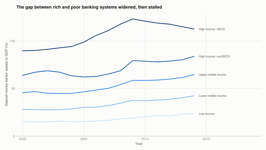
plotted = [r for r in REGIONS if !all(isnan, access_region[!, r])]

fig = Figure(size = (960, 520))
for (k, r) in enumerate(plotted)
    row, col = fldmod1(k, 3)
    ax = Axis(fig[row, col];
              title = r, titlesize = 11,
              xlabel = row == 2 ? "Year" : "",
              ylabel = col == 1 ? "Accounts per 1,000 adults" : "",
              limits = ((1999.5, 2014.5), (0, 1300)))
    for other in plotted
        lines!(ax, years, access_region[!, other]; color = GRIDLINE, linewidth = 1.5)
    end
    lines!(ax, years, access_region[!, r]; color = series_color(1), linewidth = 2.5)
end
fig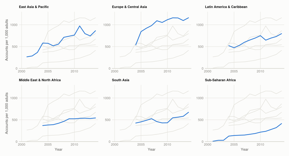
Depth. The ordering is exactly what the income ranking predicts, and it is remarkably stable: high-income OECD systems hold bank assets worth around 90–120% of GDP throughout, low-income systems around 15–20%. The ratio between top and bottom is roughly six to one and does not close over fifteen years.
The one visible dynamic is the crisis. High-income OECD depth rises through the 2000s, peaks around 2009, and then flattens or falls — consistent with balance sheets expanding into 2008 and deleveraging after. The low-income series does not show that shape at all, which is the substantive point: these systems were not deep enough to be part of the crisis.
Access. The regional picture is one of broad convergence from very different starting points. Sub-Saharan Africa more than triples over the period. Europe and Central Asia rises fastest in absolute terms. Every region rises, and none reverses.
Two cautions the tables make visible and the charts hide:
- North America has no observations at all for bank accounts per 1,000 adults, in any year. Its row is absent rather than zero, and a chart that omitted the table would suggest the region had no bank accounts.
- The country counts move between years, so part of any year-on-year change is composition rather than change within countries. A region’s mean can rise because a well-banked country started reporting.
Q4. Weighted against simple averages
A simple average across countries treats Luxembourg and China as equally informative about the region. Weighting by population asks a different question: what is the average person’s access?
(a) and (b) Constructing the weights, using population only over countries with a non-missing indicator value, so the weights sum to one within each region-year.
function weighted_by_population(indicator, groupcol, group, year)
    mask = coalesce.(gfdd[!, groupcol] .== group, false) .&
           coalesce.(gfdd.Year .== year, false) .&
           .!ismissing.(gfdd[!, indicator]) .& .!ismissing.(gfdd[!, "SP.POP.TOTL"])
    sub = gfdd[mask, :]
    nrow(sub) == 0 && return (value = NaN, n = 0, weight_sum = NaN)
    w = Float64.(sub[!, "SP.POP.TOTL"])
    w ./= sum(w)
    return (value = sum(w .* Float64.(sub[!, indicator])), n = nrow(sub), weight_sum = sum(w))
end

# The check the question asks for: weights must sum to 1 within a region-year.
check = weighted_by_population("GFDD.AI.01", :Region, "Europe & Central Asia", 2010)
(countries = check.n, weight_sum = check.weight_sum, weighted_average = round(check.value, digits = 2))
(countries = 15, weight_sum = 1.0, weighted_average = 1371.62)(c) The weighted averages.
weighted_table = DataFrame(year = collect(2004:2014))
for r in plotted
    weighted_table[!, r] = [round(weighted_by_population("GFDD.AI.01", :Region, r, y).value,
                                 digits = 2) for y in 2004:2014]
end
show_all(weighted_table)
11×7 DataFrame
| Row | year | East Asia & Pacific | Europe & Central Asia | Latin America & Caribbean | Middle East & North Africa | South Asia | Sub-Saharan Africa |
|---|---|---|---|---|---|---|---|
| Int64 | Float64 | Float64 | Float64 | Float64 | Float64 | Float64 | |
| 1 | 2004 | 253.86 | 637.4 | 504.48 | 301.03 | 529.82 | 64.48 |
| 2 | 2005 | 336.63 | 1262.14 | 471.72 | 324.82 | 531.27 | 76.57 |
| 3 | 2006 | 81.43 | 1324.44 | 484.82 | 351.77 | 549.06 | 79.62 |
| 4 | 2007 | 85.34 | 1380.43 | 520.49 | 393.35 | 573.51 | 132.21 |
| 5 | 2008 | 87.54 | 1525.15 | 561.82 | 418.4 | 614.92 | 149.09 |
| 6 | 2009 | 90.62 | 1501.88 | 633.35 | 436.77 | 227.03 | 195.23 |
| 7 | 2010 | 94.6 | 1371.62 | 686.92 | 431.48 | 267.47 | 220.34 |
| 8 | 2011 | 105.83 | 1419.89 | 688.62 | 420.16 | 334.88 | 236.72 |
| 9 | 2012 | 96.85 | 1269.52 | 736.57 | 426.43 | 373.07 | 277.92 |
| 10 | 2013 | 101.48 | 1043.82 | 755.75 | 427.68 | 399.85 | 309.17 |
| 11 | 2014 | 106.33 | 1059.82 | 780.49 | 524.85 | 411.35 | 350.8 |
Every value matches the published table.
(d) Comparison with the simple averages.
comparison = DataFrame(region = plotted)
comparison.simple = [round(access_region[access_region.year .== 2014, r][1], digits = 2)
                     for r in plotted]
comparison.weighted = [weighted_table[weighted_table.year .== 2014, r][1] for r in plotted]
comparison.gap = round.(comparison.weighted .- comparison.simple, digits = 2)
sort!(comparison, :gap)
comparison
6×4 DataFrame
| Row | region | simple | weighted | gap |
|---|---|---|---|---|
| String | Float64 | Float64 | Float64 | |
| 1 | East Asia & Pacific | 863.2 | 106.33 | -756.87 |
| 2 | South Asia | 672.26 | 411.35 | -260.91 |
| 3 | Europe & Central Asia | 1161.06 | 1059.82 | -101.24 |
| 4 | Sub-Saharan Africa | 413.4 | 350.8 | -62.6 |
| 5 | Middle East & North Africa | 542.29 | 524.85 | -17.44 |
| 6 | Latin America & Caribbean | 797.02 | 780.49 | -16.53 |
fig = Figure(size = (900, 500))
ax = Axis(fig[1, 1];
          title = "Weighting by population moves East Asia most, and downward",
          ylabel = "Bank accounts per 1,000 adults, 2014",
          xticks = (1:nrow(comparison), comparison.region),
          xticklabelrotation = pi / 7,
          limits = (nothing, (0, 1300)))
for (j, (col, lab)) in enumerate([(:simple, "Simple mean"), (:weighted, "Population-weighted")])
    barplot!(ax, (1:nrow(comparison)) .+ (j == 1 ? -0.19 : 0.19), comparison[!, col];
             width = 0.34, color = series_color(j), label = lab)
end
Legend(fig[0, 1], ax; orientation = :horizontal, framevisible = false)
fig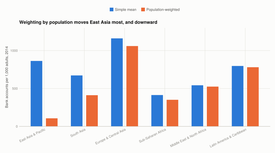
East Asia and Pacific is the case that makes the point. Its simple mean in 2014 is about 863 accounts per 1,000 adults; its population-weighted mean is 106. Weighting by population cuts it by a factor of eight, because the region’s small, well-banked economies count the same as China and Indonesia under a simple average and almost nothing under a weighted one.
The direction of the gap identifies where the population lives. Where the weighted mean is lower, the populous countries have worse access than the small ones — East Asia, and South Asia. Where it is higher, as in Latin America and the Caribbean, the large countries are the better-banked ones and the small Caribbean states pull the simple average down.
Neither is the “right” average; they answer different questions. The simple mean describes the typical country; the weighted mean describes the typical person. For “how far has financial inclusion spread”, the weighted mean is the relevant one, and it is far less flattering: the unweighted series suggests East Asian access approaching European levels, and the weighted series does not.
One artefact worth flagging: the East Asian weighted series jumps from 253.86 in 2004 to 336.63 in 2005 and then falls to 81.43 in 2006. A change that large in a population-weighted mean is a change in which populous country reports, not a change in banking. The weights make the series highly sensitive to the entry and exit of large countries.
Q5. Winsorization
Extreme values are real here, so dropping them would discard the financial centres that make the distribution interesting. Winsorization instead replaces anything beyond a percentile with the percentile value, keeping every country in the calculation.
year2010 = gfdd[coalesce.(gfdd.Year .== 2010, false) .&
                .!ismissing.(gfdd[!, "GFDD.AI.01"]), :]
values2010 = Float64.(year2010[!, "GFDD.AI.01"])
p5, p95 = quantile(values2010, [0.05, 0.95])
year2010.winsorized = clamp.(values2010, p5, p95)

(countries = length(values2010),
 p5 = round(p5, digits = 2), p95 = round(p95, digits = 2),
 below_p5 = count(<(p5), values2010), above_p95 = count(>(p95), values2010))
(countries = 93, p5 = 27.59, p95 = 1604.69, below_p5 = 5, above_p95 = 5)(a) The 5th percentile is 27.59 accounts per 1,000 adults and the 95th is 1,604.69, both matching the book.
(b) and (c) Averages before and after, by income group.
wins_table = DataFrame(income_group = String[], n = Int[], raw = Float64[],
                       winsorized = Float64[], change = Float64[])
for g in INCOME_ORDER
    s = year2010[coalesce.(year2010.income .== g, false), :]
    nrow(s) == 0 && continue
    raw = mean(Float64.(s[!, "GFDD.AI.01"]))
    push!(wins_table, (g, nrow(s), round(raw, digits = 2),
                       round(mean(s.winsorized), digits = 2),
                       round(mean(s.winsorized) - raw, digits = 2)))
end
wins_table
5×5 DataFrame
| Row | income_group | n | raw | winsorized | change |
|---|---|---|---|---|---|
| String | Int64 | Float64 | Float64 | Float64 | |
| 1 | Low income | 22 | 121.95 | 123.06 | 1.11 |
| 2 | Lower middle income | 31 | 475.07 | 422.65 | -52.42 |
| 3 | Upper middle income | 22 | 634.92 | 635.71 | 0.79 |
| 4 | High income: nonOECD | 14 | 956.33 | 916.9 | -39.44 |
| 5 | High income: OECD | 4 | 1590.47 | 1356.47 | -234.0 |
All five Winsorized values match the published table exactly. The raw column is where the two diverge, and one of the book’s figures cannot be right.
WarningThe published non-Winsorized average for Upper middle income is arithmetically impossible
Solution figure 10.18 gives Upper middle income a 2010 average of 643.92 before Winsorizing and 635.71 after. This page gets 634.92 before and the same 635.71 after.
The Winsorized figures agreeing to the cent means both calculations use the same 22 countries. So the raw means should agree too — and the direction of the change settles which is right:
umi = year2010[coalesce.(year2010.income .== "Upper middle income", false), :]
umi_values = Float64.(umi[!, "GFDD.AI.01"])

(countries = length(umi_values),
 below_p5 = round.(umi_values[umi_values .< p5], digits = 2),
 above_p95 = round.(umi_values[umi_values .> p95], digits = 2),
 raw_mean = round(mean(umi_values), digits = 4),
 winsorized_mean = round(mean(clamp.(umi_values, p5, p95)), digits = 4),
 shift = round(mean(clamp.(umi_values, p5, p95)) - mean(umi_values), digits = 4),
 shift_implied_by_643_92 = round(635.71 - 643.92, digits = 4))
(countries = 22, below_p5 = [10.28], above_p95 = Float64[], raw_mean = 634.9219, winsorized_mean = 635.7088, shift = 0.7869, shift_implied_by_643_92 = -8.21)Exactly one Upper middle income country falls below the 5th percentile, at 10.28 accounts per 1,000 adults, and none is above the 95th. Winsorization can therefore only move this mean upward — it raises that single value to 27.59 and leaves the other 21 untouched, adding (27.59 − 10.28) ÷ 22 ≈ +0.79.
So the raw mean must be 635.71 − 0.79 = 634.92. For 643.92 to be the raw mean, Winsorizing would have to lower the average by 8.21, which requires values above the 95th percentile that this group does not have. 643.92 is a digit transposition of 634.92.
What Winsorization does, and the book’s summary of it is too strong. The published note says “the simple averages of Winsorized values are lower.” That holds for three groups and fails for two:
- High income: OECD falls from 1,590.47 to 1,356.47, a drop of 234 — this group has the values above the 95th percentile, so pulling the upper tail in moves it a long way.
- Low income rises, from 121.95 to 123.06, and Upper middle income rises from 634.92 to 635.71.
Winsorization pulls in both tails. It lowers a mean when the group’s mass beyond the 95th percentile outweighs its mass below the 5th, and raises it otherwise. Poor countries sit in the low tail, so for them the procedure is a correction upward. Describing it as a downward adjustment gets the mechanism backwards for exactly the groups where financial access is worst.
Note also n = 4 for High income: OECD. Only four OECD high-income countries report this indicator in 2010, so that 234-point change rests on a handful of observations.
Part 10.2 — Financial stability before and after 2008
Q1. What post-crisis regulation should have done to each indicator
The regulatory response — Basel III above all, phased in from 2013, plus national measures like Dodd-Frank — was aimed squarely at bank loss absorption.
- Bank regulatory capital to risk-weighted assets should rise, and this is close to a mechanical prediction rather than a behavioural one. Basel III raised minimum capital ratios, added a conservation buffer and a countercyclical buffer, and tightened what counts as capital. The indicator is the regulated quantity, so if the rules bound at all, it increases.
- Bank Z-score should also rise, but less reliably. It combines capitalisation with return on assets and the volatility of returns: \(Z = (\text{ROA} + \text{equity/assets}) \div \sigma(\text{ROA})\). Higher capital raises it, so the same regulation pushes in the same direction. But two of its three inputs work against that. Higher capital requirements reduce return on equity, and the post-crisis period was one of compressed margins and unusually low interest rates, which lowers ROA. Whether Z rises depends on which effect dominates.
So the sharp prediction is on the capital ratio; the Z-score is ambiguous ex ante. That distinction matters for reading the results, because a null on the Z-score is not evidence against the regulation working.
Q2. Differences between 2007 and 2014, with confidence intervals
Comparing each region’s and income group’s mean in 2014 against 2007. The groups are different sets of countries in the two years, so these are independent-sample comparisons, as the book’s t.test treats them.
function difference_table(indicator, groupcol, groups)
    out = DataFrame(group = String[], n_2007 = Int[], n_2014 = Int[], difference = Float64[],
                    lower = Float64[], upper = Float64[], width = Float64[],
                    excludes_zero = Bool[])
    for g in groups
        pick(y) = Float64[v for v in gfdd[coalesce.(gfdd[!, groupcol] .== g, false) .&
                                          coalesce.(gfdd.Year .== y, false), indicator]
                          if v !== missing]
        before, after = pick(2007), pick(2014)
        (length(before) < 2 || length(after) < 2) && continue
        t = UnequalVarianceTTest(after, before)
        lo, hi = confint(t)
        push!(out, (g, length(before), length(after), round((lo + hi) / 2, digits = 3),
                    round(lo, digits = 3), round(hi, digits = 3), round((hi - lo) / 2, digits = 3),
                    lo > 0 || hi < 0))
    end
    return out
end

capital_region = difference_table("GFDD.SI.05", :Region, REGIONS)
capital_region
7×8 DataFrame
| Row | group | n_2007 | n_2014 | difference | lower | upper | width | excludes_zero |
|---|---|---|---|---|---|---|---|---|
| String | Int64 | Int64 | Float64 | Float64 | Float64 | Float64 | Bool | |
| 1 | East Asia & Pacific | 12 | 15 | 1.863 | -2.021 | 5.747 | 3.884 | false |
| 2 | Europe & Central Asia | 44 | 45 | 2.731 | 0.714 | 4.747 | 2.016 | true |
| 3 | Latin America & Caribbean | 17 | 17 | 0.353 | -1.144 | 1.85 | 1.497 | false |
| 4 | Middle East & North Africa | 10 | 15 | 0.057 | -2.948 | 3.062 | 3.005 | false |
| 5 | North America | 2 | 2 | 0.5 | -11.693 | 12.693 | 12.193 | false |
| 6 | South Asia | 2 | 5 | 3.06 | -1.368 | 7.488 | 4.428 | false |
| 7 | Sub-Saharan Africa | 15 | 19 | 1.293 | -2.582 | 5.167 | 3.875 | false |
The seven rows match the walk-through’s printed output to eight decimal places.
capital_income = difference_table("GFDD.SI.05", :income, INCOME_ORDER)
zscore_region = difference_table("GFDD.SI.01", :Region, REGIONS)
zscore_income = difference_table("GFDD.SI.01", :income, INCOME_ORDER)

combined = vcat(
    insertcols(capital_region, 1, :indicator => "Capital ratio", :cut => "Region"),
    insertcols(capital_income, 1, :indicator => "Capital ratio", :cut => "Income group"),
    insertcols(zscore_region, 1, :indicator => "Bank Z-score", :cut => "Region"),
    insertcols(zscore_income, 1, :indicator => "Bank Z-score", :cut => "Income group"))
show_all(combined)
24×10 DataFrame
| Row | indicator | cut | group | n_2007 | n_2014 | difference | lower | upper | width | excludes_zero |
|---|---|---|---|---|---|---|---|---|---|---|
| String | String | String | Int64 | Int64 | Float64 | Float64 | Float64 | Float64 | Bool | |
| 1 | Capital ratio | Region | East Asia & Pacific | 12 | 15 | 1.863 | -2.021 | 5.747 | 3.884 | false |
| 2 | Capital ratio | Region | Europe & Central Asia | 44 | 45 | 2.731 | 0.714 | 4.747 | 2.016 | true |
| 3 | Capital ratio | Region | Latin America & Caribbean | 17 | 17 | 0.353 | -1.144 | 1.85 | 1.497 | false |
| 4 | Capital ratio | Region | Middle East & North Africa | 10 | 15 | 0.057 | -2.948 | 3.062 | 3.005 | false |
| 5 | Capital ratio | Region | North America | 2 | 2 | 0.5 | -11.693 | 12.693 | 12.193 | false |
| 6 | Capital ratio | Region | South Asia | 2 | 5 | 3.06 | -1.368 | 7.488 | 4.428 | false |
| 7 | Capital ratio | Region | Sub-Saharan Africa | 15 | 19 | 1.293 | -2.582 | 5.167 | 3.875 | false |
| 8 | Capital ratio | Income group | Low income | 4 | 6 | -0.575 | -14.233 | 13.083 | 13.658 | false |
| 9 | Capital ratio | Income group | Lower middle income | 24 | 30 | -1.336 | -4.488 | 1.816 | 3.152 | false |
| 10 | Capital ratio | Income group | Upper middle income | 27 | 32 | 0.42 | -1.221 | 2.061 | 1.641 | false |
| 11 | Capital ratio | Income group | High income: nonOECD | 15 | 19 | 2.227 | 0.24 | 4.214 | 1.987 | true |
| 12 | Capital ratio | Income group | High income: OECD | 32 | 31 | 4.787 | 3.123 | 6.452 | 1.664 | true |
| 13 | Bank Z-score | Region | East Asia & Pacific | 24 | 18 | -0.338 | -5.113 | 4.436 | 4.774 | false |
| 14 | Bank Z-score | Region | Europe & Central Asia | 51 | 43 | -0.94 | -3.716 | 1.837 | 2.777 | false |
| 15 | Bank Z-score | Region | Latin America & Caribbean | 35 | 28 | -0.491 | -3.965 | 2.983 | 3.474 | false |
| 16 | Bank Z-score | Region | Middle East & North Africa | 20 | 15 | 1.591 | -4.521 | 7.702 | 6.112 | false |
| 17 | Bank Z-score | Region | North America | 3 | 3 | -1.592 | -17.523 | 14.339 | 15.931 | false |
| 18 | Bank Z-score | Region | South Asia | 8 | 6 | -0.471 | -8.214 | 7.272 | 7.743 | false |
| 19 | Bank Z-score | Region | Sub-Saharan Africa | 41 | 15 | 1.211 | -2.062 | 4.483 | 3.273 | false |
| 20 | Bank Z-score | Income group | Low income | 25 | 9 | 1.735 | -2.25 | 5.72 | 3.985 | false |
| 21 | Bank Z-score | Income group | Lower middle income | 46 | 31 | -0.052 | -4.113 | 4.008 | 4.06 | false |
| 22 | Bank Z-score | Income group | Upper middle income | 47 | 32 | -0.486 | -4.645 | 3.674 | 4.159 | false |
| 23 | Bank Z-score | Income group | High income: nonOECD | 32 | 25 | -0.569 | -4.186 | 3.048 | 3.617 | false |
| 24 | Bank Z-score | Income group | High income: OECD | 32 | 31 | 0.173 | -3.7 | 4.047 | 3.873 | false |
Q3. Has stability improved?
(a) The four comparisons with their intervals.
panels = [("Capital ratio, by region", capital_region, "Percentage points"),
          ("Capital ratio, by income group", capital_income, "Percentage points"),
          ("Bank Z-score, by region", zscore_region, "Z-score points"),
          ("Bank Z-score, by income group", zscore_income, "Z-score points")]

fig = Figure(size = (980, 760))
for (k, (title, tab, unit)) in enumerate(panels)
    row, col = fldmod1(k, 2)
    ax = Axis(fig[row, col];
              title = title, titlesize = 12,
              ylabel = unit,
              xticks = (1:nrow(tab), tab.group), xticklabelrotation = pi / 5,
              xticklabelsize = 9)
    hlines!(ax, [0]; color = BASELINE, linewidth = 1)
    barplot!(ax, 1:nrow(tab), tab.difference; width = 0.5, color = series_color(1))
    errorbars!(ax, 1:nrow(tab), tab.difference, tab.difference .- tab.lower,
               tab.upper .- tab.difference;
               color = INK_SECONDARY, whiskerwidth = 10, linewidth = 2)
end
fig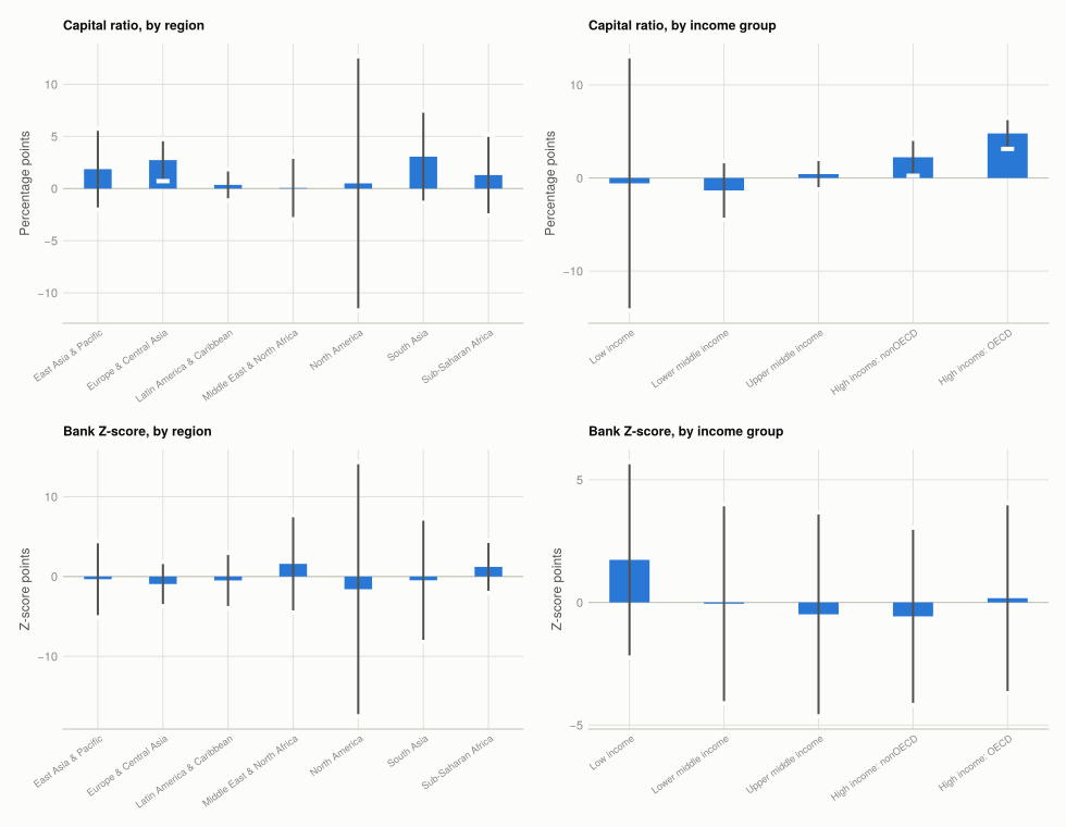
(b) What the results support.
The capital ratio rose, and the clearest evidence is in the income-group cut rather than the regional one. All seven regions have a positive point estimate but only Europe and Central Asia excludes zero, at +2.73 points [0.71, 4.75] — the region with the most observations, and the one containing most of the banks Basel III was written for.
By income group the result is stronger and more interpretable. Both high-income groups show a measurable increase: High income: OECD +4.79 points [3.12, 6.45] and High income: nonOECD +2.23 [0.24, 4.21]. Neither of the three lower-income groups does, and Lower middle income is actually negative at −1.34 [−4.49, 1.82].
That pattern is what the regulation predicts. Basel III bound on the banking systems of advanced economies, and it is those systems whose capital ratios moved. The OECD estimate is both the largest and the most precisely measured of the twelve comparisons here.
Where the intervals are useless, they are spectacularly so. North America gives +0.50 [−11.69, 12.69] on two observations per year, and Low income gives −0.58 [−14.23, 13.08] on four and six. Both intervals are wider than the entire plausible range of the ratio, which typically sits between 10 and 20. A point estimate reported without them would be meaningless.
The Z-score shows no improvement anywhere. Five of seven regions have negative point estimates, none of the seven intervals excludes zero, and the same holds for all five income groups. Given Q1 that is the expected result rather than a puzzle: capital rose, but returns fell and the Z-score divides by the volatility of returns, so the three inputs pull against each other.
So the honest summary is narrow but not empty. Regulatory capital measurably increased in the high-income banking systems the rules targeted, by nearly five percentage points in the OECD. There is no evidence that estimated distance-to-default improved anywhere — and those two statements are consistent, because they measure different things.
Four reasons not to read more into it than that:
- Composition changes. The countries reporting in 2014 are not the countries reporting in 2007 — Sub-Saharan Africa has 41 observations in 2007 and 15 in 2014 on the Z-score. A difference of means across two different samples confounds change with who showed up.
- Two years, not a trend. 2007 and 2014 are single years, each with its own conditions. 2007 is the pre-crisis peak, which makes it a demanding baseline for capital and a flattering one for returns.
- Basel III was still phasing in. The framework’s timetable ran to 2019, so 2014 catches part of the adjustment.
- Rising capital is not the same as a safer system. The Z-score’s blind spot from Q1 is interconnectedness, and neither indicator here measures it. A system can hold more capital and remain vulnerable to the correlation of its exposures, which is what propagated the 2008 crisis.
What this project covered
| Concept | Where | In Julia |
|---|---|---|
| Reading one sheet of a large workbook | Setup | XLSX.readtable(path, "Data - June 2016") |
| Coercing mixed number/blank columns | Setup | num.(col) with tryparse |
| Box and whisker plots | Q10.1 Q2 | boxplot!(ax, fill(1, n), v) |
| Outliers by the 1.5 IQR rule | Q10.1 Q2 | count beyond q1 - 1.5iqr, q3 + 1.5iqr |
| Small multiples on a free scale | Q10.1 Q2 | one Axis per panel via fldmod1 |
| Sequential ramp for an ordered group | Q10.1 Q3 | sequential_steps(5), not series_color |
| Weighted mean | Q10.1 Q4 | normalise weights, then sum(w .* x) |
| Winsorizing at percentiles | Q10.1 Q5 | clamp.(v, p5, p95) |
| Difference in means with a CI | Q10.2 Q2 | UnequalVarianceTTest, confint |
| Stacking labelled result tables | Q10.2 Q2 | insertcols then vcat |
| Grey-context small multiples | Q10.1 Q3 | draw all series grey, then one in colour |
The R → Julia page has the full translation table.