using ZipFile, CSV, DataFrames
using Statistics
using CairoMakie
using DoingEconomics

CairoMakie.activate!(type = "svg")
use_doingecon_theme!()6. Measuring management practices
Scoring how firms are run, and how confident we can be about it
Firms in the same industry and country differ enormously in productivity. One candidate explanation is that some are simply better managed — which requires management to be measurable. Bloom, Genakos, Sadun and Van Reenen built a survey that scores it, and this project works with their data.
- Part 6.1 — how management practices vary
- Part 6.2 — how confident we can be in the differences
- Part 6.3 — what management varies with
New concept: the confidence interval, and the discipline of not reading a difference between two means without one. Book pages: project, R walk-throughs, solutions.
The data
Two extracts from the World Management Survey, inside one zip:
AMP_graph_manufacturing.csv |
9,207 manufacturing firms, 20 countries |
AMP_graph_public.csv |
1,963 hospitals and schools, 7 countries |
Every published figure in this project reproduces — all 19 country means, all twelve hospital and school means, and both confidence interval widths.
"""
    read_wms(filename)

Read one CSV out of the project zip. Both files carry trailing junk from the original
Stata export - an empty `Column20`, and a fragment of the codebook that ended up as a
column header - so anything unnamed or all-missing is dropped.
"""
function read_wms(filename)
    archive = ZipFile.Reader(rawpath("06", "project-6-datafile.zip"))
    try
        idx = findfirst(f -> f.name == filename, archive.files)
        idx === nothing && error("$filename not found in the archive")
        df = CSV.read(read(archive.files[idx]), DataFrame; missingstring = "")
        keep = [c for c in names(df)
                if !startswith(c, "Column") && !occursin("storage", c) &&
                   !occursin("str44", c) && !all(ismissing, df[!, c])]
        return select(df, keep)
    finally
        close(archive)
    end
end

manufacturing = read_wms("AMP_graph_manufacturing.csv")
public_sector = read_wms("AMP_graph_public.csv")

(manufacturing = size(manufacturing), public = size(public_sector),
 countries = length(unique(manufacturing.country)))
(manufacturing = (9207, 19), public = (1963, 11), countries = 20)Part 6.1 — How management practices vary
Q1. How the survey works
The survey scores firms on eighteen practices grouped into three families, each scored 1 to 5, with the overall management score their average.
- Monitoring — whether performance is tracked, how often, and whether anyone acts on it.
- Targets — whether goals exist, are stretching, and connect to the firm’s strategy.
- Incentives (
peoplein the data) — whether promotion, pay and dismissal follow performance.
How the interviews were run. Interviewers spoke to plant managers by telephone using open-ended questions and scored the answers against a rubric — asking “how do you track performance?” rather than “do you track performance on a scale of 1 to 5”. The point is to score what the firm actually does rather than what a manager will claim.
What makes the scores trustworthy, and each is a specific design choice:
- Double scoring. A subset of interviews was scored by a second interviewer who did not hear the first’s assessment, so scorer disagreement can be measured rather than assumed away.
- Blind to performance. Interviewers were not told the firm’s financials, so they could not score a profitable firm as well managed by inference.
- Blind to purpose. Managers were told it was a research exercise, not a benchmarking service, which removes the incentive to talk the score up.
- Interviewer fixed effects. Who conducted the interview is recorded, so systematic interviewer leniency can be controlled for.
Are monitoring, targets and incentives the right criteria? They are defensible and incomplete. All three come from a particular view of the firm — that the central problem is getting information about performance and making it worth someone’s while to act on it. That misses things a different theory would emphasise: strategy, product design, whether the firm is in the right business at all. So the score measures a specific and coherent notion of management quality, not management in general. A firm could score 5 on all eighteen practices while executing a doomed strategy efficiently.
Q2. Mean management score by country
country_stats = combine(groupby(manufacturing, :country),
    :management => (x -> mean(skipmissing(x))) => :mean,
    :management => (x -> std(skipmissing(x))) => :sd,
    nrow => :firms)
sort!(country_stats, :mean, rev = true)
country_stats.rank = 1:nrow(country_stats)

select(transform(country_stats, [:mean, :sd] .=> ByRow(x -> round(x, digits = 3));
                 renamecols = false),
       :rank, :country, :firms, :mean, :sd)
20×5 DataFrame
| Row | rank | country | firms | mean | sd |
|---|---|---|---|---|---|
| Int64 | String31 | Int64 | Float64 | Float64 | |
| 1 | 1 | United States | 1225 | 3.348 | 0.643 |
| 2 | 2 | Germany | 646 | 3.23 | 0.569 |
| 3 | 3 | Japan | 176 | 3.23 | 0.615 |
| 4 | 4 | Sweden | 388 | 3.206 | 0.545 |
| 5 | 5 | Canada | 385 | 3.17 | 0.615 |
| 6 | 6 | UK | 1242 | 3.034 | 0.679 |
| 7 | 7 | France | 613 | 3.03 | 0.651 |
| 8 | 8 | Italy | 289 | 3.027 | 0.614 |
| 9 | 9 | Australia | 392 | 3.019 | 0.577 |
| 10 | 10 | New Zealand | 106 | 2.928 | 0.542 |
| 11 | 11 | Mexico | 189 | 2.919 | 0.699 |
| 12 | 12 | Poland | 351 | 2.896 | 0.641 |
| 13 | 13 | Republic of Ireland | 106 | 2.887 | 0.801 |
| 14 | 14 | Portugal | 247 | 2.869 | 0.626 |
| 15 | 15 | Chile | 317 | 2.828 | 0.599 |
| 16 | 16 | Argentina | 249 | 2.761 | 0.714 |
| 17 | 17 | Greece | 251 | 2.735 | 0.808 |
| 18 | 18 | China | 746 | 2.71 | 0.471 |
| 19 | 19 | Brazil | 569 | 2.708 | 0.685 |
| 20 | 20 | India | 720 | 2.67 | 0.68 |
fig = Figure(size = (860, 520))
ax = Axis(fig[1, 1];
          title = "The United States leads; the gap top to bottom is about 0.7 points",
          ylabel = "Mean management score",
          xticks = (1:nrow(country_stats), country_stats.country),
          xticklabelrotation = pi / 3,
          limits = (nothing, (0, 3.8)))
barplot!(ax, 1:nrow(country_stats), country_stats.mean;
         width = 0.6, color = series_color(1))
for (x, v) in zip(1:nrow(country_stats), country_stats.mean)
    text!(ax, x, v; text = string(round(v, digits = 2)), fontsize = 9,
          align = (:center, :bottom), offset = (0, 3))
end
fig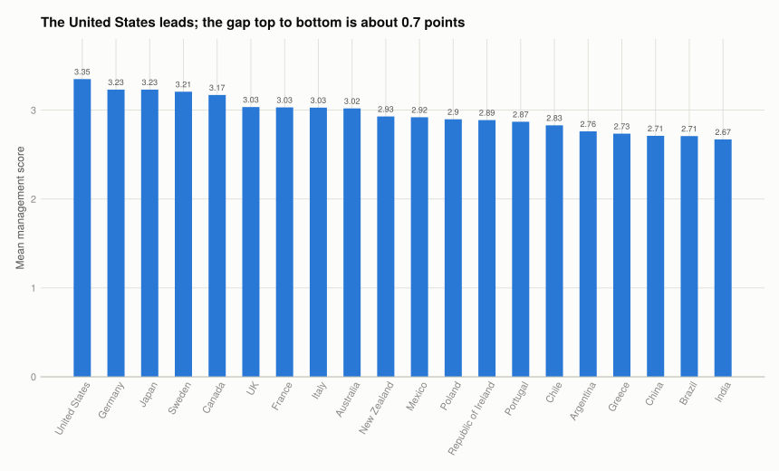
Every one of these reproduces the book’s published figures. The United States leads at 3.35, followed by Germany and Japan at 3.23; India is lowest at 2.67. The book’s list names Great Britain where the data says UK — same value, 3.03.
Comparison with Figure 1 of Bloom et al. The ordering matches: the US clearly ahead, a cluster of European and East Asian economies behind it, then the middle-income countries. The spread is the striking feature — the entire range from best to worst country is about 0.7 points on a 5-point scale, which is smaller than the standard deviation within most individual countries (0.47 to 0.81). Variation between firms inside a country dwarfs variation between country averages. That is the paper’s central finding and Q3 makes it visible.
Q3. Distributions, not just means
Three countries plus the United States, in 0.2-wide bins across the 1–5 range.
const FOCUS = ["United States", "Germany", "Brazil", "India"]
const BREAKS = 1.0:0.2:5.0

freq = DataFrame(bin = freqtable_binned(
    collect(skipmissing(manufacturing[manufacturing.country .== "United States", :management]));
    breaks = BREAKS).bin)

for country in FOCUS
    scores = collect(skipmissing(manufacturing[manufacturing.country .== country, :management]))
    t = freqtable_binned(scores; breaks = BREAKS)
    freq[!, country] = round.(100 .* t.proportion, digits = 1)
end

freq[6:16, :]
11×5 DataFrame
| Row | bin | United States | Germany | Brazil | India |
|---|---|---|---|---|---|
| String | Float64 | Float64 | Float64 | Float64 | |
| 1 | (2, 2.20] | 2.3 | 2.2 | 7.2 | 8.8 |
| 2 | (2.20, 2.40] | 3.8 | 4.2 | 9.1 | 11.5 |
| 3 | (2.40, 2.60] | 4.7 | 3.7 | 10.2 | 9.2 |
| 4 | (2.60, 2.80] | 7.8 | 9.1 | 12.0 | 12.1 |
| 5 | (2.80, 3] | 11.3 | 11.1 | 12.5 | 10.8 |
| 6 | (3, 3.20] | 9.6 | 11.8 | 7.6 | 6.7 |
| 7 | (3.20, 3.40] | 13.4 | 16.4 | 8.6 | 8.2 |
| 8 | (3.40, 3.60] | 9.1 | 11.6 | 5.1 | 4.0 |
| 9 | (3.60, 3.80] | 11.8 | 12.1 | 4.2 | 4.6 |
| 10 | (3.80, 4] | 9.3 | 8.5 | 2.3 | 2.2 |
| 11 | (4, 4.20] | 4.9 | 3.1 | 1.2 | 1.5 |
Percentages rather than counts, because the samples differ by a factor of ten and raw counts would only show that the US sample is large.
us_scores = collect(skipmissing(manufacturing[manufacturing.country .== "United States", :management]))
us_table = freqtable_binned(us_scores; breaks = BREAKS)
centres(t) = (t.lower .+ t.upper) ./ 2

fig = Figure(size = (900, 560))
Label(fig[0, 1:2], "Countries differ less in where the distribution sits than in how wide it is";
      fontsize = 15, font = :bold, color = INK, halign = :left,
      tellwidth = false, padding = (0, 0, 8, 0))

for (i, country) in enumerate(FOCUS)
    r, c = fldmod1(i, 2)
    ax = Axis(fig[r, c]; title = country,
              xlabel = r == 2 ? "Management score" : "",
              ylabel = c == 1 ? "% of firms" : "",
              limits = ((1, 5), (0, 20)))
    # The US distribution behind every panel as the reference.
    barplot!(ax, centres(us_table), 100 .* us_table.proportion;
             width = 0.18, color = (BASELINE, 0.55))
    scores = collect(skipmissing(manufacturing[manufacturing.country .== country, :management]))
    t = freqtable_binned(scores; breaks = BREAKS)
    barplot!(ax, centres(t), 100 .* t.proportion;
             width = 0.11, color = series_color(1))
    c == 2 && hideydecorations!(ax; grid = false)
    r == 1 && hidexdecorations!(ax; grid = false)
end
fig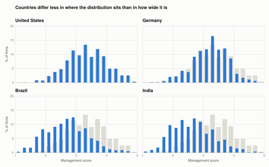
All four distributions are broadly bell-shaped and heavily overlapping. The US panel is the reference against itself. Germany sits close to the US with a slightly tighter spread. Brazil and India are shifted left, but the overlap is the point: a large fraction of Brazilian and Indian firms score above the US average, and a large fraction of US firms score below the Brazilian average. The country means differ; the distributions mostly do not separate.
India’s left tail is the clearest difference — a group of very badly managed firms with no real US counterpart. That tail, rather than a wholesale shift, is much of what moves the mean.
Q4. Box and whisker plots
box_data = manufacturing[in(FOCUS).(manufacturing.country) .&
                         .!ismissing.(manufacturing.management), :]
positions = [findfirst(==(c), FOCUS) for c in box_data.country]

fig = Figure(size = (760, 480))
ax = Axis(fig[1, 1];
          title = "Medians differ by less than the spread within any one country",
          ylabel = "Management score",
          xticks = (1:length(FOCUS), FOCUS))
boxplot!(ax, positions, Float64.(box_data.management);
         width = 0.5, color = series_color(1),
         mediancolor = SURFACE, whiskercolor = BASELINE, strokecolor = BASELINE)
fig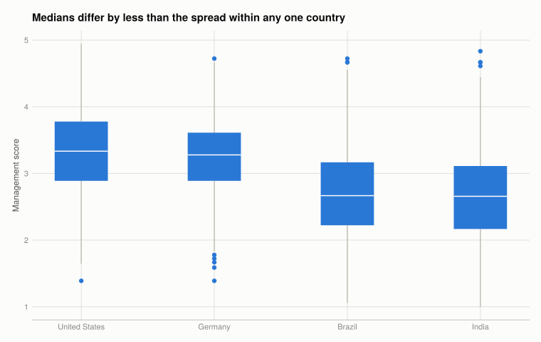
DataFrame(country = FOCUS,
          q25 = [round(quantile(collect(skipmissing(
                    manufacturing[manufacturing.country .== c, :management])), 0.25), digits = 2)
                 for c in FOCUS],
          median = [round(median(collect(skipmissing(
                    manufacturing[manufacturing.country .== c, :management]))), digits = 2)
                 for c in FOCUS],
          q75 = [round(quantile(collect(skipmissing(
                    manufacturing[manufacturing.country .== c, :management])), 0.75), digits = 2)
                 for c in FOCUS])
4×4 DataFrame
| Row | country | q25 | median | q75 |
|---|---|---|---|---|
| String | Float64 | Float64 | Float64 | |
| 1 | United States | 2.89 | 3.33 | 3.78 |
| 2 | Germany | 2.89 | 3.28 | 3.61 |
| 3 | Brazil | 2.22 | 2.67 | 3.17 |
| 4 | India | 2.17 | 2.66 | 3.11 |
The box plots say the same thing as Q3 more compactly, and lose something. They make the overlap of the interquartile ranges immediately obvious — every box overlaps every other box — which is the central point. What they discard is shape: a box plot cannot show that India’s distribution has a long thin left tail rather than being uniformly shifted, because five summary numbers do not encode skew. The histograms and the box plots are worth having together for that reason.
Q5. Hospitals and schools
public_stats = combine(groupby(dropmissing(public_sector, :management), [:ind, :country]),
    :management => mean => :mean,
    :monitoring => (x -> mean(skipmissing(x))) => :monitoring,
    :targets => (x -> mean(skipmissing(x))) => :targets,
    :people => (x -> mean(skipmissing(x))) => :people,
    nrow => :organisations)
sort!(public_stats, [:ind, :mean], rev = [false, true])

select(transform(public_stats, names(public_stats, Float64) .=>
                 ByRow(x -> round(x, digits = 3)); renamecols = false),
       :ind, :country, :organisations, :mean, :monitoring, :targets, :people)
12×7 DataFrame
| Row | ind | country | organisations | mean | monitoring | targets | people |
|---|---|---|---|---|---|---|---|
| String15 | String7 | Int64 | Float64 | Float64 | Float64 | Float64 | |
| 1 | Hospitals | US | 327 | 3.005 | 3.212 | 2.872 | 2.923 |
| 2 | Hospitals | UK | 184 | 2.824 | 3.07 | 2.711 | 2.621 |
| 3 | Hospitals | Germany | 130 | 2.64 | 2.848 | 2.549 | 2.454 |
| 4 | Hospitals | Sweden | 43 | 2.566 | 2.898 | 2.679 | 2.364 |
| 5 | Hospitals | Canada | 175 | 2.524 | 2.823 | 2.44 | 2.173 |
| 6 | Hospitals | Italy | 166 | 2.48 | 2.672 | 2.33 | 2.2 |
| 7 | Hospitals | France | 158 | 2.404 | 2.592 | 2.29 | 2.033 |
| 8 | Schools | UK | 110 | 2.958 | 3.075 | 2.967 | 2.745 |
| 9 | Schools | Sweden | 89 | 2.801 | 3.09 | 2.724 | 2.506 |
| 10 | Schools | Canada | 151 | 2.78 | 2.915 | 2.862 | 2.328 |
| 11 | Schools | US | 285 | 2.725 | 2.881 | 2.625 | 2.474 |
| 12 | Schools | Germany | 143 | 2.538 | 2.695 | 2.494 | 2.262 |
fig = Figure(size = (900, 440))
Label(fig[0, 1:2], "The US leads in hospitals and the UK in schools - and both trail manufacturing";
      fontsize = 15, font = :bold, color = INK, halign = :left,
      tellwidth = false, padding = (0, 0, 8, 0))

for (i, industry) in enumerate(("Hospitals", "Schools"))
    sub = sort(public_stats[public_stats.ind .== industry, :], :mean, rev = true)
    ax = Axis(fig[1, i]; title = industry,
              ylabel = i == 1 ? "Mean management score" : "",
              xticks = (1:nrow(sub), sub.country), xticklabelrotation = pi / 4,
              limits = (nothing, (0, 3.4)))
    barplot!(ax, 1:nrow(sub), sub.mean; width = 0.6, color = series_color(1))
    for (x, v) in zip(1:nrow(sub), sub.mean)
        text!(ax, x, v; text = string(round(v, digits = 2)), fontsize = 10,
              align = (:center, :bottom), offset = (0, 3))
    end
    i == 2 && hideydecorations!(ax; grid = false)
end
colgap!(fig.layout, 28)
fig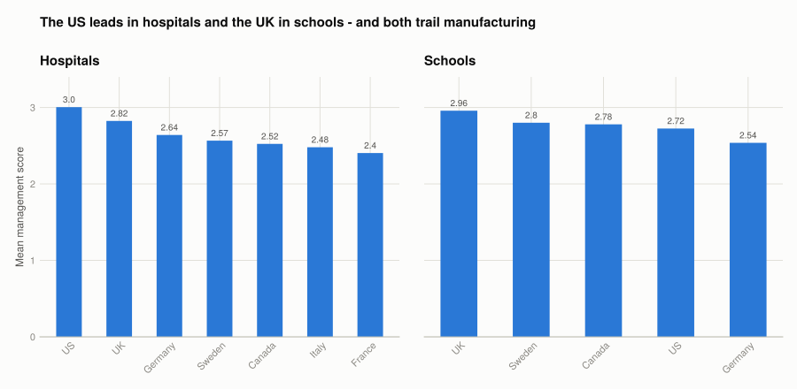
Both reproduce the book exactly. Hospitals: the US leads at 3.00, France lowest at 2.40. Schools: the UK leads at 2.96, Germany lowest at 2.54.
Two things worth noticing. Public-sector scores are lower across the board than manufacturing — every hospital and school average falls below almost every manufacturing country average. And the country ordering changes between sectors: the US leads hospitals but sits fourth of five in schools, while the UK is the reverse.
Plausible explanations. The incentives family is where public organisations score worst, and that is close to mechanical: promotion and dismissal in a public hospital or state school are constrained by tenure rules and collective agreements in ways a manufacturer’s are not, so practices the rubric rewards are often not legally available. Competitive pressure is also weaker — a badly managed factory loses customers, a badly managed school may not.
That the ordering differs by sector is the more interesting fact, because it argues against a single national management culture. Whatever makes the US good at running factories and hospitals does not carry to its schools.
Part 6.2 — How confident can we be?
Every mean in Part 6.1 is an estimate from a sample. A confidence interval says how precise.
Q1. Confidence intervals for four countries
"""
    mean_ci(values; z = 1.96)

Sample mean with the half-width of its 95% confidence interval, `z * s / sqrt(n)`.

The book writes the half-width as `1.96 * sqrt(s^2 / (n - 1))`, which puts `n - 1`
under the root rather than using it in the variance. At these sample sizes the two
agree to three decimal places; the conventional form is used here.
"""
function mean_ci(values; z = 1.96)
    v = collect(skipmissing(values))
    n = length(v)
    m, s = mean(v), std(v)
    return (n = n, mean = m, sd = s, half_width = z * s / sqrt(n))
end

ci_table = DataFrame(country = String[], firms = Int[], mean = Float64[],
                     sd = Float64[], half_width = Float64[],
                     lower = Float64[], upper = Float64[])
for country in FOCUS
    r = mean_ci(manufacturing[manufacturing.country .== country, :management])
    push!(ci_table, (country, r.n, round(r.mean, digits = 3), round(r.sd, digits = 3),
                     round(r.half_width, digits = 3),
                     round(r.mean - r.half_width, digits = 3),
                     round(r.mean + r.half_width, digits = 3)))
end
ci_table
4×7 DataFrame
| Row | country | firms | mean | sd | half_width | lower | upper |
|---|---|---|---|---|---|---|---|
| String | Int64 | Float64 | Float64 | Float64 | Float64 | Float64 | |
| 1 | United States | 1225 | 3.348 | 0.643 | 0.036 | 3.312 | 3.384 |
| 2 | Germany | 646 | 3.23 | 0.569 | 0.044 | 3.186 | 3.274 |
| 3 | Brazil | 569 | 2.708 | 0.685 | 0.056 | 2.651 | 2.764 |
| 4 | India | 720 | 2.67 | 0.68 | 0.05 | 2.621 | 2.72 |
Adding Chile, which the book uses as its contrast with the US:
comparison = DataFrame(country = String[], firms = Int[], mean = Float64[],
                       sd = Float64[], half_width = Float64[])
for country in ("United States", "Chile")
    r = mean_ci(manufacturing[manufacturing.country .== country, :management])
    push!(comparison, (country, r.n, round(r.mean, digits = 2), round(r.sd, digits = 2),
                       round(r.half_width, digits = 3)))
end
comparison
2×5 DataFrame
| Row | country | firms | mean | sd | half_width |
|---|---|---|---|---|---|
| String | Int64 | Float64 | Float64 | Float64 | |
| 1 | United States | 1225 | 3.35 | 0.64 | 0.036 |
| 2 | Chile | 317 | 2.83 | 0.6 | 0.066 |
The book reports a half-width of 0.04 for the US and 0.07 for Chile; the computed values are 0.036 and 0.066. The one difference anywhere in this project: the US firm count is 1,225 here against the book’s 1,224.
fig = Figure(size = (760, 480))
ax = Axis(fig[1, 1];
          title = "Intervals narrow enough that these four countries are distinguishable",
          ylabel = "Mean management score",
          xticks = (1:nrow(ci_table), ci_table.country),
          limits = (nothing, (2.0, 3.7)))
barplot!(ax, 1:nrow(ci_table), ci_table.mean; width = 0.5, color = series_color(1))
errorbars!(ax, 1:nrow(ci_table), ci_table.mean, ci_table.half_width;
           color = INK, whiskerwidth = 12, linewidth = 2)
fig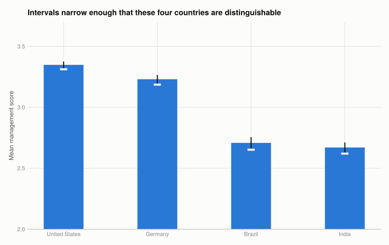
What the interval means. If the sampling were repeated many times, 95% of the intervals constructed this way would contain the true population mean. It is a statement about the procedure, not a 95% probability that this particular interval contains the truth.
Reading the differences. The rule of thumb is that non-overlapping intervals indicate a difference unlikely to be chance. Here none of the four overlap, so the ranking of these four countries is not an artefact of sampling. Note how much narrower the intervals are than the distributions in Q1.3 — with 646 to 1,225 firms per country, the mean is pinned down precisely even though individual firms vary hugely. Those are different quantities and the chart types keep them separate.
A different confidence level changes the multiplier: 1.645 for 90%, 2.576 for 99%. A 99% interval is about 31% wider than a 95% one on the same data. Nothing about the data changes — only how much of the sampling distribution you insist on covering. Demanding more confidence buys it with precision.
Q2. Which public-sector countries differ from the US
public_ci = DataFrame(ind = String[], country = String[], n = Int[],
                      mean = Float64[], half_width = Float64[],
                      lower = Float64[], upper = Float64[])
for industry in ("Hospitals", "Schools")
    sub = public_sector[(public_sector.ind .== industry) .& .!ismissing.(public_sector.management), :]
    for country in sort(unique(sub.country))
        r = mean_ci(sub[sub.country .== country, :management])
        push!(public_ci, (industry, country, r.n, round(r.mean, digits = 3),
                          round(r.half_width, digits = 3),
                          round(r.mean - r.half_width, digits = 3),
                          round(r.mean + r.half_width, digits = 3)))
    end
end
sort!(public_ci, [:ind, :mean], rev = [false, true])
public_ci
12×7 DataFrame
| Row | ind | country | n | mean | half_width | lower | upper |
|---|---|---|---|---|---|---|---|
| String | String | Int64 | Float64 | Float64 | Float64 | Float64 | |
| 1 | Hospitals | US | 327 | 3.005 | 0.059 | 2.946 | 3.063 |
| 2 | Hospitals | UK | 184 | 2.824 | 0.062 | 2.762 | 2.886 |
| 3 | Hospitals | Germany | 130 | 2.64 | 0.066 | 2.574 | 2.707 |
| 4 | Hospitals | Sweden | 43 | 2.566 | 0.131 | 2.435 | 2.698 |
| 5 | Hospitals | Canada | 175 | 2.524 | 0.067 | 2.457 | 2.591 |
| 6 | Hospitals | Italy | 166 | 2.48 | 0.079 | 2.401 | 2.559 |
| 7 | Hospitals | France | 158 | 2.404 | 0.067 | 2.337 | 2.471 |
| 8 | Schools | UK | 110 | 2.958 | 0.074 | 2.884 | 3.032 |
| 9 | Schools | Sweden | 89 | 2.801 | 0.092 | 2.708 | 2.893 |
| 10 | Schools | Canada | 151 | 2.78 | 0.063 | 2.717 | 2.842 |
| 11 | Schools | US | 285 | 2.725 | 0.052 | 2.672 | 2.777 |
| 12 | Schools | Germany | 143 | 2.538 | 0.07 | 2.468 | 2.607 |
fig = Figure(size = (940, 460))
Label(fig[0, 1:2], "Confidently worse than the US in hospitals; in schools, mostly indistinguishable";
      fontsize = 15, font = :bold, color = INK, halign = :left,
      tellwidth = false, padding = (0, 0, 8, 0))

for (i, industry) in enumerate(("Hospitals", "Schools"))
    sub = sort(public_ci[public_ci.ind .== industry, :], :mean, rev = true)
    us = only(sub[sub.country .== "US", :])
    ax = Axis(fig[1, i]; title = industry,
              ylabel = i == 1 ? "Mean management score" : "",
              xticks = (1:nrow(sub), sub.country), xticklabelrotation = pi / 4,
              limits = (nothing, (2.0, 3.3)))
    # The US interval as a band, so "clears the US" is readable directly.
    hspan!(ax, us.lower, us.upper; color = (BASELINE, 0.4))
    scatter!(ax, 1:nrow(sub), sub.mean; color = series_color(1))
    errorbars!(ax, 1:nrow(sub), sub.mean, sub.half_width;
               color = series_color(1), whiskerwidth = 12, linewidth = 2)
    i == 2 && hideydecorations!(ax; grid = false)
end
colgap!(fig.layout, 28)
fig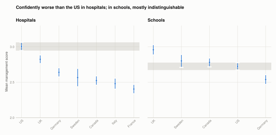
verdicts = DataFrame(ind = String[], country = String[], verdict = String[])
for industry in ("Hospitals", "Schools")
    sub = public_ci[public_ci.ind .== industry, :]
    us = only(sub[sub.country .== "US", :])
    for r in eachrow(sub[sub.country .!= "US", :])
        v = r.upper < us.lower ? "confidently worse" :
            r.lower > us.upper ? "confidently better" : "not distinguishable"
        push!(verdicts, (industry, r.country, v))
    end
end
verdicts
10×3 DataFrame
| Row | ind | country | verdict |
|---|---|---|---|
| String | String | String | |
| 1 | Hospitals | UK | confidently worse |
| 2 | Hospitals | Germany | confidently worse |
| 3 | Hospitals | Sweden | confidently worse |
| 4 | Hospitals | Canada | confidently worse |
| 5 | Hospitals | Italy | confidently worse |
| 6 | Hospitals | France | confidently worse |
| 7 | Schools | UK | confidently better |
| 8 | Schools | Sweden | not distinguishable |
| 9 | Schools | Canada | not distinguishable |
| 10 | Schools | Germany | confidently worse |
Hospitals: every other country’s interval sits entirely below the US band, so all six are confidently worse managed on this measure.
Schools: the picture reverses. Of the four comparisons, only Germany is confidently worse; Canada and Sweden cannot be distinguished from the US despite both having higher point estimates, and the UK is confidently better at 2.96 against 2.73.
Canada and Sweden are the instructive pair. Both look better than the US on the means — 2.78 and 2.80 against 2.73 — and neither difference survives its confidence interval. Reading the ranking off the point estimates alone would assert something the data does not support.
Sample sizes are much smaller in the public files — 43 Swedish hospitals, 89 Swedish schools against 1,225 US manufacturers — so intervals are wide and fewer comparisons resolve. Same measure, same method: how much confidence a country ranking can carry depends on how many organisations were surveyed.
Q3. What determines the interval’s width
drivers = combine(groupby(manufacturing, :country),
    :management => (x -> length(collect(skipmissing(x)))) => :n,
    :management => (x -> std(skipmissing(x))) => :sd)
drivers.half_width = 1.96 .* drivers.sd ./ sqrt.(drivers.n)
sort!(drivers, :half_width, rev = true)

select(transform(drivers, [:sd, :half_width] .=> ByRow(x -> round(x, digits = 4));
                 renamecols = false), :country, :n, :sd, :half_width)
20×4 DataFrame
| Row | country | n | sd | half_width |
|---|---|---|---|---|
| String31 | Int64 | Float64 | Float64 | |
| 1 | Republic of Ireland | 106 | 0.8011 | 0.1525 |
| 2 | New Zealand | 106 | 0.5418 | 0.1032 |
| 3 | Greece | 251 | 0.8084 | 0.1 |
| 4 | Mexico | 189 | 0.6994 | 0.0997 |
| 5 | Japan | 176 | 0.6149 | 0.0909 |
| 6 | Argentina | 249 | 0.7141 | 0.0887 |
| 7 | Portugal | 247 | 0.6262 | 0.0781 |
| 8 | Italy | 289 | 0.6139 | 0.0708 |
| 9 | Poland | 351 | 0.6414 | 0.0671 |
| 10 | Chile | 317 | 0.5988 | 0.0659 |
| 11 | Canada | 385 | 0.6153 | 0.0615 |
| 12 | Australia | 392 | 0.5773 | 0.0571 |
| 13 | Brazil | 569 | 0.6848 | 0.0563 |
| 14 | Sweden | 388 | 0.5453 | 0.0543 |
| 15 | France | 613 | 0.6505 | 0.0515 |
| 16 | India | 720 | 0.6797 | 0.0496 |
| 17 | Germany | 646 | 0.5694 | 0.0439 |
| 18 | UK | 1242 | 0.6788 | 0.0378 |
| 19 | United States | 1225 | 0.6428 | 0.036 |
| 20 | China | 746 | 0.4715 | 0.0338 |
fig = Figure(size = (760, 520))
ax = Axis(fig[1, 1];
          title = "Width falls with the square root of sample size",
          xlabel = "Firms surveyed (log scale)",
          ylabel = "95% CI half-width (log scale)",
          xscale = log10, yscale = log10)
scatter!(ax, drivers.n, drivers.half_width; color = series_color(1))
for name in ("New Zealand", "United States", "UK", "Greece")
    idx = findfirst(==(name), drivers.country)
    idx === nothing && continue
    text!(ax, drivers.n[idx], drivers.half_width[idx]; text = name, fontsize = 11,
          color = MUTED, align = (:left, :center), offset = (7, 0))
end
fig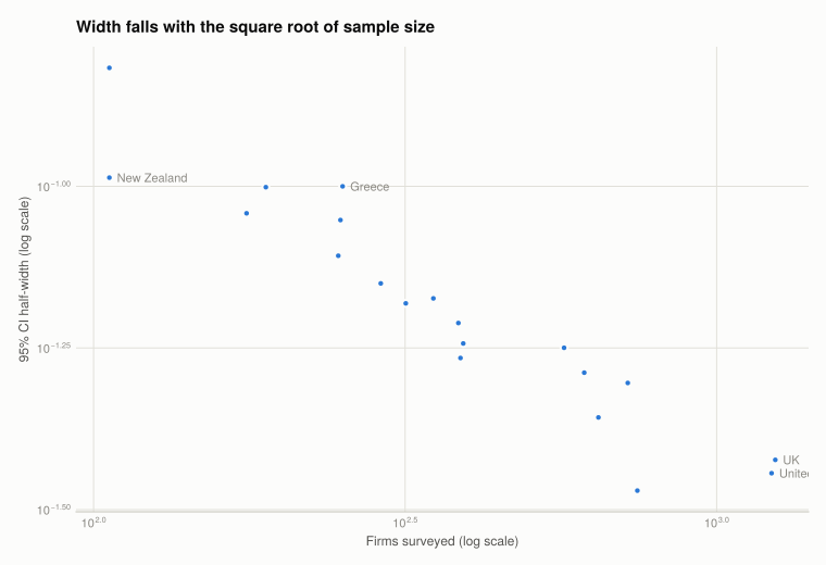
The half-width is \(1.96 \, s / \sqrt{n}\), so it rises with the standard deviation and falls with the square root of the sample size. Both show up in the table:
- Greece has the widest interval despite a mid-sized sample, because its standard deviation is the largest at 0.81 — its firms genuinely differ more from each other.
- New Zealand has a wide interval for the opposite reason: 106 firms, though its spread is the second smallest.
- The UK and US have the narrowest intervals, on more than 1,200 firms each.
The square-root relationship is why precision gets expensive. Halving an interval requires four times the sample. Going from New Zealand’s 106 firms to the UK’s 1,242 — nearly twelve times as many — narrows the interval by only a factor of about three.
Part 6.3 — What management varies with
Q1. Ownership and industry in the public sector
pub_own = DataFrame(ind = String[], ownership = String[], n = Int[],
                    mean = Float64[], half_width = Float64[])
for industry in ("Hospitals", "Schools"), own in sort(unique(public_sector.ownership))
    sub = public_sector[(public_sector.ind .== industry) .&
                        (public_sector.ownership .== own) .&
                        .!ismissing.(public_sector.management), :]
    nrow(sub) < 10 && continue
    r = mean_ci(sub.management)
    push!(pub_own, (industry, own, r.n, round(r.mean, digits = 3),
                    round(r.half_width, digits = 3)))
end
pub_own
4×5 DataFrame
| Row | ind | ownership | n | mean | half_width |
|---|---|---|---|---|---|
| String | String | Int64 | Float64 | Float64 | |
| 1 | Hospitals | Private | 355 | 2.94 | 0.055 |
| 2 | Hospitals | Public | 828 | 2.591 | 0.033 |
| 3 | Schools | Private | 145 | 2.763 | 0.084 |
| 4 | Schools | Public | 632 | 2.737 | 0.033 |
fig = Figure(size = (860, 460))
for (i, industry) in enumerate(("Hospitals", "Schools"))
    sub = pub_own[pub_own.ind .== industry, :]
    ax = Axis(fig[1, i]; title = industry,
              ylabel = i == 1 ? "Mean management score" : "",
              xticks = (1:nrow(sub), sub.ownership),
              limits = (nothing, (2.0, 3.4)))
    barplot!(ax, 1:nrow(sub), sub.mean; width = 0.45, color = series_color(1))
    errorbars!(ax, 1:nrow(sub), sub.mean, sub.half_width;
               color = INK, whiskerwidth = 12, linewidth = 2)
    i == 2 && hideydecorations!(ax; grid = false)
end
colgap!(fig.layout, 28)
fig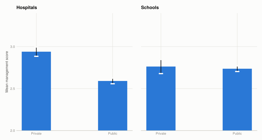
Private organisations score higher than public ones in both sectors, and the intervals separate in hospitals. The gap is not evidence that private ownership causes better management — Q3 is about exactly that problem — but it is a real difference in the practices the rubric measures.
Q2. Firm size and ownership in manufacturing
# `lemp_firm` is log employment, so the median in levels is exp of the median.
median_log_employment = median(skipmissing(manufacturing.lemp_firm))
median_employees = round(exp(median_log_employment), digits = 0)

work = dropmissing(manufacturing[:, [:management, :lemp_firm, :ownership, :country]])
work.size_group = ifelse.(work.lemp_firm .<= median_log_employment,
                          "Smaller (<= $(Int(median_employees)))",
                          "Larger (> $(Int(median_employees)))")

(median_log_employment = round(median_log_employment, digits = 3),
 median_employees = median_employees,
 smaller = sum(work.size_group .!= "Larger (> $(Int(median_employees)))"),
 larger = sum(work.size_group .== "Larger (> $(Int(median_employees)))"))
(median_log_employment = 5.799, median_employees = 330.0, smaller = 4309, larger = 4231)The median firm has 330 employees, matching the threshold the book uses.
const OWNERSHIP_4 = ["Dispersed Shareholders", "Private Individuals",
                     "Founder", "Family owned, family CEO"]

own_size = DataFrame(ownership = String[], size_group = String[], n = Int[],
                     mean = Float64[], half_width = Float64[])
for own in OWNERSHIP_4, grp in unique(work.size_group)
    sub = work[(work.ownership .== own) .& (work.size_group .== grp), :]
    nrow(sub) < 10 && continue
    r = mean_ci(sub.management)
    push!(own_size, (own, grp, r.n, round(r.mean, digits = 3), round(r.half_width, digits = 3)))
end
own_size
8×5 DataFrame
| Row | ownership | size_group | n | mean | half_width |
|---|---|---|---|---|---|
| String | String | Int64 | Float64 | Float64 | |
| 1 | Dispersed Shareholders | Larger (> 330) | 1511 | 3.306 | 0.031 |
| 2 | Dispersed Shareholders | Smaller (<= 330) | 1049 | 3.143 | 0.038 |
| 3 | Private Individuals | Larger (> 330) | 662 | 3.071 | 0.047 |
| 4 | Private Individuals | Smaller (<= 330) | 807 | 2.844 | 0.043 |
| 5 | Founder | Larger (> 330) | 558 | 2.755 | 0.051 |
| 6 | Founder | Smaller (<= 330) | 821 | 2.568 | 0.042 |
| 7 | Family owned, family CEO | Larger (> 330) | 506 | 2.911 | 0.056 |
| 8 | Family owned, family CEO | Smaller (<= 330) | 834 | 2.678 | 0.043 |
larger_label = "Larger (> $(Int(median_employees)))"
groups = [larger_label, "Smaller (<= $(Int(median_employees)))"]

fig = Figure(size = (960, 460))
Label(fig[0, 1:4], "Larger firms score higher under every ownership type";
      fontsize = 15, font = :bold, color = INK, halign = :left,
      tellwidth = false, padding = (0, 0, 8, 0))

for (i, own) in enumerate(OWNERSHIP_4)
    sub = own_size[own_size.ownership .== own, :]
    ax = Axis(fig[1, i]; title = replace(own, ", " => ",\n"),
              ylabel = i == 1 ? "Mean management score" : "",
              xticks = (1:2, ["Larger", "Smaller"]),
              limits = (nothing, (2.0, 3.8)))
    for (j, grp) in enumerate(groups)
        row = sub[sub.size_group .== grp, :]
        isempty(row) && continue
        barplot!(ax, [j], row.mean; width = 0.45, color = series_color(j),
                 label = j == 1 ? "Larger" : "Smaller")
        errorbars!(ax, [j], row.mean, row.half_width;
                   color = INK, whiskerwidth = 10, linewidth = 2)
    end
    i > 1 && hideydecorations!(ax; grid = false)
end
fig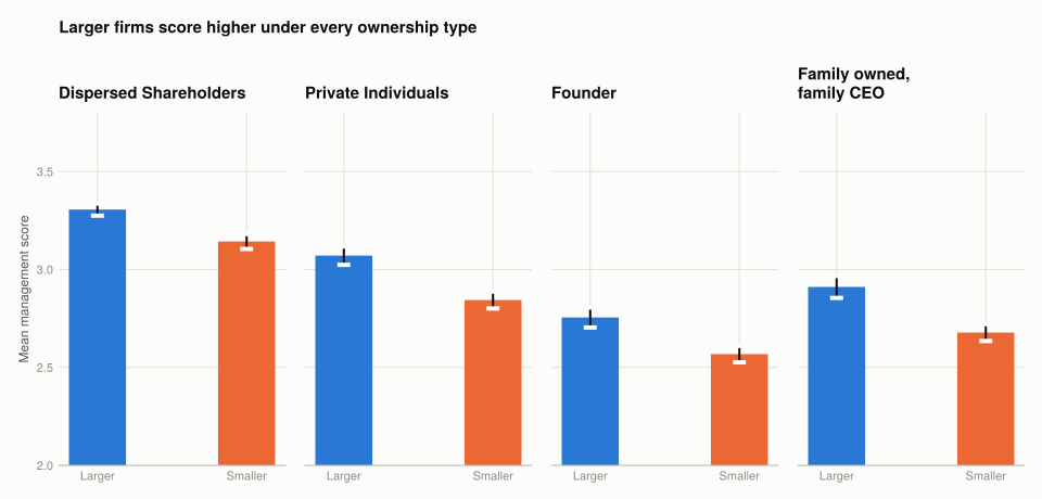
Two patterns, both consistent across ownership types:
- Larger firms score higher, in every category, and the intervals separate in most.
- Ownership matters and the ordering is stable. Firms with dispersed shareholders score highest; founder-run and family-owned-with-a-family-CEO firms score lowest. The book’s numbers for Brazil and the US show the same ranking within each country.
The family-CEO result is the one the paper emphasises: firms that pass management to a family member score materially worse than those recruiting externally, and the gap persists after controlling for size and country.
Q3. Which way does the causation run?
Every relationship in Q1 and Q2 is a correlation. For each, the reverse story is also plausible.
Manager education. The obvious reading is that better-educated managers run firms better. Reversed: well-managed firms are more profitable, can pay more, and so attract managers with better credentials — the education follows the management quality. There is also a common cause: firms in richer regions face both a better-educated labour pool and stronger product-market competition. Plausible mechanisms in both directions, and the data cannot separate them.
Number of competitors. Forward: competition kills badly managed firms and forces survivors to improve. Reversed: well-managed firms are more productive, cut prices, and drive competitors out — so good management reduces the competitor count, giving a negative relationship from the opposite direction. Worse, the measure is self-reported: managers who monitor their market carefully may simply be more aware of competitors, so the variable partly measures the management practice it is meant to explain.
Firm size. Forward: large firms need formal monitoring and targets because informal oversight does not scale, and can spread the fixed cost of good management systems over more output. Reversed: well-managed firms grow. This is the cleanest case for reverse causation of the three — growth is exactly what good management should produce, so a size–management correlation is close to what the hypothesis predicts either way.
Q4. The field experiment
The correlational evidence cannot settle this, which is why Bloom et al. ran a randomised experiment on Indian textile firms.
The design. Large multi-plant textile firms near Mumbai were randomly split. Treatment plants received five months of free management consulting implementing the practices the survey scores — inventory control, quality monitoring, preventive maintenance, production scheduling. Control plants received only a one-month diagnostic, so both groups were measured equally and only the implementation differed.
Why randomisation is the point. It breaks every reverse-causal channel in Q3 at once. Treated plants were not chosen for being ambitious, well-run or fast-growing — a coin decided. Any subsequent difference is caused by the consulting, because nothing else systematically distinguished the groups beforehand. This is the same logic as Project 2’s period 1 comparison and Project 3’s parallel pre-trends, achieved by design rather than argued for after the fact.
The results. Treated plants adopted a substantial share of the recommended practices, and productivity rose roughly 17% within a year — from better quality, less downtime and lower inventory rather than from working harder. Firms also expanded, opening new plants faster than controls.
Reading Figure 12. The productivity series for the two groups track each other before the intervention and separate after it, with the gap persisting rather than fading. The persistence matters: a temporary Hawthorne-style response to being studied would decay, and this does not.
What it does not settle. One industry, one region, large firms, and consulting that was free — the firms did not choose to pay for it. If good management raises productivity 17%, the obvious question is why firms had not adopted it already. The paper’s answer is that managers did not know these practices existed or believed they were already following them, which is an argument about information rather than about incentives — and that answer is specific to this setting rather than general.
What this project covered
| Concept | Where | In Julia |
|---|---|---|
| Reading one file from a zip | Setup | ZipFile.Reader, CSV.read(read(f), ...) |
| Dropping junk columns | Setup | select on a filtered name list |
| Grouped means and counts | Q6.1 Q2 | combine(groupby(df, :country), ...) |
| Frequency tables on fixed bins | Q6.1 Q3 | freqtable_binned(x; breaks) |
| Reference distribution behind a facet | Q6.1 Q3 | two barplot! calls, grey then colour |
| Box plots | Q6.1 Q4 | boxplot!(ax, positions, values) |
| Confidence interval | Q6.2 Q1 | 1.96 * std(v) / sqrt(length(v)) |
| Error bars | Q6.2 Q1 | errorbars!(ax, x, y, half_width) |
| A reference interval as a band | Q6.2 Q2 | hspan!(ax, lower, upper) |
| Median split on a log variable | Q6.3 Q2 | compare in logs, report exp of the median |
| Log-log scatter | Q6.2 Q3 | Axis(...; xscale = log10, yscale = log10) |
The R → Julia page has the full translation table.