Doing Economics in Julia
  • Home
  • Setup
  • R → Julia
  1. Empirical projects
  2. 7. Supply and demand
  • Getting started
    • Overview
    • Setup
  • Empirical projects
    • 1. Measuring climate change
    • 2. Data from experiments
    • 3. Measuring a sugar tax
    • 4. Measuring wellbeing
    • 5. Measuring inequality
    • 6. Management practices
    • 7. Supply and demand
    • 8. Cost of unemployment
    • 9. Credit-excluded households
    • 10. Banking systems
    • 11. Willingness to pay
    • 12. Hong Kong cash handout
    • Extra 2. Carbon taxation
  • Reference
    • R → Julia
    • Technical reference

On this page

  • Part 7.1 — Supply, demand and equilibrium
    • Q1. Price and quantity over time
    • Q2. Supply and demand curves
    • Q3. A negative supply shock
  • Part 7.2 — Elasticities and shifts
    • Q1. Price elasticities
    • Q2. The supply equation
    • Q3. The demand equation
    • Q4. Exogenous demand shocks, and why identification needs them
    • What this project covered
  • View source
  • Report an issue
  1. Empirical projects
  2. 7. Supply and demand

7. Supply and demand

Fitting curves to a market, and why you cannot see either one directly

The US watermelon market, 1930–1951, from Henry Suits’ 1955 study. Watermelons are a good teaching market: the crop is planted months before it is sold, so supply in any year is effectively fixed by decisions made earlier, which is what makes it possible to separate the supply curve from the demand curve at all.

  • Part 7.1 — supply, demand, and equilibrium
  • Part 7.2 — elasticities and what shifts each curve

New concepts: the natural log transformation, elasticity read off a log-log slope, and simultaneity — the reason a scatter of price against quantity traces out neither curve. Book pages: project, R walk-through, solutions.

using XLSX, DataFrames
using Statistics
using CairoMakie
using DoingEconomics

CairoMakie.activate!(type = "svg")
use_doingecon_theme!()
# `log.pv` and `log.w` contain the string "NA", which is what the book's `na = "NA"`
# handles. Column names use dots, so they need string indexing rather than symbols.
melons = DataFrame(XLSX.readtable(rawpath("07", "watermelon-market.xlsx"), "Sheet1";
                                  infer_eltypes = true))
for col in names(melons)
    if eltype(melons[!, col]) === Any
        melons[!, col] = [v isa Number ? Float64(v) : missing for v in melons[!, col]]
    end
end

(rows = nrow(melons), years = extrema(melons.Year), columns = names(melons))
(rows = 22, years = (1930, 1951), columns = ["Year", "log.q", "log.h", "log.p", "log.pc", "log.pv", "log.w", "log.n", "log.y_n", "log.pf"])
ImportantThese logs are base 10, not natural

The book states that “whenever log (or ln) is used in economics, it refers to natural logarithms”, and Q1 asks you to recover levels with exp(). Applied to this file that gives quantities of about 5 to 7 — for a series whose actual values are 48 to 86.

The population column settles it, because US population is independently known:

known_population = [(1930, 123.2), (1940, 132.2), (1950, 151.3), (1951, 154.9)]

DataFrame(year = first.(known_population),
          log_n = [only(melons[melons.Year .== y, "log.n"]) for (y, _) in known_population],
          natural = [round(exp(only(melons[melons.Year .== y, "log.n"])), digits = 2)
                     for (y, _) in known_population],
          base_10 = [round(10^only(melons[melons.Year .== y, "log.n"]), digits = 2)
                     for (y, _) in known_population],
          actual_millions = last.(known_population))
4×5 DataFrame
Row year log_n natural base_10 actual_millions
Int64 Float64 Float64 Float64 Float64
1 1930 2.09 8.08 123.03 123.2
2 1940 2.121 8.34 132.13 132.2
3 1950 2.181 8.86 151.71 151.3
4 1951 2.189 8.93 154.53 154.9

10^log.n matches the true population to within 0.4%. exp(log.n) is not a population at all. So this project uses base 10 to recover levels, and says so wherever it matters.

Elasticities are unaffected. A log-log slope is a percentage elasticity whatever base the logs use, because changing base multiplies both sides by the same constant. Only the levels recovered by exponentiating depend on it — which is why the error is easy to miss.

Part 7.1 — Supply, demand and equilibrium

Q1. Price and quantity over time

melons.price = 10 .^ melons[!, "log.p"]
melons.quantity = 10 .^ melons[!, "log.q"]
melons.harvest = 10 .^ melons[!, "log.h"]

select(first(melons, 6), :Year, "log.p", :price, "log.q", :quantity)
6×5 DataFrame
Row Year log.p price log.q quantity
Int64 Float64 Float64 Float64 Float64
1 1930 2.068 116.95 1.932 85.5067
2 1931 2.004 100.925 1.892 77.983
3 1932 1.897 78.886 1.826 66.9885
4 1933 1.968 92.8966 1.751 56.3638
5 1934 2.017 103.992 1.779 60.1174
6 1935 1.982 95.9401 1.822 66.3743
fig = Figure(size = (900, 420))
Label(fig[0, 1:2], "Price rises sharply through the war; quantity drifts down";
      fontsize = 15, font = :bold, color = INK, halign = :left,
      tellwidth = false, padding = (0, 0, 8, 0))

specs = [(:price, "Price", "Price (index)", 1), (:quantity, "Quantity", "Millions of melons", 2)]
for (col, title, ylab, i) in specs
    ax = Axis(fig[1, i]; title = title, xlabel = "Year", ylabel = ylab)
    lines!(ax, melons.Year, melons[!, col]; color = series_color(i))
    scatter!(ax, melons.Year, melons[!, col]; color = series_color(i), markersize = 7)
    # 1942-1945: wartime, when the series behave differently.
    vspan!(ax, 1942, 1945; color = (BASELINE, 0.35))
end
colgap!(fig.layout, 28)
fig
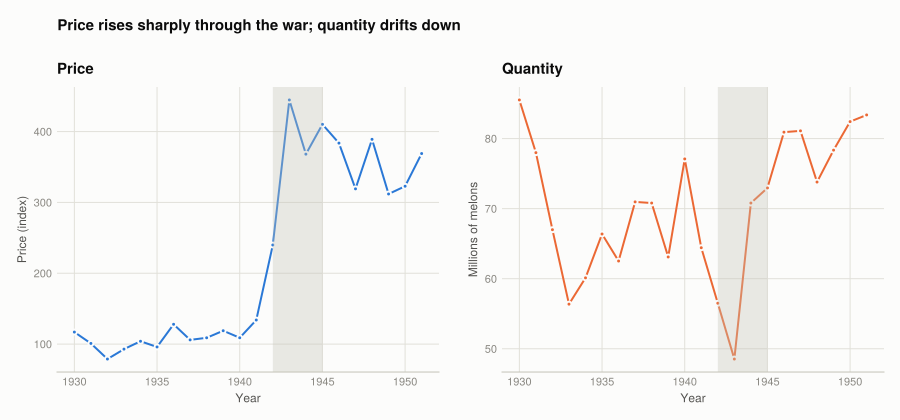
Figure 1: Watermelon price and quantity, 1930–1951. Two panels rather than one: price is an index and quantity is millions of melons, so a single axis would need two scales — and the alignment of two scales is arbitrary.

Price is flat through the 1930s and then rises steeply from about 1942 — the shaded war years — roughly quadrupling by the end of the sample. Quantity moves in a much narrower band and drifts downward. Rising price with falling quantity is the signature of supply contracting rather than demand growing, which Part 7.2’s supply equation confirms: it carries a WWII coefficient of −0.36.

Q2. Supply and demand curves

The book works with a stylised version of the market rather than Suits’ full estimates:

\[\log P = -2.0 + 1.7 \log Q \quad \text{(supply)} \qquad \log P = 8.5 - 0.82 \log Q \quad \text{(demand)}\]

These are stated in natural logs — a separate convention from the data file, and the one that reproduces the book’s published prices.

supply_log_price(log_q) = -2.0 + 1.7 * log_q
demand_log_price(log_q) = 8.5 - 0.82 * log_q

curves = DataFrame(Q = 20:5:100)
curves.log_Q = log.(curves.Q)
curves.supply_log_P = round.(supply_log_price.(curves.log_Q), digits = 3)
curves.demand_log_P = round.(demand_log_price.(curves.log_Q), digits = 3)
curves.supply_P = round.(exp.(supply_log_price.(curves.log_Q)), digits = 2)
curves.demand_P = round.(exp.(demand_log_price.(curves.log_Q)), digits = 2)

curves
17×6 DataFrame
Row Q log_Q supply_log_P demand_log_P supply_P demand_P
Int64 Float64 Float64 Float64 Float64 Float64
1 20 2.99573 3.093 6.043 22.04 421.37
2 25 3.21888 3.472 5.861 32.2 350.91
3 30 3.4012 3.782 5.711 43.91 302.18
4 35 3.55535 4.044 5.585 57.06 266.3
5 40 3.68888 4.271 5.475 71.6 238.68
6 45 3.80666 4.471 5.379 87.47 216.7
7 50 3.91202 4.65 5.292 104.63 198.77
8 55 4.00733 4.812 5.214 123.03 183.83
9 60 4.09434 4.96 5.143 142.65 171.17
10 65 4.17439 5.096 5.077 163.44 160.29
11 70 4.2485 5.222 5.016 185.39 150.84
12 75 4.31749 5.34 4.96 208.46 142.55
13 80 4.38203 5.449 4.907 232.63 135.2
14 85 4.44265 5.553 4.857 257.88 128.64
15 90 4.49981 5.65 4.81 284.2 122.75
16 95 4.55388 5.742 4.766 311.56 117.43
17 100 4.60517 5.829 4.724 339.95 112.59

At Q = 65 the supply price is 163.44 and the demand price 160.29, matching the book exactly.

# Setting the two expressions equal: -2.0 + 1.7 q = 8.5 - 0.82 q, so q = 10.5 / 2.52.
log_q_star = 10.5 / 2.52
q_star = exp(log_q_star)
p_star = exp(supply_log_price(log_q_star))

(log_Q_star = round(log_q_star, digits = 4), Q_star = round(q_star, digits = 2),
 log_P_star = round(supply_log_price(log_q_star), digits = 4), P_star = round(p_star, digits = 2))
(log_Q_star = 4.1667, Q_star = 64.5, log_P_star = 5.0833, P_star = 161.31)

Equilibrium is where the curves cross: Q* ≈ 64.5, P* ≈ 161.3. The table brackets it — supply is below demand at Q = 60 and above it at Q = 65.

q_grid = 20:0.5:100

fig = Figure(size = (780, 560))
ax = Axis(fig[1, 1];
          title = "Equilibrium at Q ≈ $(round(q_star, digits = 1)), P ≈ $(round(p_star, digits = 0))",
          xlabel = "Quantity (millions of melons)", ylabel = "Price")
lines!(ax, q_grid, exp.(supply_log_price.(log.(q_grid)));
       color = series_color(1), label = "Supply")
lines!(ax, q_grid, exp.(demand_log_price.(log.(q_grid)));
       color = series_color(2), label = "Demand")
scatter!(ax, [q_star], [p_star]; color = INK, markersize = 11)
text!(ax, q_star, p_star; text = "  equilibrium", align = (:left, :center),
      fontsize = 11, color = INK)
axislegend(ax; position = :rt, framevisible = false)
fig
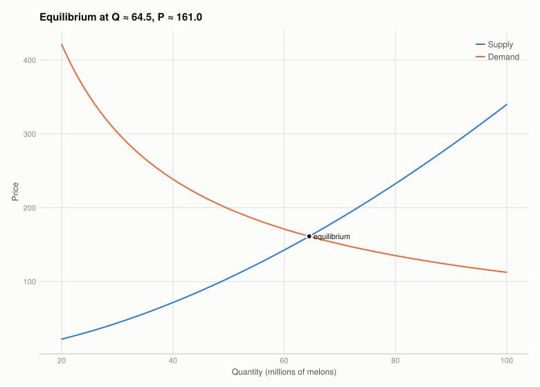
Figure 2: Supply and demand for watermelons, from the stylised model. Both curves are drawn in price–quantity space with quantity on the horizontal axis, following the convention in the book.

The supply curve slopes up and the demand curve down, and both are curved rather than straight because a linear relationship in logs is a power relationship in levels.

Q3. A negative supply shock

A drought or a disease outbreak shifts supply left: at any price, less is offered. In the log specification that is a fall in the intercept.

shocked_supply_log_price(log_q) = -1.4 + 1.7 * log_q   # intercept -2.0 -> -1.4

log_q_shock = (8.5 + 1.4) / (1.7 + 0.82)
q_shock = exp(log_q_shock)
p_shock = exp(shocked_supply_log_price(log_q_shock))

DataFrame(scenario = ["Before shock", "After shock"],
          Q = round.([q_star, q_shock], digits = 2),
          P = round.([p_star, p_shock], digits = 2),
          Q_change_pct = round.([0.0, 100 * (q_shock - q_star) / q_star], digits = 1),
          P_change_pct = round.([0.0, 100 * (p_shock - p_star) / p_star], digits = 1))
2×5 DataFrame
Row scenario Q P Q_change_pct P_change_pct
String Float64 Float64 Float64 Float64
1 Before shock 64.5 161.31 0.0 0.0
2 After shock 50.83 196.09 -21.2 21.6
fig = Figure(size = (820, 580))
ax = Axis(fig[1, 1];
          title = "Supply contracts: quantity falls $(abs(round(100*(q_shock-q_star)/q_star, digits = 0)))%, price rises $(round(100*(p_shock-p_star)/p_star, digits = 0))%",
          xlabel = "Quantity (millions of melons)", ylabel = "Price",
          limits = ((20, 100), (0, 600)))

demand_p = exp.(demand_log_price.(log.(q_grid)))

# Consumer surplus: between the demand curve and the new price, up to the new quantity.
inside = q_grid .<= q_shock
band!(ax, q_grid[inside], fill(p_shock, sum(inside)), demand_p[inside];
      color = (series_color(2), 0.18))
# Producer surplus: between the new price and the new supply curve.
band!(ax, q_grid[inside], exp.(shocked_supply_log_price.(log.(q_grid[inside]))),
      fill(p_shock, sum(inside)); color = (series_color(3), 0.22))

lines!(ax, q_grid, demand_p; color = series_color(2), label = "Demand")
lines!(ax, q_grid, exp.(supply_log_price.(log.(q_grid)));
       color = (series_color(1), 0.45), linestyle = :dash, label = "Supply (before)")
lines!(ax, q_grid, exp.(shocked_supply_log_price.(log.(q_grid)));
       color = series_color(1), label = "Supply (after)")

scatter!(ax, [q_star, q_shock], [p_star, p_shock]; color = INK, markersize = 10)
axislegend(ax; position = :rt, framevisible = false)
fig
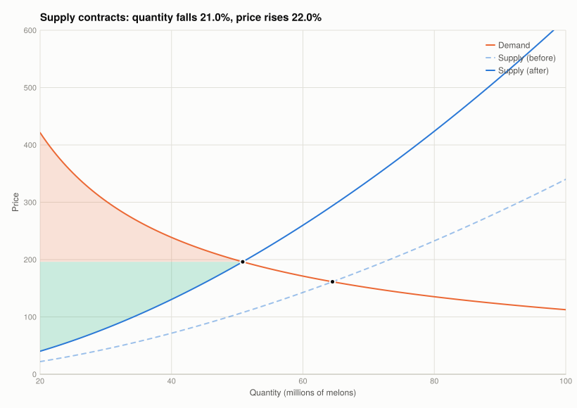
Figure 3: A negative supply shock. Quantity falls and price rises; the shaded regions are consumer surplus above the equilibrium price and producer surplus below it, after the shock.

What happens to surplus. Quantity falls and price rises, and all three measures shrink:

  • Consumer surplus falls unambiguously. Consumers buy less and pay more for each unit, so both the height and the width of their surplus triangle shrink.
  • Total surplus falls. Fewer units are traded, and every unit no longer traded was one whose value to a consumer exceeded its cost of production. That lost value is the deadweight cost of the shock.
  • Producer surplus also falls here, which is worth stating because it is not automatic. A higher price per unit pulls producer surplus up while the smaller quantity and higher costs pull it down. Which dominates depends on the elasticity of demand:
revenue_before = p_star * q_star
revenue_after = p_shock * q_shock
(revenue_before = round(revenue_before, digits = 0),
 revenue_after = round(revenue_after, digits = 0),
 revenue_change_pct = round(100 * (revenue_after - revenue_before) / revenue_before, digits = 1))
(revenue_before = 10405.0, revenue_after = 9968.0, revenue_change_pct = -4.2)

Quantity falls 21.2% while price rises 21.6%, so revenue falls about 4.2% — and producers are selling that smaller quantity from a higher cost curve, so surplus falls on both counts.

The reason is elastic demand. With an elasticity of 1.22, a contraction in supply raises price proportionally less than it cuts quantity, so revenue shrinks. Had demand been inelastic, price would have risen more than quantity fell and producers could have gained from a bad harvest — which is the standard explanation for why agricultural price supports and supply restrictions can help farmers in markets for staples.

So “a bad harvest hurts farmers” is not a general truth. It holds when demand is elastic, as it is for a discretionary fruit with close substitutes, and reverses when demand is inelastic, as it is for staples.

Part 7.2 — Elasticities and shifts

Q1. Price elasticities

Inverting the stylised curves puts quantity on the left, which is the form whose slope is the elasticity:

# log P = -2.0 + 1.7 log Q  =>  log Q = (2.0 + log P) / 1.7
# log P =  8.5 - 0.82 log Q =>  log Q = (8.5 - log P) / 0.82
DataFrame(curve = ["Supply", "Demand"],
          intercept = round.([2.0 / 1.7, 8.5 / 0.82], digits = 2),
          elasticity = round.([1 / 1.7, -1 / 0.82], digits = 2),
          verdict = ["inelastic (|e| < 1)", "elastic (|e| > 1)"])
2×4 DataFrame
Row curve intercept elasticity verdict
String Float64 Float64 String
1 Supply 1.18 0.59 inelastic (|e| < 1)
2 Demand 10.37 -1.22 elastic (|e| > 1)

Supply: \(\log Q = 1.18 + 0.59 \log P\). Demand: \(\log Q = 10.37 - 1.22 \log P\). Both match the book.

Price elasticity of supply is 0.59 — inelastic. A 10% price rise brings only about 5.9% more melons. That is what you would expect from a crop planted months before it is sold: by the time the price is known, the acreage is committed, so the only response available within the season is at the margin of whether to harvest and ship.

Price elasticity of demand is 1.22 — elastic. A 10% price rise cuts quantity demanded by about 12.2%. Also unsurprising: a watermelon is a discretionary purchase with close substitutes, so buyers switch to other fruit rather than pay more.

The two together explain the shock result in Q1.3. Inelastic supply means a shift in supply moves quantity little and price a lot; elastic demand means the price rise is not enough to compensate producers for the lost volume.

Q2. The supply equation

Suits’ estimated supply equation:

\[\log Q_t = 2.42 + 0.58 \log P_{t-1} - 0.32 \log C_{t-1} - 0.12 \log T_{t-1} + 0.07\, CP_t - 0.36\, WW2_t\]

DataFrame(
    variable = ["Lagged watermelon price", "Lagged cotton price", "Lagged vegetable price",
                "Cotton acreage programme", "Second World War"],
    symbol = ["log P(t-1)", "log C(t-1)", "log T(t-1)", "CP", "WW2"],
    coefficient = [0.580, -0.321, -0.124, 0.073, -0.360],
    interpretation = ["own-price elasticity", "cross-price elasticity",
                      "cross-price elasticity", "shift (dummy)", "shift (dummy)"])
5×4 DataFrame
Row variable symbol coefficient interpretation
String String Float64 String
1 Lagged watermelon price log P(t-1) 0.58 own-price elasticity
2 Lagged cotton price log C(t-1) -0.321 cross-price elasticity
3 Lagged vegetable price log T(t-1) -0.124 cross-price elasticity
4 Cotton acreage programme CP 0.073 shift (dummy)
5 Second World War WW2 -0.36 shift (dummy)

Everything is lagged one year, and that is the identifying assumption rather than a technical detail. Planting decisions respond to last year’s prices because this year’s are unknown at planting. It also means supply is predetermined with respect to this year’s demand, which is what lets the two curves be separated at all — Q4 returns to this.

  • Own price, +0.58. A 1% higher watermelon price last year raises this year’s crop 0.58%. Inelastic, and consistent with the 0.59 from the stylised model.
  • Cotton price, −0.32 and vegetable price, −0.12. Both negative, because these are competing uses of the same land: when cotton is more valuable, farmers plant cotton. Both are smaller than 1 in absolute value, so substitution is real but partial — land is not freely switchable.
  • Cotton programme, +0.07. The federal programme restricted cotton acreage, pushing land into other crops including watermelons. Positive, as the mechanism predicts.
  • Second World War, −0.36. The largest coefficient in the equation. Labour, fuel and rail capacity were diverted to the war effort, so less was planted and shipped. This is the coefficient that explains the price spike in Figure 1.

Q3. The demand equation

\[\log (X_t/N_t) = \alpha_0 - 1.13 \log P_t + 1.75 \log(Y_t/N_t) - 0.97 \log F_t\]

DataFrame(
    variable = ["Watermelon price", "Income per capita", "Railway freight cost"],
    symbol = ["log P(t)", "log Y/N(t)", "log F(t)"],
    coefficient = [-1.125, 1.750, -0.968],
    interpretation = ["own-price elasticity", "income elasticity", "cost pass-through"])
3×4 DataFrame
Row variable symbol coefficient interpretation
String String Float64 String
1 Watermelon price log P(t) -1.125 own-price elasticity
2 Income per capita log Y/N(t) 1.75 income elasticity
3 Railway freight cost log F(t) -0.968 cost pass-through

The dependent variable is quantity per capita, which handles population growth by construction rather than by including population as a regressor.

  • Own price, −1.13. Elastic, close to the stylised model’s 1.22. A 1% price rise cuts consumption per head by 1.13%.
  • Income per capita, +1.75. Greater than 1, which makes watermelons a luxury in the technical sense: as income rises, spending on them rises more than proportionally. Plausible for a fresh, perishable, non-essential fruit in the 1930s and 40s.
  • Freight cost, −0.97. Almost exactly −1. Watermelons are heavy, bulky and perishable, so rail freight is a large share of delivered cost, and a 1% rise in freight cuts quantity about 1%. This is the variable that makes the demand curve identifiable — it shifts what consumers pay without shifting what farmers decide to plant.

The book notes the demand coefficients have wide confidence intervals, which is the honest caveat: 22 annual observations is a very small sample for estimating four parameters, so these point estimates are imprecise even where the signs are clear.

Q4. Exogenous demand shocks, and why identification needs them

An exogenous shock shifts one curve without being caused by anything in the market itself. That property is what makes it useful, and the reason is the simultaneity problem.

Every observed price–quantity pair is an intersection of supply and demand. Plotting the data directly traces out neither curve:

fig = Figure(size = (760, 540))
ax = Axis(fig[1, 1];
          title = "Observed pairs are intersections, so this scatter is neither curve",
          xlabel = "Quantity (millions of melons)", ylabel = "Price")
scatter!(ax, melons.quantity, melons.price; color = series_color(1))
for i in (argmin(melons.Year), argmax(melons.price), argmax(melons.Year))
    text!(ax, melons.quantity[i], melons.price[i]; text = string(melons.Year[i]),
          fontsize = 11, color = MUTED, align = (:left, :center), offset = (7, 0))
end
fig
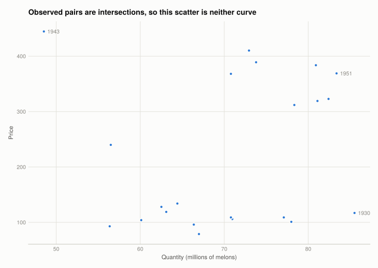
Figure 4: Observed price against quantity, 1930–1951. Each point is an equilibrium, not a point on either curve — which is why the cloud has no useful slope.
q = log.(melons.quantity); p = log.(melons.price)
naive_slope = cov(q, p) / var(q)
(naive_slope_of_logP_on_logQ = round(naive_slope, digits = 3),
 correlation = round(cor(q, p), digits = 3))
(naive_slope_of_logP_on_logQ = 0.777, correlation = 0.184)

The naive slope is +0.78, with a correlation of only 0.18. Read as a demand curve that is nonsense — it says quantity and price rise together, so demand would slope upward. Read as a supply curve it is also wrong, since the supply relationship in this model has slope 1.7.

It is neither, because it is a mixture of both, weighted by how much each curve happened to shift over these 22 years. Supply moved a great deal (the war, the cotton programme) and demand moved too (income, freight), so the intersections wander across the plane and their slope estimates nothing. Separating the curves requires variables that shift one and not the other.

Two exogenous demand shocks, and why each qualifies:

  1. Railway freight rates — the F in the demand equation. Rates were set by regulated tariffs and by conditions in the rail industry, both determined outside the watermelon market. They change what consumers pay per melon without changing the growing conditions or planting incentives farmers face. A watermelon farmer’s acreage decision does not move national freight tariffs, so the causation runs one way.

  2. Per-capita income — the Y/N term. Aggregate income is driven by the macroeconomy: the Depression, wartime employment, post-war expansion. Watermelons are far too small a share of national spending for the market to affect national income, so income shifts demand while being unaffected by it.

What makes them exogenous is the absence of a reverse channel, and it has to be argued mechanism by mechanism rather than asserted. A weather shock, by contrast, is exogenous to the supply side but would be a poor demand shifter — hot weather raises watermelon demand and affects the crop, so it shifts both curves and identifies neither.

The symmetric point completes the argument. Suits identifies demand using freight and income, which shift demand only; and supply using lagged prices, the cotton programme and the war, which shift supply only. Each curve is traced out by variation that moves the other one along it. That is the whole method, and it is why the equations in Q2 and Q3 contain the variables they do.

What this project covered

Concept Where In Julia
Recovering levels from logs Q7.1 Q1 10 .^ x (base 10 here, not exp)
Verifying a log base against known data Setup compare exp and 10^ with US population
Shading a period on a chart Q7.1 Q1 vspan!(ax, 1942, 1945)
Curves from a function over a grid Q7.1 Q2 lines!(ax, grid, f.(log.(grid)))
Solving for equilibrium Q7.1 Q2 set the expressions equal, solve for log Q
Shading surplus regions Q7.1 Q3 band!(ax, x, lower, upper)
Elasticity from a log-log slope Q7.2 Q1 invert the curve; the slope is the elasticity
Dot-named columns Setup df[!, "log.p"], not df.log.p

The R → Julia page has the full translation table.

6. Management practices
8. Cost of unemployment
Source Code
---
title: "7. Supply and demand"
subtitle: "Fitting curves to a market, and why you cannot see either one directly"
engine: julia
julia:
  exeflags: ["--project=@."]
---

The US watermelon market, 1930–1951, from Henry Suits' 1955 study. Watermelons are a good
teaching market: the crop is planted months before it is sold, so supply in any year is
effectively fixed by decisions made earlier, which is what makes it possible to separate the
supply curve from the demand curve at all.

- **[Part 7.1](#part-7.1)** — supply, demand, and equilibrium
- **[Part 7.2](#part-7.2)** — elasticities and what shifts each curve

New concepts: the **natural log transformation**, elasticity read off a log-log slope, and
**simultaneity** — the reason a scatter of price against quantity traces out neither curve. Book
pages: [project](https://books.core-econ.org/doing-economics/book/text/07-01.html),
[R walk-through](https://books.core-econ.org/doing-economics/book/text/07-03.html),
[solutions](https://books.core-econ.org/doing-economics/book/text/07-04.html).

```{julia}
#| label: setup
#| output: false
using XLSX, DataFrames
using Statistics
using CairoMakie
using DoingEconomics

CairoMakie.activate!(type = "svg")
use_doingecon_theme!()
```

```{julia}
#| label: read-watermelon
# `log.pv` and `log.w` contain the string "NA", which is what the book's `na = "NA"`
# handles. Column names use dots, so they need string indexing rather than symbols.
melons = DataFrame(XLSX.readtable(rawpath("07", "watermelon-market.xlsx"), "Sheet1";
                                  infer_eltypes = true))
for col in names(melons)
    if eltype(melons[!, col]) === Any
        melons[!, col] = [v isa Number ? Float64(v) : missing for v in melons[!, col]]
    end
end

(rows = nrow(melons), years = extrema(melons.Year), columns = names(melons))
```

::: {.callout-important}
## These logs are base 10, not natural

The book states that "whenever log (or ln) is used in economics, it refers to natural
logarithms", and Q1 asks you to recover levels with `exp()`. Applied to this file that gives
quantities of about 5 to 7 — for a series whose actual values are 48 to 86.

The population column settles it, because US population is independently known:

```{julia}
#| label: log-base-test
known_population = [(1930, 123.2), (1940, 132.2), (1950, 151.3), (1951, 154.9)]

DataFrame(year = first.(known_population),
          log_n = [only(melons[melons.Year .== y, "log.n"]) for (y, _) in known_population],
          natural = [round(exp(only(melons[melons.Year .== y, "log.n"])), digits = 2)
                     for (y, _) in known_population],
          base_10 = [round(10^only(melons[melons.Year .== y, "log.n"]), digits = 2)
                     for (y, _) in known_population],
          actual_millions = last.(known_population))
```

`10^log.n` matches the true population to within 0.4%. `exp(log.n)` is not a population at all.
So this project uses base 10 to recover levels, and says so wherever it matters.

**Elasticities are unaffected.** A log-log slope is a percentage elasticity whatever base the
logs use, because changing base multiplies both sides by the same constant. Only the *levels*
recovered by exponentiating depend on it — which is why the error is easy to miss.
:::

# Part 7.1 — Supply, demand and equilibrium {#part-7.1}

## Q1. Price and quantity over time {#p1-q1}

```{julia}
#| label: levels
melons.price = 10 .^ melons[!, "log.p"]
melons.quantity = 10 .^ melons[!, "log.q"]
melons.harvest = 10 .^ melons[!, "log.h"]

select(first(melons, 6), :Year, "log.p", :price, "log.q", :quantity)
```

```{julia}
#| label: fig-time-series
#| fig-cap: "Watermelon price and quantity, 1930–1951. Two panels rather than one: price is an index and quantity is millions of melons, so a single axis would need two scales — and the alignment of two scales is arbitrary."
fig = Figure(size = (900, 420))
Label(fig[0, 1:2], "Price rises sharply through the war; quantity drifts down";
      fontsize = 15, font = :bold, color = INK, halign = :left,
      tellwidth = false, padding = (0, 0, 8, 0))

specs = [(:price, "Price", "Price (index)", 1), (:quantity, "Quantity", "Millions of melons", 2)]
for (col, title, ylab, i) in specs
    ax = Axis(fig[1, i]; title = title, xlabel = "Year", ylabel = ylab)
    lines!(ax, melons.Year, melons[!, col]; color = series_color(i))
    scatter!(ax, melons.Year, melons[!, col]; color = series_color(i), markersize = 7)
    # 1942-1945: wartime, when the series behave differently.
    vspan!(ax, 1942, 1945; color = (BASELINE, 0.35))
end
colgap!(fig.layout, 28)
fig
```

Price is flat through the 1930s and then rises steeply from about 1942 — the shaded war years —
roughly quadrupling by the end of the sample. Quantity moves in a much narrower band and drifts
downward. Rising price with falling quantity is the signature of supply contracting rather than
demand growing, which Part 7.2's supply equation confirms: it carries a WWII coefficient of
−0.36.

## Q2. Supply and demand curves {#p1-q2}

The book works with a stylised version of the market rather than Suits' full estimates:

$$\log P = -2.0 + 1.7 \log Q \quad \text{(supply)} \qquad \log P = 8.5 - 0.82 \log Q \quad \text{(demand)}$$

These are stated in **natural** logs — a separate convention from the data file, and the one that
reproduces the book's published prices.

```{julia}
#| label: curve-table
supply_log_price(log_q) = -2.0 + 1.7 * log_q
demand_log_price(log_q) = 8.5 - 0.82 * log_q

curves = DataFrame(Q = 20:5:100)
curves.log_Q = log.(curves.Q)
curves.supply_log_P = round.(supply_log_price.(curves.log_Q), digits = 3)
curves.demand_log_P = round.(demand_log_price.(curves.log_Q), digits = 3)
curves.supply_P = round.(exp.(supply_log_price.(curves.log_Q)), digits = 2)
curves.demand_P = round.(exp.(demand_log_price.(curves.log_Q)), digits = 2)

curves
```

At **Q = 65** the supply price is **163.44** and the demand price **160.29**, matching the book
exactly.

```{julia}
#| label: equilibrium
# Setting the two expressions equal: -2.0 + 1.7 q = 8.5 - 0.82 q, so q = 10.5 / 2.52.
log_q_star = 10.5 / 2.52
q_star = exp(log_q_star)
p_star = exp(supply_log_price(log_q_star))

(log_Q_star = round(log_q_star, digits = 4), Q_star = round(q_star, digits = 2),
 log_P_star = round(supply_log_price(log_q_star), digits = 4), P_star = round(p_star, digits = 2))
```

Equilibrium is where the curves cross: **Q\* ≈ 64.5, P\* ≈ 161.3**. The table brackets it — supply
is below demand at Q = 60 and above it at Q = 65.

```{julia}
#| label: fig-curves
#| fig-cap: "Supply and demand for watermelons, from the stylised model. Both curves are drawn in price–quantity space with quantity on the horizontal axis, following the convention in the book."
q_grid = 20:0.5:100

fig = Figure(size = (780, 560))
ax = Axis(fig[1, 1];
          title = "Equilibrium at Q ≈ $(round(q_star, digits = 1)), P ≈ $(round(p_star, digits = 0))",
          xlabel = "Quantity (millions of melons)", ylabel = "Price")
lines!(ax, q_grid, exp.(supply_log_price.(log.(q_grid)));
       color = series_color(1), label = "Supply")
lines!(ax, q_grid, exp.(demand_log_price.(log.(q_grid)));
       color = series_color(2), label = "Demand")
scatter!(ax, [q_star], [p_star]; color = INK, markersize = 11)
text!(ax, q_star, p_star; text = "  equilibrium", align = (:left, :center),
      fontsize = 11, color = INK)
axislegend(ax; position = :rt, framevisible = false)
fig
```

The supply curve slopes up and the demand curve down, and both are curved rather than straight
because a linear relationship *in logs* is a power relationship in levels.

## Q3. A negative supply shock {#p1-q3}

A drought or a disease outbreak shifts supply left: at any price, less is offered. In the log
specification that is a fall in the intercept.

```{julia}
#| label: shock
shocked_supply_log_price(log_q) = -1.4 + 1.7 * log_q   # intercept -2.0 -> -1.4

log_q_shock = (8.5 + 1.4) / (1.7 + 0.82)
q_shock = exp(log_q_shock)
p_shock = exp(shocked_supply_log_price(log_q_shock))

DataFrame(scenario = ["Before shock", "After shock"],
          Q = round.([q_star, q_shock], digits = 2),
          P = round.([p_star, p_shock], digits = 2),
          Q_change_pct = round.([0.0, 100 * (q_shock - q_star) / q_star], digits = 1),
          P_change_pct = round.([0.0, 100 * (p_shock - p_star) / p_star], digits = 1))
```

```{julia}
#| label: fig-shock
#| fig-cap: "A negative supply shock. Quantity falls and price rises; the shaded regions are consumer surplus above the equilibrium price and producer surplus below it, after the shock."
fig = Figure(size = (820, 580))
ax = Axis(fig[1, 1];
          title = "Supply contracts: quantity falls $(abs(round(100*(q_shock-q_star)/q_star, digits = 0)))%, price rises $(round(100*(p_shock-p_star)/p_star, digits = 0))%",
          xlabel = "Quantity (millions of melons)", ylabel = "Price",
          limits = ((20, 100), (0, 600)))

demand_p = exp.(demand_log_price.(log.(q_grid)))

# Consumer surplus: between the demand curve and the new price, up to the new quantity.
inside = q_grid .<= q_shock
band!(ax, q_grid[inside], fill(p_shock, sum(inside)), demand_p[inside];
      color = (series_color(2), 0.18))
# Producer surplus: between the new price and the new supply curve.
band!(ax, q_grid[inside], exp.(shocked_supply_log_price.(log.(q_grid[inside]))),
      fill(p_shock, sum(inside)); color = (series_color(3), 0.22))

lines!(ax, q_grid, demand_p; color = series_color(2), label = "Demand")
lines!(ax, q_grid, exp.(supply_log_price.(log.(q_grid)));
       color = (series_color(1), 0.45), linestyle = :dash, label = "Supply (before)")
lines!(ax, q_grid, exp.(shocked_supply_log_price.(log.(q_grid)));
       color = series_color(1), label = "Supply (after)")

scatter!(ax, [q_star, q_shock], [p_star, p_shock]; color = INK, markersize = 10)
axislegend(ax; position = :rt, framevisible = false)
fig
```

**What happens to surplus.** Quantity falls and price rises, and all three measures shrink:

- **Consumer surplus falls** unambiguously. Consumers buy less and pay more for each unit, so both
  the height and the width of their surplus triangle shrink.
- **Total surplus falls.** Fewer units are traded, and every unit no longer traded was one whose
  value to a consumer exceeded its cost of production. That lost value is the deadweight cost of
  the shock.
- **Producer surplus also falls here**, which is worth stating because it is not automatic. A
  higher price per unit pulls producer surplus up while the smaller quantity and higher costs pull
  it down. Which dominates depends on the elasticity of demand:

```{julia}
#| label: revenue-check
revenue_before = p_star * q_star
revenue_after = p_shock * q_shock
(revenue_before = round(revenue_before, digits = 0),
 revenue_after = round(revenue_after, digits = 0),
 revenue_change_pct = round(100 * (revenue_after - revenue_before) / revenue_before, digits = 1))
```

Quantity falls 21.2% while price rises 21.6%, so **revenue falls about 4.2%** — and producers are
selling that smaller quantity from a higher cost curve, so surplus falls on both counts.

The reason is elastic demand. With an elasticity of 1.22, a contraction in supply raises price
proportionally *less* than it cuts quantity, so revenue shrinks. Had demand been inelastic, price
would have risen more than quantity fell and producers could have **gained** from a bad harvest —
which is the standard explanation for why agricultural price supports and supply restrictions can
help farmers in markets for staples.

So "a bad harvest hurts farmers" is not a general truth. It holds when demand is elastic, as it
is for a discretionary fruit with close substitutes, and reverses when demand is inelastic, as it
is for staples.

# Part 7.2 — Elasticities and shifts {#part-7.2}

## Q1. Price elasticities {#p2-q1}

Inverting the stylised curves puts quantity on the left, which is the form whose slope *is* the
elasticity:

```{julia}
#| label: elasticities
# log P = -2.0 + 1.7 log Q  =>  log Q = (2.0 + log P) / 1.7
# log P =  8.5 - 0.82 log Q =>  log Q = (8.5 - log P) / 0.82
DataFrame(curve = ["Supply", "Demand"],
          intercept = round.([2.0 / 1.7, 8.5 / 0.82], digits = 2),
          elasticity = round.([1 / 1.7, -1 / 0.82], digits = 2),
          verdict = ["inelastic (|e| < 1)", "elastic (|e| > 1)"])
```

Supply: $\log Q = 1.18 + 0.59 \log P$. Demand: $\log Q = 10.37 - 1.22 \log P$. Both match the
book.

**Price elasticity of supply is 0.59** — inelastic. A 10% price rise brings only about 5.9% more
melons. That is what you would expect from a crop planted months before it is sold: by the time
the price is known, the acreage is committed, so the only response available within the season is
at the margin of whether to harvest and ship.

**Price elasticity of demand is 1.22** — elastic. A 10% price rise cuts quantity demanded by about
12.2%. Also unsurprising: a watermelon is a discretionary purchase with close substitutes, so
buyers switch to other fruit rather than pay more.

The two together explain the shock result in Q1.3. Inelastic supply means a shift in supply moves
quantity little and price a lot; elastic demand means the price rise is not enough to compensate
producers for the lost volume.

## Q2. The supply equation {#p2-q2}

Suits' estimated supply equation:

$$\log Q_t = 2.42 + 0.58 \log P_{t-1} - 0.32 \log C_{t-1} - 0.12 \log T_{t-1} + 0.07\, CP_t - 0.36\, WW2_t$$

```{julia}
#| label: supply-coefficients
DataFrame(
    variable = ["Lagged watermelon price", "Lagged cotton price", "Lagged vegetable price",
                "Cotton acreage programme", "Second World War"],
    symbol = ["log P(t-1)", "log C(t-1)", "log T(t-1)", "CP", "WW2"],
    coefficient = [0.580, -0.321, -0.124, 0.073, -0.360],
    interpretation = ["own-price elasticity", "cross-price elasticity",
                      "cross-price elasticity", "shift (dummy)", "shift (dummy)"])
```

**Everything is lagged one year**, and that is the identifying assumption rather than a technical
detail. Planting decisions respond to *last* year's prices because this year's are unknown at
planting. It also means supply is predetermined with respect to this year's demand, which is what
lets the two curves be separated at all — Q4 returns to this.

- **Own price, +0.58.** A 1% higher watermelon price last year raises this year's crop 0.58%.
  Inelastic, and consistent with the 0.59 from the stylised model.
- **Cotton price, −0.32** and **vegetable price, −0.12.** Both negative, because these are
  competing uses of the same land: when cotton is more valuable, farmers plant cotton. Both are
  smaller than 1 in absolute value, so substitution is real but partial — land is not freely
  switchable.
- **Cotton programme, +0.07.** The federal programme restricted cotton acreage, pushing land into
  other crops including watermelons. Positive, as the mechanism predicts.
- **Second World War, −0.36.** The largest coefficient in the equation. Labour, fuel and rail
  capacity were diverted to the war effort, so less was planted and shipped. This is the
  coefficient that explains the price spike in @fig-time-series.

## Q3. The demand equation {#p2-q3}

$$\log (X_t/N_t) = \alpha_0 - 1.13 \log P_t + 1.75 \log(Y_t/N_t) - 0.97 \log F_t$$

```{julia}
#| label: demand-coefficients
DataFrame(
    variable = ["Watermelon price", "Income per capita", "Railway freight cost"],
    symbol = ["log P(t)", "log Y/N(t)", "log F(t)"],
    coefficient = [-1.125, 1.750, -0.968],
    interpretation = ["own-price elasticity", "income elasticity", "cost pass-through"])
```

The dependent variable is quantity **per capita**, which handles population growth by
construction rather than by including population as a regressor.

- **Own price, −1.13.** Elastic, close to the stylised model's 1.22. A 1% price rise cuts
  consumption per head by 1.13%.
- **Income per capita, +1.75.** Greater than 1, which makes watermelons a **luxury** in the
  technical sense: as income rises, spending on them rises *more than proportionally*. Plausible
  for a fresh, perishable, non-essential fruit in the 1930s and 40s.
- **Freight cost, −0.97.** Almost exactly −1. Watermelons are heavy, bulky and perishable, so rail
  freight is a large share of delivered cost, and a 1% rise in freight cuts quantity about 1%.
  This is the variable that makes the demand curve identifiable — it shifts what consumers pay
  without shifting what farmers decide to plant.

The book notes the demand coefficients have **wide confidence intervals**, which is the honest
caveat: 22 annual observations is a very small sample for estimating four parameters, so these
point estimates are imprecise even where the signs are clear.

## Q4. Exogenous demand shocks, and why identification needs them {#p2-q4}

An **exogenous** shock shifts one curve without being caused by anything in the market itself.
That property is what makes it useful, and the reason is the **simultaneity problem**.

Every observed price–quantity pair is an *intersection* of supply and demand. Plotting the data
directly traces out neither curve:

```{julia}
#| label: fig-scatter
#| fig-cap: "Observed price against quantity, 1930–1951. Each point is an equilibrium, not a point on either curve — which is why the cloud has no useful slope."
fig = Figure(size = (760, 540))
ax = Axis(fig[1, 1];
          title = "Observed pairs are intersections, so this scatter is neither curve",
          xlabel = "Quantity (millions of melons)", ylabel = "Price")
scatter!(ax, melons.quantity, melons.price; color = series_color(1))
for i in (argmin(melons.Year), argmax(melons.price), argmax(melons.Year))
    text!(ax, melons.quantity[i], melons.price[i]; text = string(melons.Year[i]),
          fontsize = 11, color = MUTED, align = (:left, :center), offset = (7, 0))
end
fig
```

```{julia}
#| label: naive-slope
q = log.(melons.quantity); p = log.(melons.price)
naive_slope = cov(q, p) / var(q)
(naive_slope_of_logP_on_logQ = round(naive_slope, digits = 3),
 correlation = round(cor(q, p), digits = 3))
```

The naive slope is **+0.78**, with a correlation of only 0.18. Read as a demand curve that is
nonsense — it says quantity and price rise together, so demand would slope *upward*. Read as a
supply curve it is also wrong, since the supply relationship in this model has slope 1.7.

It is neither, because it is a mixture of both, weighted by how much each curve happened to shift
over these 22 years. Supply moved a great deal (the war, the cotton programme) and demand moved
too (income, freight), so the intersections wander across the plane and their slope estimates
nothing. Separating the curves requires variables that shift one and not the other.

**Two exogenous demand shocks, and why each qualifies:**

1. **Railway freight rates** — the `F` in the demand equation. Rates were set by regulated
   tariffs and by conditions in the rail industry, both determined outside the watermelon market.
   They change what consumers pay per melon without changing the growing conditions or planting
   incentives farmers face. A watermelon farmer's acreage decision does not move national freight
   tariffs, so the causation runs one way.

2. **Per-capita income** — the `Y/N` term. Aggregate income is driven by the macroeconomy: the
   Depression, wartime employment, post-war expansion. Watermelons are far too small a share of
   national spending for the market to affect national income, so income shifts demand while being
   unaffected by it.

**What makes them exogenous is the absence of a reverse channel**, and it has to be argued
mechanism by mechanism rather than asserted. A weather shock, by contrast, is exogenous to the
*supply* side but would be a poor demand shifter — hot weather raises watermelon demand *and*
affects the crop, so it shifts both curves and identifies neither.

The symmetric point completes the argument. Suits identifies **demand** using freight and income,
which shift demand only; and **supply** using lagged prices, the cotton programme and the war,
which shift supply only. Each curve is traced out by variation that moves the *other* one along
it. That is the whole method, and it is why the equations in Q2 and Q3 contain the variables they
do.

## What this project covered

| Concept | Where | In Julia |
|---|---|---|
| Recovering levels from logs | Q7.1 Q1 | `10 .^ x` (base 10 here, not `exp`) |
| Verifying a log base against known data | Setup | compare `exp` and `10^` with US population |
| Shading a period on a chart | Q7.1 Q1 | `vspan!(ax, 1942, 1945)` |
| Curves from a function over a grid | Q7.1 Q2 | `lines!(ax, grid, f.(log.(grid)))` |
| Solving for equilibrium | Q7.1 Q2 | set the expressions equal, solve for `log Q` |
| Shading surplus regions | Q7.1 Q3 | `band!(ax, x, lower, upper)` |
| Elasticity from a log-log slope | Q7.2 Q1 | invert the curve; the slope *is* the elasticity |
| Dot-named columns | Setup | `df[!, "log.p"]`, not `df.log.p` |

The [R → Julia page](../../reference/r-to-julia.qmd) has the full translation table.

Code MIT-licensed. Projects and solutions © CORE Econ.

 
  • View source
  • Report an issue

Built with Quarto and Julia.